|
REGISTRATION REQUIRED
awards
EXHIBITOR MAGAZINE'S FIFTH ANNUAL
PORTABLE/MODULAR AWARDS Perhaps now more than ever before, portable, modular, and system exhibitry has taken root in the trade show industry. Popping up everywhere from Dublin to Djibouti, these structures are agile, affordable, effortless to install, and easy on the eyes. What's more, this nimble exhibitry will no doubt maintain or grow its foothold so long as exhibitors, designers, and fabricators continue to push the creative envelope. To spotlight what's possible with these sprightly exhibit structures, EXHIBITOR magazine offers the annual Portable/Modular Awards. This year's competition drew a record number of entries and resulted in 12 winners. Eleven winners, ranging from a 10-by-10 powerhouse to a 55-by-112-foot colossus, were selected by a panel of marketing and design experts who evaluated both the aesthetic and marketing merits of all entrants. And one winner took home the People's Choice Award, chosen by popular vote on ExhibitorOnline.com. But no matter their route to the winners' circle, these stunning stands not only raised the bar for the industry but also proved that lightweight, economical exhibitry can also be innovative, sophisticated, and downright inspiring. 
Best Island Exhibit (More than 1,000 sq. ft.) Exhibitor: Aluvision Inc. Design/Fabrication: Aluvision Inc., Duluth, GA, 470-252-3500, www.aluvision.com System: Aluvision Inc. Event: EuroShop Budget: $250,000 – $499,000 Size: 50-by-100 feet Photo: Aluvision Inc. Most exhibitors hope that attendees will experience a sense of wonder inside their stands. But Aluvision Inc., a manufacturer of modular exhibit systems, had a slightly more literal objective for a new stand at EuroShop. On top of creating an environment where visitors could experience its depth and breadth of products, Aluvision also wanted to bring its Alice in Wonderland-inspired marketing campaign to life. Thus, its 50-by-100-foot EuroShop exhibit featured a World of Wonder theme represented by recognizable elements such as images of a white rabbit interspersed into key graphics, 3-D playing cards suspended from a canopy, and a giant chair that served as a photo-op prop. Throughout the environ, Aluvision designers optimized the firm's wares to craft elegant yet eye-catching vignettes that played up the theme while highlighting the products' seemingly endless applications. For example, designers employed silicone-edge graphics, Aluvibond panels, sheer fabrics, mirrored panels, and more to deliver as much variety as wonder. The design also presented a combination of straight and curved walls, lightboxes, hanging signs, LED solutions, and an assortment of furniture options. Designers caught the eyes of attendees and jurors alike. One member of the latter group heralded the stand as "an utterly intriguing exhibit that's whimsical, smart, unexpected, and wondrous." The collective panel scored this stand so highly that it took home the competition's top honor, The Zeigler Award, which goes to the entry with the highest overall point total regardless of category. 
Exhibitor: Parallon Business Solutions, HealthTrust Purchasing Group L.P. Design/Fabrication: Classic Exhibits Inc., Portland, OR, 866-652-2100, www.classicexhibits.com Design: Astor Group, Lake Oswego, OR, 800-342-9579, www.astor-group.com System: Classic Exhibits Inc. Event: Healthcare Financial Management Association Annual Conference Budget: $250,000 – $499,000 Size: 20-by-50 feet Photo: Miriphoto Parallon Business Solutions and its strategic partner, HealthTrust Purchasing Group L.P., walked away with the People's Choice Award, chosen by popular vote on www.ExhibitorOnline.com. However, if there was a category for best use of vertical space, the design may have taken home that award as well. Designed by Portland, OR-headquartered Classic Exhibits Inc. and the Astor Group of Lake Oswego, OR, the attention-grabbing vertical exhibitry was born out of the exhibitors' objectives for the Healthcare Financial Management Association Annual Conference. HealthTrust and Parallon, which would essentially share ownership of the property and therefore need to merge their mutual aesthetics, wanted a stand with a prominent, open-concept experience that would attract attention from aisles around and then allow visitors to easily flow into and out of the space. In addition, the exhibit needed to accommodate various footprints, integrate lighting and technology throughout the environment, and allow for easy rebranding – with one set of brand-specific graphics for Parallon and another for HealthTrust. Thus, the design featured a 16-foot-tall central tower comprising ClassicModul aluminum extrusion frames and silicone-edge graphics, the latter of which could be quickly swapped out when necessary. The curved, slatted structure was positioned atop a circular, glossy-white floor and boasted large entry archways, which created an arresting presence without blocking the view from any angle. Programmable LED lights in the top and bottom slots of the extrusion cast a blue glow throughout the entire booth space, and an elegant, spherical chandelier lured attendees' eyes upward to the ceiling. Each of the structure's "end caps" offered looping informational presentations via a 2-by-5-foot video wall and a mosaic-like monitor arrangement. Meanwhile, multiple hospitality desks along with digital signage displays drew visitors into the dramatic element. 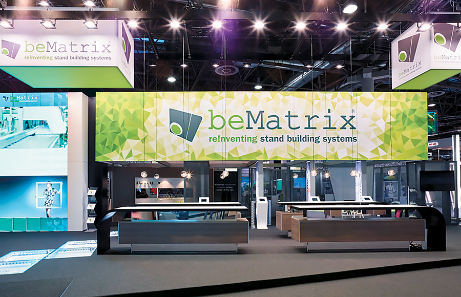
Exhibitor: BeMatrix Design: Dirk Driehuijzeh Design, Gent Area, Belgium, 32-475-74-23-67 Fabrication: Next Level BVBA, Maldegem, Belgium, 32-475-97-42-85, www.nextlevelbvba.be System: BeMatrix Event: EuroShop Budget: $150,000 – $249,000 Size: 55-by-112 feet Photo: BeMatrix The award for Best Use of Technology went to this 55-by-112-foot stand for BeMatrix, a Belgium-headquartered provider of exhibit-building systems. Debuting at EuroShop, a global retail trade fair in Dusseldorf, Germany, the exhibit put the firm's new LEDskin product center stage while surrounding it with what one judge called "an inviting layout that effectively highlighted BeMatrix's wide range of product offerings." LEDskin is a programmable LED tile system that seamlessly integrates with BeMatrix's other products. As such, the tiles can add elements of animation, movement, and emotion within a more standard frame system, and/or LEDskin can be combined to create expansive full-wall motion graphics. Thus, Dirk Driehuijzeh Design peppered this technology throughout the space, employing it as a full-on presentation screen near two main counter areas at the front of the exhibit as well as integrating small square tiles into an aisle-facing wall. Jurors applauded the strategic placement and utilization of BeMatrix's new tech. "I love that this exhibit highlights what LEDskin can do for the customer, not what the technology can do for the exhibit," one juror said. Featuring a sort of runway down the center, which was delineated via raised flooring systems on either side, the award-winning exhibit also integrated BeMatrix's PanelSkin along with b62 frames, and a neutral palette of brown, gray, and white appeared on almost all of the stand's cladding. However, two suspended, rectangular identification elements – accompanied by a bold header of sorts that ran nearly the entire length of the space – clearly branded the environment, offering both the company's logo and vibrant swaths of its lime-green corporate hue. 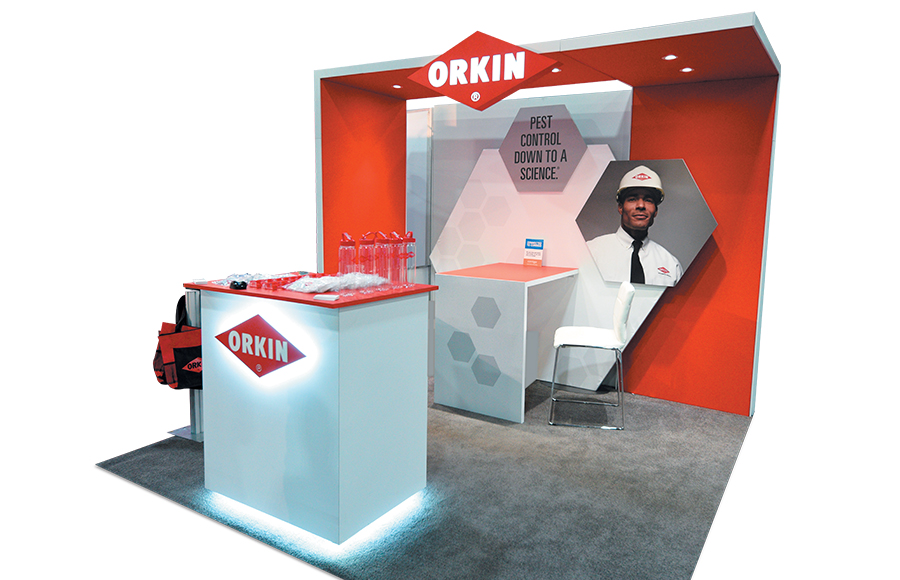
Exhibitor: Orkin LLC Design/Fabrication: E4 Design, Norcross, GA, 770-717-8665, www.efourdesign.com System: BeMatrix Event: National Apartment Association Education Conference and Exposition Budget: $20,000 – $39,000 Size: 10-by-10 feet Photo: E4 Design Portable/Modular Awards judges don't always agree with one another. But in their comments regarding this stand for Orkin LLC, winner of the Best 10-by-10-Foot Exhibit category, every single one of this year's jurors used the word "clean" – and most tacked on "simple" and "on point" to boot. Created by E4 Design, this small-but-mighty beauty, which launched at the National Apartment Association Education Conference and Exposition, also ticked all of the boxes for Orkin. The pest-control firm wanted to launch a new campaign – "Pest Control Down to a Science" – and logo while still emphasizing its "Orkin Man" icon. Thus, the stand married the existing and new campaigns via dimensional graphics. Three hexagon-shaped panels protruded from the red-and-white back-wall structure, adding interest and depth. In addition, a 3-foot version of Orkin's logo projected out from a ceiling element, where it was supported by a similarly sized side wall. A minimal yet functional desk attached to the back wall featured gray, hexagonal graphics and offered a cozy locale for sit-down conversations. Together, the back wall, ceiling structure, and desk created an inviting alcove – perfect for intimate shop talk or simply as a place to take a load off – and added further dimensionality to the space. At the front of the booth, a waist-high reception desk continued the red-and-white palette and Orkin branding. Meanwhile, puck lighting in the ceiling as well as edge lighting positioned under the countertop and around the base of the reception desk injected energy, allowing the logos to shine and drawing eyes to the crisp design. 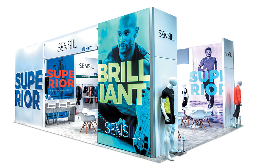
Exhibitor: Nilit Ltd. Design/Fabrication: Hill & Partners, Weymouth, MA, 617-471-7990, www.hillpartners.com System: Moss Inc. Event: Outdoor Retailer – Summer Market Budget: $40,000 – $79,000 Size: 20-by-30 feet Photo: Cole Group When someone mentions the words "nylon fiber," most people don't normally think of sophistication, style, and head-turning allure. But those were the exact words used by one juror to describe this stunning 20-by-30-foot exhibit for Nilit Ltd., a provider of custom nylon fiber solutions typically used in apparel applications. Taking the top slot in the Best Use of Graphics category, this beauty was born of Nilit's desire to create a retail-inspired exhibit that would highlight its new nylon brand, Sensil. Designed by Hill & Partners, the booth featured a rectangular, box-like structure that extended to the far corners of the footprint. While the majority of the display employed Moss Inc. fabric architecture, large, double-sided lightbox graphics took center stage. Here, visitors discovered larger-than-life imagery of athletes wearing apparel comprising Nilit's nylon-fiber products. These graphics, along with 3-D letters attached to the exhibit's exterior, offered vibrantly colored words, such as "brilliant," "superior," and "beautiful," that spoke to Sensil's brand characteristics. While the stand's graphics featured bright hues, the remainder of the space offered a clean, white palette, which served as the perfect backdrop for not only the signage but also various mounted clothing racks and mannequins that displayed fabric samples and finished garments using Nilit nylon. In addition to the apparel, the exhibit's interior offered four white table-and-chair groupings for semiprivate conversations as well as a waist-high reception desk and hospitality bar tucked conveniently into one corner of the environment – complete with similarly neutral-hued stools for weary showgoers. 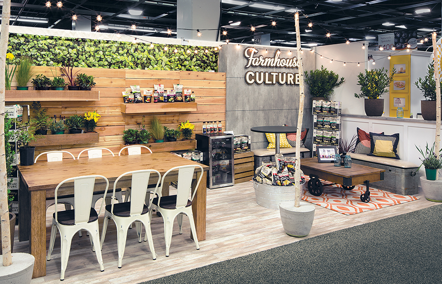
Exhibitor: Farmhouse Culture Design/Fabrication: Condit Exhibits, Denver, 303-744-7167, www.condit.com System: BeMatrix Event: Natural Products Expo West Budget: $40,000 – $79,000 Size: 10-by-20 feet Photo: Exposures Ltd. According to one judge, the competition's Best In-Line Exhibit was "a drool-worthy visual feast." Crafted by Condit Exhibits, this delicious design for Farmhouse Culture, a provider of probiotic-rich foods, launched at Natural Products Expo West as not one but two 10-by-20-foot in-line structures situated directly across the aisle from one another. Creating a unique cross-aisle experience, the stands delivered a cohesive presence while serving two very different functional purposes. Both spaces employed the BeMatrix system and Brumark-brand, white-washed, wood-laminate flooring. Plus, designers used string lights hung from wooden poles, branded graphics, and an upscale farmhouse aesthetic to unite the environments. However, that's where the similarities ended, as one space contained a farmhouse interior and product samples while the other functioned as a cozy outdoor-themed meeting space. The mock interior space featured painted board-and-batten panels for the back wall and sampling counters, which contrasted with black window frames and a chalkboard menu that served a dose of homey kitchen charm. Designers also installed "kegerators" (refrigerator/keg hybrids) below the counters to house the client's juice products. Meanwhile, a glass-door refrigerator displayed – and cooled – the client's line of sauerkrauts. Across the aisle, booth visitors encountered a patio vibe courtesy of concrete-patterned laminate, cedar fencing, planter boxes, an assortment of live plants, and fabric graphics featuring images of foliage. Here designers incorporated three separate seating areas: two small, casual arrangements and a six-person table-and-chair ensemble. While the exhibit used unique spaces with distinct purposes, one judge suggested that it "offered a welcoming, cohesive feel that was fun and hip – and decidedly on brand for the company." 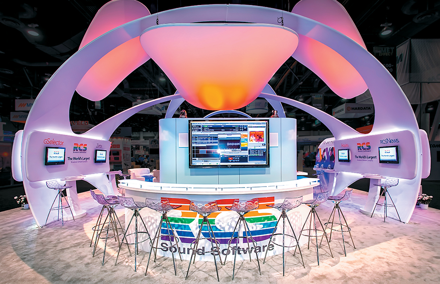
Exhibitor: IHeartMedia Inc. (dba RCS Sound) Design/Fabrication: Exhibit Concepts Inc., Vandalia, OH, 800-324-5063, www.exhibitconcepts.com System: Tectonics Event: National Association of Broadcasters Show Budget: $80,000 – $149,000 Size: 40-by-50 feet Photo: Cole Group How do you unite two distinct brands using cost-effective yet modular exhibit elements that can be adapted to various layouts? If you're Exhibit Concepts Inc., you devise a two-part design that uses fabric exhibitry that not only lightens weight-related charges but also is easily reconfigurable. This nimble 40-by-50-foot booth was brought to life at the National Association of Broadcasters Show for IHeartMedia Inc. (dba RCS Sound) and its Florical Systems division, which provide broadcast software (for radio, TV, internet, cable, satellite, etc.) and television-automation technology, respectively. To draw a distinction between the two brands, designers symbolically drew a line in the sand. They delineated the brands' spaces via cobalt blue carpet in Florical Systems' area, which encompassed roughly one-quarter of the entire space, and off-white carpet in RCS Sound's environment. Both regions were unified by tensioned-fabric architecture from Tectonics, structures that one judge lauded as "bright and variable elements that afforded designers the opportunity to alter the tone and mood via color-changing lighting." While each brand area offered separate freestanding structures that arched across the footprint and suspended fabric discs that added prominence as well as brand messaging, the fluidity and overall aesthetic of the disparate pieces tied the design together. Overhead, backlighting and color-changing RGB lighting elements cast soothing hues into both environs, and furniture and cabinetry chosen for their similarly modern design further aided the unification. What's more, all of the exhibit's components (e.g., fabric arches, overhead disks, furniture, cabinetry, etc.) were independent elements, a factor that allowed both brands to reuse and reconfigure them as necessary to create nearly endless arrangements at multiple trade shows. 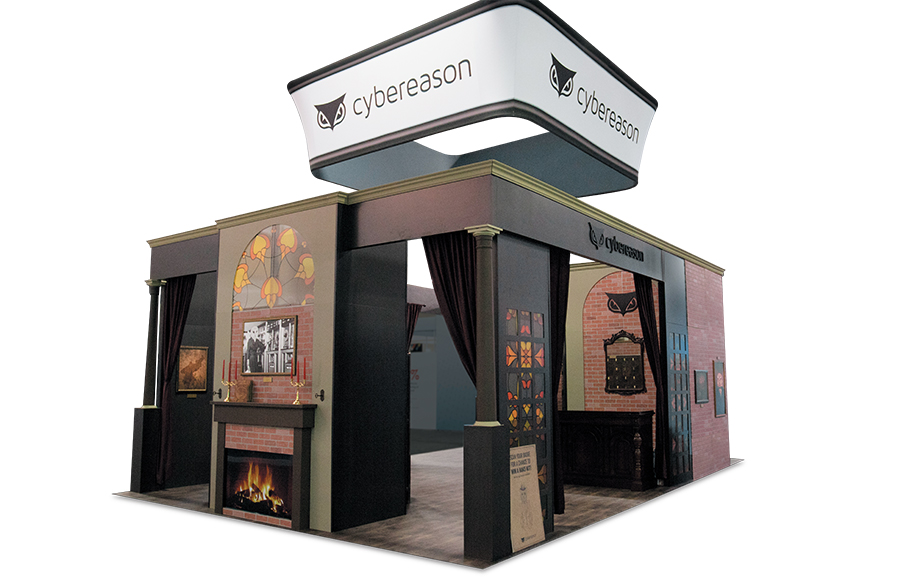
Exhibitor: Cybereason Inc. Design/Fabrication: Hill & Partners, Weymouth, MA, 617-471-7990, www.hillpartners.com System: Moss Inc. Event: Black Hat Budget: $150,000 – $249,000 Size: 20-by-30 feet Photo: Hill & Partners The safety of consumers' personal and financial information is top-of-mind in the corporate world and in popular culture. So it's no wonder that cybersecurity software provider Cybereason Inc. wanted to raise the face-to-face marketing stakes at Black Hat, a computer-security conference that draws thousands of professionals, not to mention scads of hackers, from sectors such as academia, research, and business. Cybereason hoped to stand out on the show floor via an immersive, nontraditional exhibit that would offer a memorable and engaging attendee experience – one that would also spark the interest of this utterly unique audience. Designers at Hill & Partners played off the secrecy and code-related language of the security industry to craft a 20-by-30-foot stand that resembled a speakeasy. Employing Moss Inc. fabric architecture at its core, the one-of-a-kind booth boasted brick and wood finishes, ornate columns, and crown molding. In addition, a solid-wood bar with touches such as a faux fireplace, heavy drapes, gold-toned candleholders, and wall treatments inspired by ornate stained-glass windows completed the whimsical, clandestine-saloon theme. A jarring contrast to the high-tech stands dotting the show floor, the semi-enclosed booth featured a series of complex puzzles and games, including "planted" computers that were intended to be hacked by attendees and several lock-picking puzzles, which challenged guests to open antique apothecaries and safes. Attendees and jurors alike were enthralled with the offerings, as one judge called it "a fun, engaging, and noteworthy experience that far exceeded the expectations of traditional rental exhibitry." 
Exhibitor: Burkhardt Leitner Modular Spaces GmbH Design/Fabrication: Terminal Design, Istanbul, 90-216-557-83-84, www.terminaldesign.com.tr System: Burkhardt Leitner Modular Spaces GmbH Event: EuroShop Budget: $80,000 – $149,000 Size: 26-by-42 feet Photo: Andreas Hagemann Earning the highest score in the Best International Design category, this light-filled, 26-by-42-foot stand launched at EuroShop in Dusseldorf, Germany. Designed by Istanbul-based Terminal Design for Burkhardt Leitner Modular Spaces GmbH, a provider of modular architectural systems for exhibits, office spaces, museums, etc., the exhibit set out to highlight Burkhardt Leitner's range of products while putting special emphasis on those with integrated lighting. To make the most of the exhibit's two open sides, designers bathed the front-right corner of the space in brilliant illumination. Interrupted only by the firm's logo in simple black type, five overhead lightboxes organized into an L shape formed a couldn't-miss element that attracted visitors from aisles around. Immediately beneath these boxes, which like the rest of the stand comprised Burkhardt Leitner products, designers added illuminated flooring, also in a stark-white hue, to balance the presence of the massive overhead element. Meanwhile, the rest of the space, including an enclosed conference room positioned at the front-left corner of the footprint and an open meeting area at the back that could accommodate up to 10 booth visitors at a time, bore dark-gray tones. At the front edge of the environment, a functional storage room was awash in white and tucked away unobtrusively. This contrast of light and dark drew applause from one juror who called the stand "a setting that perfectly married a neutral, elegant color scheme with simplicity and functionality." Meanwhile, another judge praised the designers' effective use of contrast to capture the attention of EuroShop attendees. The back wall, which comprised the firm's Pon Media and large-format fabric graphics, offered an inset 95-inch monitor that played an animated video. To add a pop of color – and break up the otherwise minimal palette – designers crafted four wheeled podiums out of the exhibitor's products and situated them atop the illuminated flooring. The brilliantly hued components – in shades of ruby red, deep violet, emerald green, and aquamarine – attracted attention like a drop of red wine on a white tablecloth. 
Exhibitor: Twitch Interactive Inc. Design/Fabrication: Astound Group Inc., Las Vegas, 702-462-9718, www.astoundgroup.com System: BeMatrix Event: Penny Arcade Expo East (PAX) Budget: $250,000 – $499,000 Size: 50-by-50 feet Photo: Evan Richman Photography Designing an exhibit that effectively communicates a brand's marketing messages and offers multiple reconfigurations to meet objectives that ebb and flow with each show is a tall order indeed. Astound Group Inc. rose to this challenge by creating a sort of Mr. Potato Head stand that, while still serious and sophisticated, comprised interchangeable parts that could be added, relocated, and removed with ease. This Swiss-army-knife exhibit, which one juror touted as "a cohesive design no matter the layout," was crafted for Twitch Interactive Inc. A video platform and online community for gamers, Twitch allows viewers to chat – or lurk – while watching everything from classic TV show marathons to "eSports" tournaments. Going into 2017, Twitch wanted a nimble booth that could adapt its layout to suit varying objectives, in-booth activities, and demographics. Plus, these once-a-year points of interaction were key, as trade shows are the only time fans can interact with the brand in a nondigital format. Comprising BeMatrix exhibitry, the booth featured several main components, such as a streaming zone, demo stations, and various-size meeting rooms, along with one central element: a green room and production area that facilitated a live, streaming broadcast. While the main components were added and subtracted from the design and rotated or relocated within the various footprints, the live-broadcast space was present throughout all of the exhibit's iterations. Jurors appreciated the design's modularity and reconfigurability, and they also hailed its graphics and finishes, which one felt "added visual interest and a unifying element without overpowering or cluttering the activity-oriented space." 
Exhibitor: Elgato Systems GmbH Design/Fabrication: Access TCA Inc., Whitinsville, MA, 508-234-9791, www.accesstca.com System: BeMatrix Event: International Consumer Electronics Show Budget: $150,000 – $249,000 Size: 20-by-40 feet Photo: Padgett and Company Inc. Some displays put the product center stage, and some transform the product into art. This stand for Elgato Systems GmbH excelled on both counts, placing the firm's app-based lifestyle technology in the limelight while elevating the products to museum-worthy status. Crafted by Access TCA Inc., the 20-by-40-foot booth was born of Elgato's desire to have a sophisticated and refined display in which to promote its connected-home technologies. For its presence at the International Consumer Electronics show, Elgato also hoped to incorporate Ligeo, which comprises custom elements built with LED light bars, from its partner, GIP Innovation Tools GmbH. Hailed by one judge as "an enchanting space that oozes elegance," the resulting exhibit was capped by a black-and-white fabric ceiling structure. Underneath, 15 product displays acted as couldn't-miss eye candy. Comprising glowing Ligeo bars formed into pyramid shapes and suspended from the canopy, each display housed a single piece of Elgato hardware placed on reflective glass. Designers also combined these same light bars to form repeating geometric patterns and attached them to the underside of the canopy, creating dramatic light fixtures that mirrored the displays' aesthetics. Playing second fiddle to the light-and-product symphony, a wide counter and shelving provided additional product-display space near the booth's center. Meanwhile, the back of the space housed a meeting area and a storage room, which were fabricated using rented wall panels clad with printed fabric and Sintra graphics. Elgato also gave a nod to its Eve collection of glowing orbs and spheres, as one corner of the design incorporated a product display atop a wooden deck. 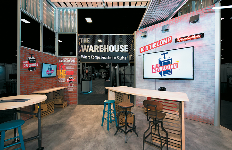
Exhibitor: Payfactors Group LLC Design/Fabrication: Hill & Partners, Weymouth, MA, 617-471-7990, www.hillpartners.com System: Moss Inc. Event: WorldatWork Total Rewards Conference and Exhibition Budget: $80,000 – $149,000 Size: 20-by-20 feet Photo: Hill & Partners Going into the WorldatWork Total Rewards Conference and Exhibition, Payfactors Group LLC wanted attendees to know it's revolutionizing the world of employee compensation. And amid a show floor crammed with traditional booths, the provider of cloud-based tools for compensation-data management desired an industrial exhibit to stand out in this sea of sameness. Designers at Hill & Partners delivered via this 20-by-20-foot booth that paired a Moss Inc. EZ-Panel system with industrial and high-tech elements. Offering a warehouse ambiance, the booth featured an open floor plan, save for an L-shaped structure along two sides. Here, designers married elements such as unfinished wood, corrugated-metal panels, chain-link fencing, air-duct vents, and fluorescent and Edison-style suspended light bulbs with modern-day monitors, upon which Payfactors offered product presentations and demos. Throughout the environment, which one juror described as "an engaging, whimsical, and multisensory experience," designers added four table-and-chair ensembles for impromptu sit-down demos. But everywhere visitors looked, they encountered eye candy, including everything from mismatched seating and retro mini fridges to school lockers and neon signage, all of which added an air of authenticity. Overhead and eye-level graphics suggested that attendees "join the comp revolution," while air vents pumping out faux smoke and vinyl flooring resembling unfinished concrete enriched the industrial atmosphere. To further lure potential visitors to the space, Payfactors distributed light-up electronic wristbands via pre-show and on-site marketing activities. Once per day, all the activated wristbands lit up, signaling attendees to visit the Payfactors booth for a giveaway bonanza.
2018 Judges
Entries were scored by a two-part panel of marketing and design experts, who evaluated both the aesthetic qualities of the completed portable/modular exhibits as well as their functionality, practicality, suitability, messaging, and marketing capabilities. 
|
|
|
||||||||||||||||||||||||||||
|
|
||||||||||||||||||||||||||||
|
TOPICS Measurement & Budgeting Planning & Execution Marketing & Promotion Events & Venues Personal & Career Exhibits & Experiences International Exhibiting Resources for Rookies Research & Resources |
MAGAZINE Subscribe Today! Renew Subscription Update Address Digital Downloads Newsletters Advertise |
FIND IT Exhibit Producers Products & Services All Companies Get Listed |
EXHIBITORLIVE Sessions Exhibit Hall Exhibit at the Show Registration |
ETRAK Sessions Certification F.A.Q. Registration |
EDUCATION WEEK Overview Sessions Hotel Registration |
CERTIFICATION The Program Steps to Certification Faculty and Staff Enroll in CTSM Submit Quiz Answers My CTSM |
AWARDS Exhibit Design Awards Portable/Modular Awards Corporate Event Awards Centers of Excellence |
NEWS Associations/Press Awards Company News International New Products People Shows & Events Venues & Destinations EXHIBITOR News |
||||||||||||||||||||
|
||||||||||||||||||||||||||||


