EXHIBITOR magazine ranks the most remarkable exhibits from the 2017 International Consumer Electronics Show.
Held annually in Las Vegas, the International Consumer Electronics Show isn't just the largest trade show in the United States by every measure; CES also sets the bar for global exhibiting trends at the onset of each calendar year. The 2017 show featured 2.5 million square feet of show-floor space and more than 3,800 individual exhibits. And EXHIBITOR magazine editor Travis Stanton saw every last one of them (and has the blistered feet to prove it). After four days, 50 miles of aisles, and nearly 4,000 booths to consider, he arrived at a list of the 20 most impressive exhibits from CES 2017.
1.
Many of the exhibits at the International Consumer Electronics Show fall into what could be called the "department-store booth" category, in which several product lines under a wide corporate umbrella are apportioned individual slices of a company's booth space. Even the best of them often end up looking more like shopping malls full of disparate stores and kiosks than well-branded corporate exhibits. Relying on brand hues, monochromatic carpeting, or au courant finishes to serve as cohesive threads capable of tying together unrelated product groupings, designers make a valiant effort, yet often succeed in little more than offering up disjointed experiences as attendees pass from one vignette to another. But LG Electronics Inc. broke the mold with an exceptionally curated assemblage of individual components. Designed by LG's in-house agency, HSAD, and fabricated by Taylor Manufacturing Industries Inc. (The Taylor Group), the exhibit offered surprise and delight around every corner. From the tunnel of 4K OLED curved screens to the captivating
kinetic installation representing the "nano cell" technology behind the company's
Super UHD HDR offerings, the exhibit was absolutely memorable and the undeniable star of CES 2017.
2. Like an enchanted garden that had been tipped on its head, the exhibit for Changhong
Electric Co. Ltd. invited attendees to walk beneath a star-like sky of glowing, crimson-colored lotus flowers. Merging two significant symbols in Chinese culture (the lotus, which represents perfection, and the color red, signifying good fortune), the design may have foretold its own success. The focal point of the space was an in-booth theater placed beneath a massive fabric lotus flower. Designed and fabricated by Soya Messe+Event and MC2, the exhibit was like a Zen garden amid the cacophony of CES.
3. How do you put a sole automobile center stage, ensure excellent sight lines for VIP visitors, and position your brand as an indisputable trailblazer? You follow Faraday & Future Inc.'s lead and erect a literal show-floor stadium with your product as the centerpiece. Designed and fabricated by Pinnacle Exhibits Inc., Faraday's booth attracted throngs of onlookers, while VIPs and members of the press were invited to step inside the space or climb the stairs for a bird's-eye view from a platform that ran the length of the back wall. The FF91 self-driving electric car was parked front and center like a national treasure in a brilliant jewel box, while an LED screen provided a futuristic backdrop, setting the scene for a superbly executed single-product display.
4. In our increasingly eco-minded era, reuse is definitely in vogue. So kudos to Select Comfort Corp.'s Sleep Number brand (and Southfield, MI-based exhibit designer JGA Inc.) for repurposing its 2016 exhibit with a stark-white color scheme and a tantalizingly brilliant twist. The tensioned-fabric structure remained, along with a pair of aisle-side displays atop pedestals (which seemed to elevate both the products and their prestige), but Sleep Number swapped out last year's psychedelic, color-changing light show for cool, white illumination that bathed the booth and made the entire space glow from within. The piece de resistance of this exhibit inside the Sands Expo and Convention Center was a series of flatscreen monitors running informational content. And since the screens were positioned parallel to the floor and above five of the company's 360 Smart Beds, interested visitors had to lay down and test out the products in order to watch the videos and learn more.
5. A subtle, sophisticated color palette and restrained use of structure and graphics made this dramatically illuminated exhibit for Fasetto LLC a purple-hued white space on the trade show floor. Nothing in the booth shouted at visitors, the violet lights didn't pulse, and there were no flashy gimmicks, which is exactly what made this successfully simple booth sing. Designed and fabricated by ExhibitTrader.com Inc. and Southwest Displays and Events, a Core Visual Marketing company, the exhibit also featured a videowall embedded into a supersized replica of the Link, which is a product that allows users to store and easily share data. But the wow factor in this exhibit came from a novel 20-foot-tall string-art sculpture made using hand-painted cloth strapping ‐ referencing the product's ability to stream information to multiple devices simultaneously ‐ surrounded by six tablets that quietly beckoned to passersby.
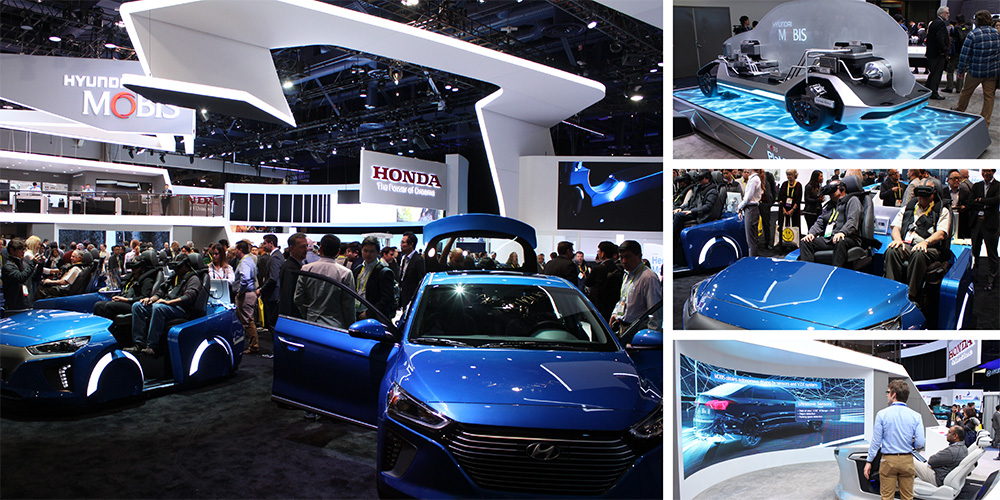
6. High-tech wizardry can go horribly wrong, but Hyundai Motor Co. managed to use some of the exhibition industry's hottest techno tools in absolutely artful ways. In two separate spaces ‐ one for Hyundai and another for Hyundai Mobis ‐ booth visitors were treated to a symphony of experiential delights beneath a series of angular ceiling structures. The exhibit's clever use of virtual reality and large- and small-scale multimedia elements was both thoughtful and thoroughly successful. And best of all, the spaces (designed and fabricated by InnOcean, an in-house agency of Hyundai Motor Group, and Plus Infini Co. Ltd.) were staffed with brand reps at the ready to help attendees make sense of the special effects.
7. The lavender-lit exhibit for Belkin International Inc.'s Linksys brand, which took up just a portion of Belkin's booth, dropped one spot on our Best of CES list since 2016. While the space, designed and fabricated by Pinnacle Exhibits Inc., was equally arresting, attracting droves of attendees like mosquitoes to a beautiful, glowing bug zapper, the interactive elements seemed somehow less inviting than last year, prompting passersby to snap a picture rather than step into the amethyst environ.
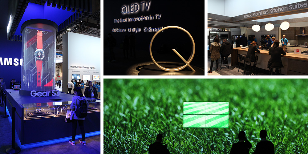
8. The exhibit for Samsung Electronics Co. felt like a hip museum of next-generation necessities. While some of the displays seemed to deviate from the overall aesthetic, the exhibit, designed and fabricated by MC2 and McKinney Ventures LLC, succeeded in enveloping attendees in the brand and serving them a series of product-centric experiences. Meanwhile, the QLED Theater, which merged a massive high-definition wall with four quantum-dot TVs, attracted attention but seemed to paradoxically raise more questions than it answered.
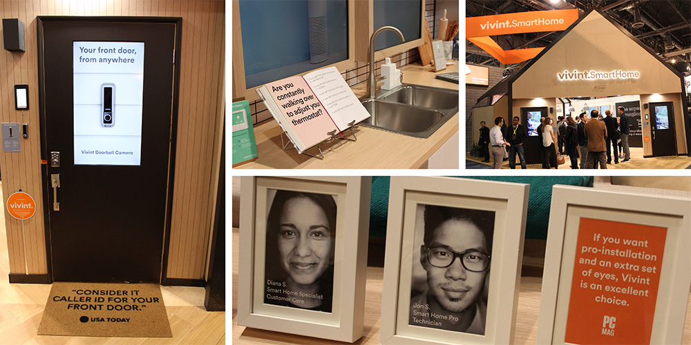
9. Some say the devil's in the details, but inside Vivint Smart Home's exhibit (designed by Vivint Inc.'s Smart Home Design Team and fabricated by Premier Displays and Exhibits Inc.), the details were absolutely delightful. Doormats printed with rave reviews, an open cookbook on the kitchen counter asking a rhetorical question, and framed photos of the people behind the products lent a homey vibe to the space while keeping the focus on the company's offerings. Sure, the idea of building a home-inspired exhibit is nothing new to the trade show floor, but this iteration of the tried-and-true archetype was remarkably authentic, and the products were adeptly and seamlessly embedded throughout, allowing a number of different demos to take place in suitable spaces.
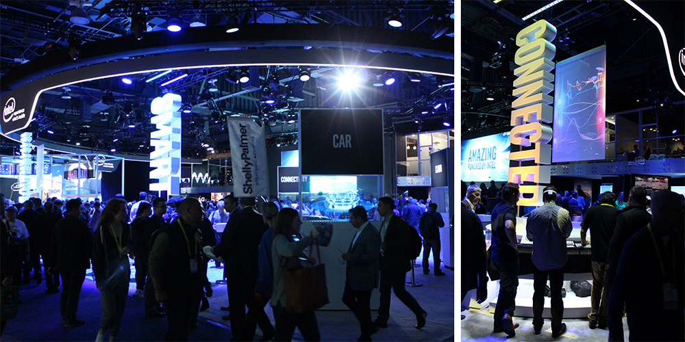
10. Intel Corp. did what Intel does best: It offered a big, bold exhibit, designed and fabricated by Taylor Manufacturing Industries Inc. (The Taylor Group), that was full of well-trained staffers and hands-on product engagements vividly illustrating the experiences made possible by Intel technology. While the soul of the space seemed somewhat diminished compared to last year, when the company topped our Best of CES list, the Intel booth offered a barrage of dynamic live presentations in its central theater, as well as immersive interactions in four themed areas: sports and analytics, automated driving, virtual reality, and wearables, all of which were delineated by color-shifting, illuminated 3-D signage. Hosting more than 75,000 visitors, who were all invited to get hands on with Intel's often intangible tech, the exhibit was yet another solid hit in a string of successes from the Santa Clara, CA-based company.
11. Elgato Systems GmbH played with light and shadows in its 20-by-40-foot exhibit
featuring the company's electronic offerings. A tensioned-fabric ceiling element hung over the exhibit (which was designed and fabricated by Access TCA Inc.) like a starless night sky, while glowing pyramidal product displays comprising Ligeo LED light tubes seemed to float in midair, teasing attendees into entering and exploring.And since the demo/display kiosks were suspended from the ceiling, the resulting aesthetic was more open and inviting than competitors' comparably cluttered booths. Rollable vinyl printed to resemble hardwood flooring infused a welcoming vibe into what could have been an angular, austere space. Meanwhile, a wooden deck displayed Elgato's light orbs, and a semiprivate
meeting room facilitated conversations with clients and prospects.
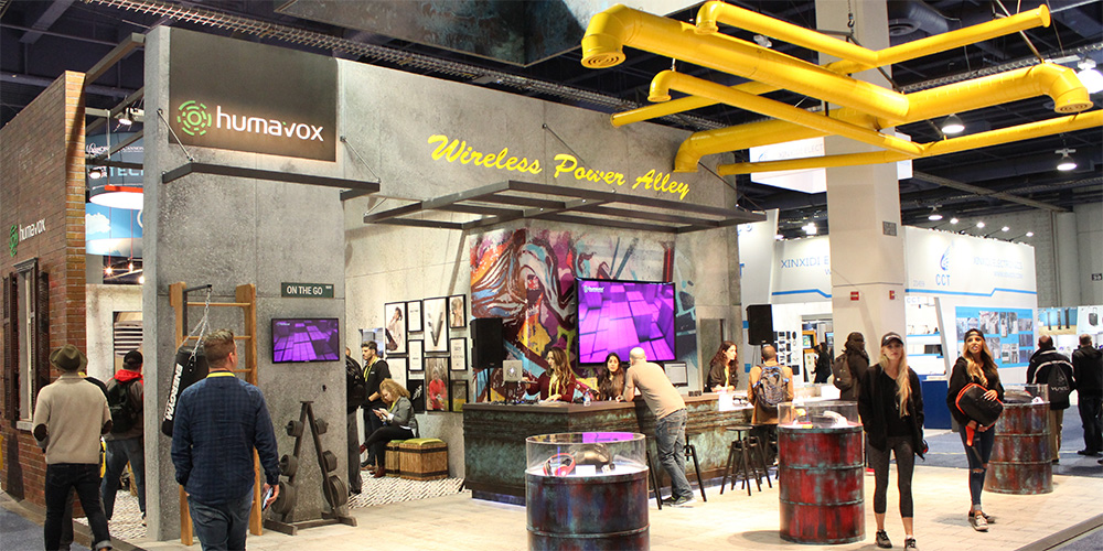
12. Humavox Ltd. took one of today's top trends ‐ industrial chic ‐ and kicked it
up a notch by adding a little urban grunge. The faux finishes, graffiti-inspired graphics, hazard-yellow overhead ductwork, and oil-drum display cases intertwined to create an authentically edgy exhibit dubbed the "Wireless Power Alley" inside LVCC's South Hall. Add a few aisle-side brand ambassadors dressed in ball caps and hoodies, and the result was so genuinely urban you could almost smell the smog.
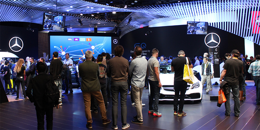
13. Mercedes-Benz USA LLC's exhibits always seem imbued with the brand's signature sophistication and luxurious details, and this design was no exception. The elegant, airy ceiling structure looked like a miraculous piece of macrame from an art gallery you're probably too underdressed for, and the rich wood flooring conjured high-end condos that you definitely can't afford. But despite the almost off-putting elegance, the exhibit had an undeniable allure that drew attendees in, even if the look-don't-touch luxury kept many of them standing along the perimeter.
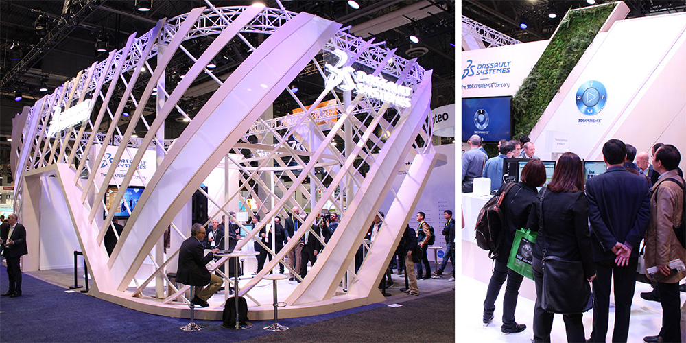
14. Fully enclosed exhibits can be a gamble, either intriguing aisle-walkers with the allure of exclusivity or repelling them with an unwelcoming air that makes visitors feel less like guests and more like an imposition ‐ and forcing attendees to nervously question whether or not they're "on the list." But the 30-by-50-foot exhibit for Dassault Systemes SE managed to capitalize on the pros and sidestep the cons with soaring, 16-foot walls that resembled a sort of luxe latticework. Plus, the structure ‐ which admittedly did have rather limited points of ingress and egress, resulting in a less-than-ideal traffic flow ‐ provided passersby with a tantalizing glimpse of the exhibit's interior, which housed a lush "living wall" that added a much-needed pop of color to what was otherwise a somewhat sterile space. Designed and fabricated by Auditoire Group, the exhibit featured a demo space, a virtual-reality experience, and a pair of private meeting rooms.
15. Sometimes effective exhibiting is all about making a good first impression. That's one reason this exhibit for Hong Kong Skyworth Digital Holdings Co. Ltd. was a hit, greeting visitors to the LVCC's South Hall with an attention-grabbing focal point comprising a dramatically lit ceiling structure, bold brand signage, and a series of hypnotic rings made of flatscreen monitors running space-inspired imagery. That element alone positioned Skyworth as the final frontier of consumer electronics. While the rest of the exhibit paled in comparison, a series of beanbag chairs offered a unique opportunity for visitors to take a load off.
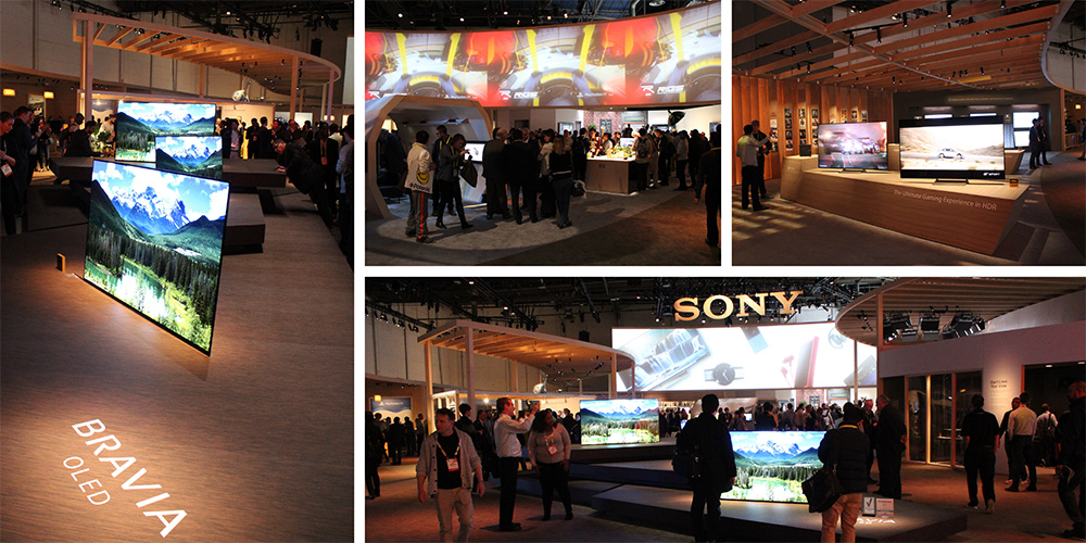
16. An almost indiscernible, natural wood-grain finish and warm-toned lighting combined to create a surprisingly sophisticated structure for Sony Corp, topped off with a slatwall-like ceiling. A smattering of individual vignettes begged further exploration (despite poorly designed traffic patterns), and dramatically lit product displays featured everything from Sony's HDR to OLED offerings. A massive wraparound screen, onto which high-impact imagery was projected, held attendees' attention long enough for them to soak up some of Sony's key messages before getting hands on at a number of demo stations.
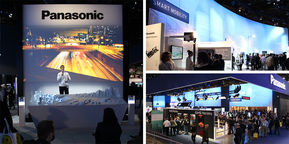
17. Panasonic Corp. continued its theme from the past few years, offering up a city-centric exhibit designed and fabricated by Czarnowski Display Services Inc. Divided into various vignettes representing work, home, and play, the exhibit associated Panasonic's many offerings with attendees' everyday lives, with a focus on a "smart world" where devices and infrastructure are interconnected. An imposing back wall featured a modern skyline sketch that set the scene and provided a contextual backdrop for many of the various product displays. Meanwhile, a barrage of formal and impromptu presentations and activities ‐ including a main stage show with a projection-mapped cityscape ‐ kept visitors engaged with Panasonic's brand. Finally, a section dubbed the Future Tech Lab highlighted what's on the horizon for the consumer-electronics industry.
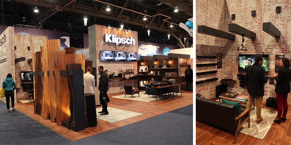
18. Klipsch Group Inc. appealed to its target audience of audiophiles with a warm, wood-toned exhibit that looked like the love child of a chill man cave and a hip craft brewery. Rustic elements commingled with industrial light fixtures and faux-concrete finishes, lending the entire space a sense of permanence and a modern masculinity without the gratuitous machismo that tends to make women roll their eyes and walk on by. A faux-brick wall with a well-lit corporate header branded the booth, and weathered wood planks delineated a corner display space for Klipsch's products.
19. Sometimes it's hard to find something truly unique on the trade show floor, but
the exhibit for ShadeCraft LLC had a few exceptional elements that made it noteworthy. First, the laser-tight focus on the company's product was a welcome contrast to its graphics-heavy and display-cluttered neighbors. Second, positioning the tall, central structure diagonally across the booth space allowed it to stand out and appear even larger than the space itself. Third, using the tall, white wall as a projection surface was a brilliant way to keep the booth minimalistic while still communicating important key messages in a visually impactful manner that made visitors to the Sand's Expo and Convention Center stop and take note.
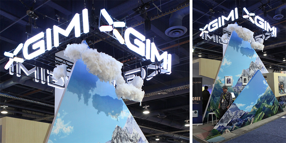
20. This whimsical little exhibit for Changdu Xgimi Technology Co., tucked away in the LVCC's South Hall, was a unique combination of two-dimensional graphics and 3-D elements referencing a mountain theme. Complete with relatively realistic clouds circling the exhibit's peak, the design was equally quaint and creative ‐ and among the most memorable of CES's smaller booth spaces.