|
REGISTRATION REQUIRED
awards
EXHIBITOR Magazine's Third Annual Portable/Modular Awards
Affordable to own, simple to install, and infinitely customizable, portable/modular exhibits now rival the eye-candy allure of traditional custom-built exhibitry – often at a fraction of the cost. That's why EXHIBITOR launched its Portable/Modular Awards in 2014, in hopes of spotlighting what's capable within the realm of system exhibitry. So join us in congratulating the winners of the third annual Portable/Modular Awards. These stunning exhibits raise the bar for the industry and prove that "portable" and "modular" are adjectives that go hand in hand with "innovative" and "stunning."
The Judges (top row) Glenda Brungardt, CTSM, trade show and event marketing program manager, HP Inc., Fort Collins, CO; Donna Castillo, former senior global event manager, Atmel Corp., San Jose, CA; Tom Doumasiou, creative director, NeosCreative, Hampton Wick, U.K.; Tom Graboski, principal, Tom Graboski & Associates Inc., Miami Beach, FL; Alp Gumus, managing partner, Terminal Design, Istanbul; (bottom row) Annette M. Piskel, founder and creative director, AMPdzine, Fort Lauderdale, FL; Gale Portwine, CTSM Gold Level, marketing specialist, Aon plc, Hatboro, PA; Angi Schoolcraft, event marketing specialist, Chevron Products Co., Louisville, KY; Terrence Young, CMP, marketing programs manager, Pyrotek Inc., Spokane WA; Carmelo Zappulla, Ph.D., architect and founding partner, External Reference Architects, Barcelona, Spain 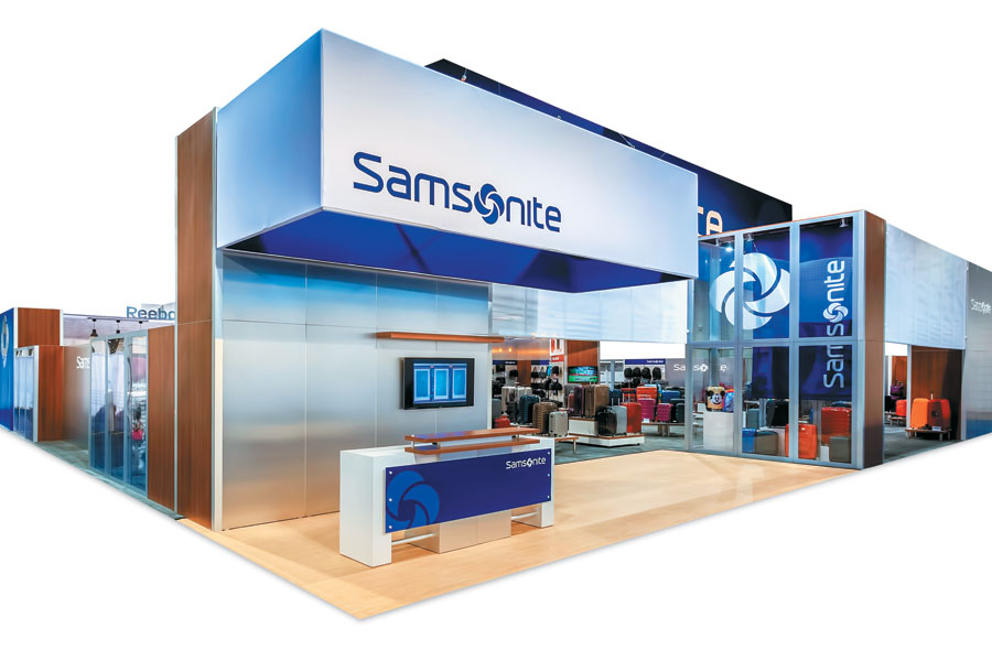
Exhibitor: Samsonite International S.A.
A streamlined aesthetic, simple finishes, and durable yet versatile components combined to create not only an exhibit that nabbed the top notch in its category but also one that took home the competition's top honor, The Zeigler Award, presented to the entrant with the highest cumulative score regardless of category. What's more, the 80-by-80-foot rental exhibit, which debuted at The Travel Goods Show, embodied the essence of Samsonite International S.A. – a firm known for its several different lines of lightweight, streamlined, and durable luggage. Design/Fabrication: Hill & Partners Inc., Weymouth, MA, 617-471-7990, www.hillpartners.com System: Searle Exhibit Technologies Inc.; Moss Inc. Event: The Travel Goods Show, 2015 Budget: $500,000 – $749,000 Size: 80-by-80 feet Photo: Michael Cole Designed by Hill & Partners Inc. using system components from Searle Exhibit Technologies Inc. and Moss Inc., the exhibit functioned as a retail space, showcasing hundreds of products. In fact, judges lauded the designers' ability to house myriad displays in an organized and attractive fashion. "While products were everywhere, exhibitry was kept to a minimum, and the aesthetic remained clean and uncluttered. That ultimately helped the designers keep the spotlight focused on Samsonite's offerings," judges said. 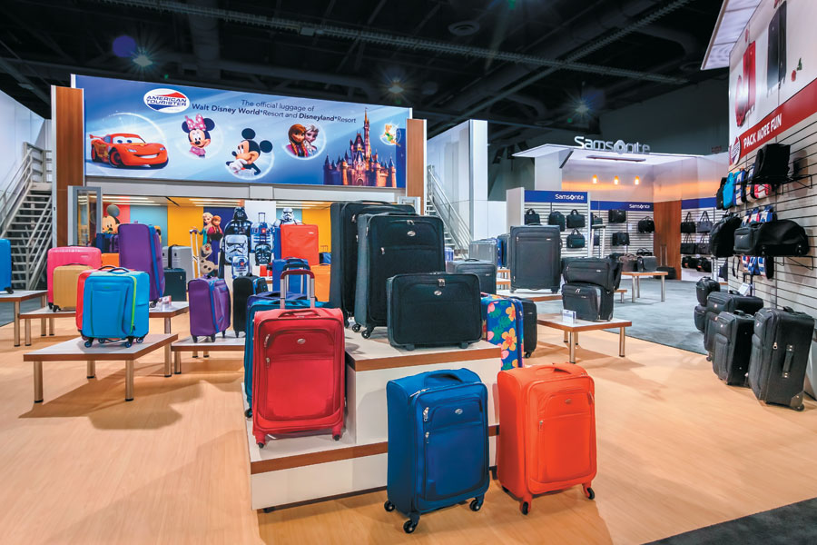 Booth visitors discovered the Star Wars and Disney lines near the back of the exhibit. Featuring a 30-foot-long graphic mounted to a second-story deck (which housed VIP meetings), the area was equipped with dramatic lighting, Mickey-Mouse and Darth Vader sound effects, and a staffer dressed as a Storm Trooper. Samsonite's success just goes to show that creating a remarkable trade show booth doesn't require a ton of exhibitry or high-tech gadgets. Rather, you just need a talented designer who understand that sometimes, the exhibitry needs to stand in the wings and allow the products to take center stage. 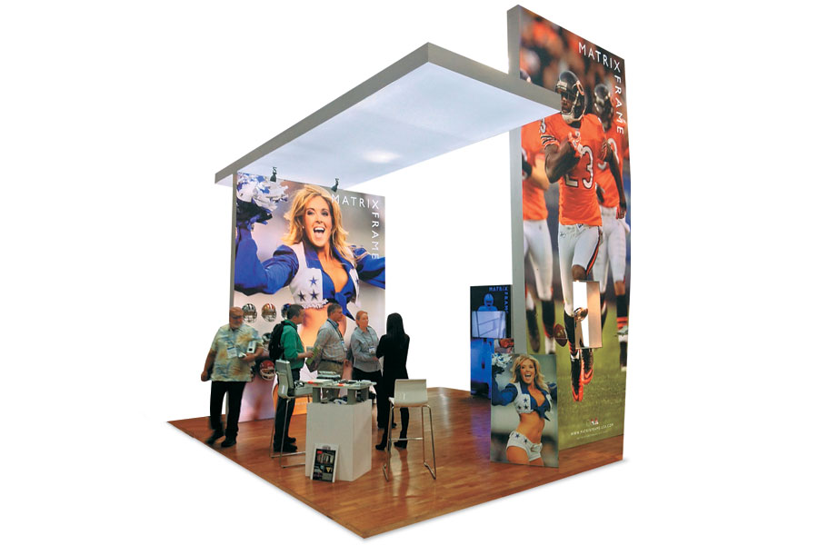
Exhibitor: Matrix Frame USA LLC
Most exhibitors think of lightboxes as mere exhibit accoutrements, not core components. But Matrix Frame USA LLC, which provides lightboxes, frames, and more, hoped to change that perception at EXHIBITORLIVE. In fact, the firm wanted a stop-'em-in-their-tracks booth that would expand attendees' perception about the role of lightboxes in their own exhibit designs. Design: Matrix Frame BV, Leiden, Netherlands, 31-715-226-771, www.matrixframe.eu Fabrication: Matrix Frame USA LLC, Charlotte, NC, 704-393-2881, www.matrixframe.com/us System: Matrix Frame USA LLC Event: EXHIBITORLIVE, 2015 Budget: $20,000 – $39,000 Size: 20-by-20 feet Photo: Matrix Frame USA LLC The 400-square-foot exhibit, designed by the company's home office in Leiden, Netherlands, featured three Matrix Frame lightboxes. Two of them, which measured 10-by-13 feet and 8-by-18 feet, actually supported the third, a 20-by-6.5-foot structure that served as an eye-catching ceiling element. Two of the lightboxes housed football-themed graphics, which were a fitting touch since the show took place shortly after the Super Bowl and because sports imagery often delivers an emotional impact. Nine football helmets representing various pro teams were displayed using magnetic shelving attached to a lightbox frame. Designers also built a pass-through shadow box in one of the lightboxes where they housed a replica of the famous Lombardi trophy to further drive home the sports-centric theme. The three cantilevered lightboxes, which comprised aluminum frames and large-format silicone-edged fabric graphics, were actually standalone structures that linked together at subtle points via internal bolts and wing nuts. Together, they created the effect of completely freestanding elements minus any bulky, unattractive rigging points. According to judges, "This exhibit proves that sometimes less is more. You don't need to have a ton of exhibitry in order to make a big impact on the trade show floor. All you really need is some luminous – and voluminous – lightboxes paired with bold, emotional, colorful, and impactful graphics." 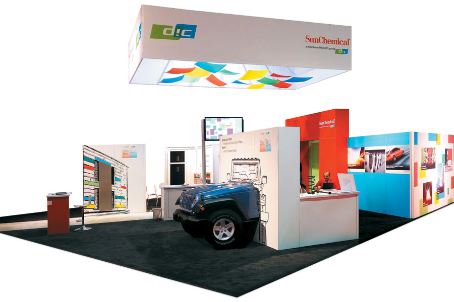
Exhibitor: Sun Chemical Corp.
Hailed by judges as "a prime example of how to effectively pair 3-D objects with flat, two-dimensional graphics," the 40-by-40-foot design for Sun Chemical Corp. took top honors in
the Best Use of Graphics category. Crafted by E4 Design, the exhibit was meant to recreate various environments in which Sun Chemical's myriad printing inks and pigments are used. Thus, each vignette within the booth, which debuted at the American Coatings Show, brought a unique environment to life with graphics and objects, the latter of which featured coatings made with Sun Chemical's pigments. Design/Fabrication: E4 Design, Norcross, GA, 770-717-8665, www.efourdesign.com System: BeMatrix USA Event: American Coatings Show, 2014 Budget: $80,000 – $149,000 Size: 40-by-40 feet Photo: E4 Design For example, inside the kitchen vignette, designers paired a dishwasher and a toaster with vinyl graphics meant to represent a stove, windows, and cabinets. Similarly, the garage area featured tires, mufflers, and the front of a Jeep while the rear end was represented by black-vinyl graphics. Throughout the space, colorful graphics provided product info related to each vignette as well as vibrant photos depicting various pigments in real-life applic-ations. Above the space, a fabric element featured the exhibitor's logos as well as colorful Plexiglas panels in the same hues that make up the Sun Chemicals logo, which were suspended within the oblong element. And underneath all of that fabric and laminate, a sturdy BeMatrix system comprised the exhibit's core. Overall, this design was all about proper pairings. For when you mix effective structural components with eye-catching coverings – and pair 3-D objects with two-dimensional graphics – you get an award-winning combination of real and representative elements. 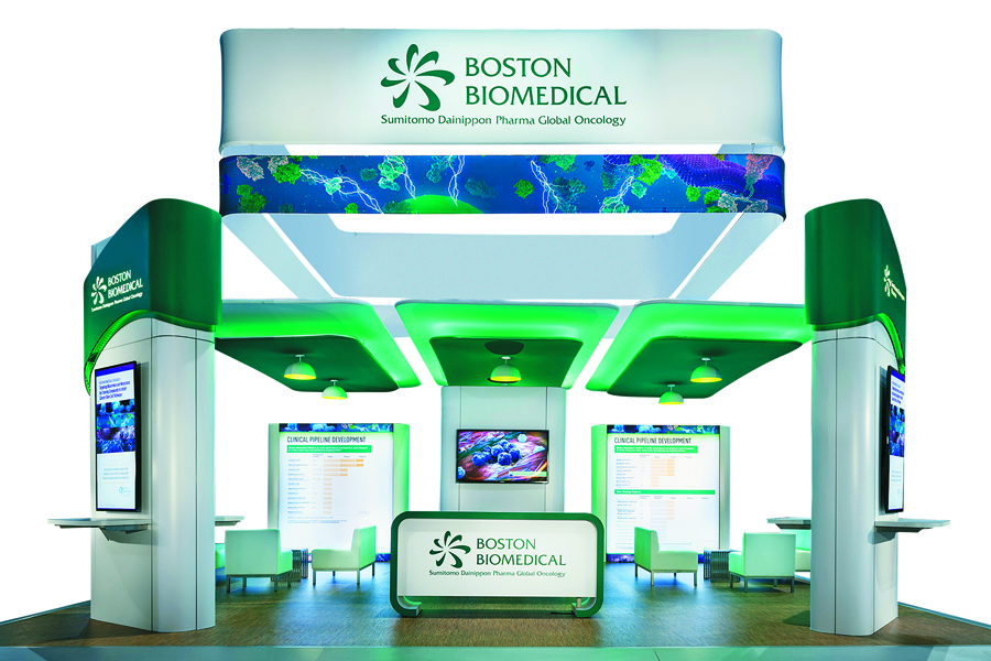
Exhibitor: Boston Biomedical Inc.
In preparation for the American Society of Clinical Oncology show, the marketers at Boston Biomedical Inc. had two overarching goals for their exhibit: 1) generate brand awareness via a classic exhibit comprising flexible, modular, and lightweight materials, and 2) create a loosely defined room of sorts where attendees and scientists could discuss recent cancer research. Design/Fabrication: Access TCA Inc., Whitinsville, MA, 508-234-9791, www.accesstca.com System: BeMatrix USA; TenFab Design LLC Event: American Society of Clinical Oncology, 2015 Budget: $150,000 – $249,000 Size: 30-by-30 feet Photo: Padgett and Company Inc. The resulting 30-by-30-foot structure featured four ID towers, one on each corner of the space, which displayed the firm's logo and emerald-green hue as well as information about its clinical-development research. Designers also positioned two comfortable furniture groupings and a pair of reception desks atop raised, vinyl flooring. However, a series of suspended elements in the center of the space offered the bulk of the booth's theatrics – and further met the firm's goals. Hailed by judges as "a cohesive element that added dimension and a sense of permanence to an otherwise temporary space," the overhead structure acted as an ID beacon and helped create a cozy environment in the area below. Bathed in white and green lights, the uppermost layer comprised two square 20-by-20-foot forms of fabric scrim – with the top box bearing the Boston Biomedical logo and the bottom featuring a blue and green design reminiscent of cancer cells under a microscope. Below these two pieces, three green fabric canopies acted as a ceiling for the "room" below. Here, designers attached three dark-green fabric pieces, each of which featured two globe-style light fixtures. Combined, the overhead elements and dramatic lighting managed to create a one-of-a-kind vibe. Whereas the ground floor was cozy and inviting, the overall effect was serious and scientific. 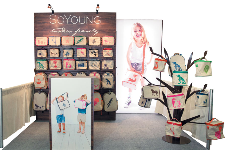
Exhibitor: SoYoung Inc.
Any exhibit featuring a considerable amount of products runs the risk of looking like a jumbled mess, and that threat increases exponentially if the booth's footprint is only 10-by-10 feet. Nevertheless, designers created a stunning booth for SoYoung Inc. that judges called "perfectly on point for a product-centric space."Design: Classic Exhibits Inc., Portland, OR, 503-652-2100, www.classicexhibits.com; TradeshowGuy Exhibits, Salem, OR, 503-589-4494, tradeshowguyexhibits.com Fabrication: Classic Exhibits Inc., Portland, OR, 503-652-2100, www.classicexhibits.com System: Classic Exhibits Inc. Event: Natural Products Expo East, 2015 Budget: $10,000 – $19,000 Size: 10-by-10 feet Photo: Papercamera – Tracey Brown Photography SoYoung wanted a brand-appropriate booth to accommodate tons of products, both displayed openly and stored out of sight, at the Natural Products Expo East show. The resulting exhibit featured an eye-catching back wall comprising a 4-by-8-foot backlit graphic on the right side and an identification and product-display wall on the left. Covered in wood-toned laminate, the wall was pushed out from the back of the space by roughly 4 feet, a move that created additional product storage space in the void and shifted the samples even closer to the aisle. The exhibit exuded a natural, authentic vibe, and gave retailers an example of how to market the products in their own stores. Despite the risks, SoYoung proved that you can create a classy, brand-friendly space and still allow plenty of products to shine, regardless of the booth's square footage. 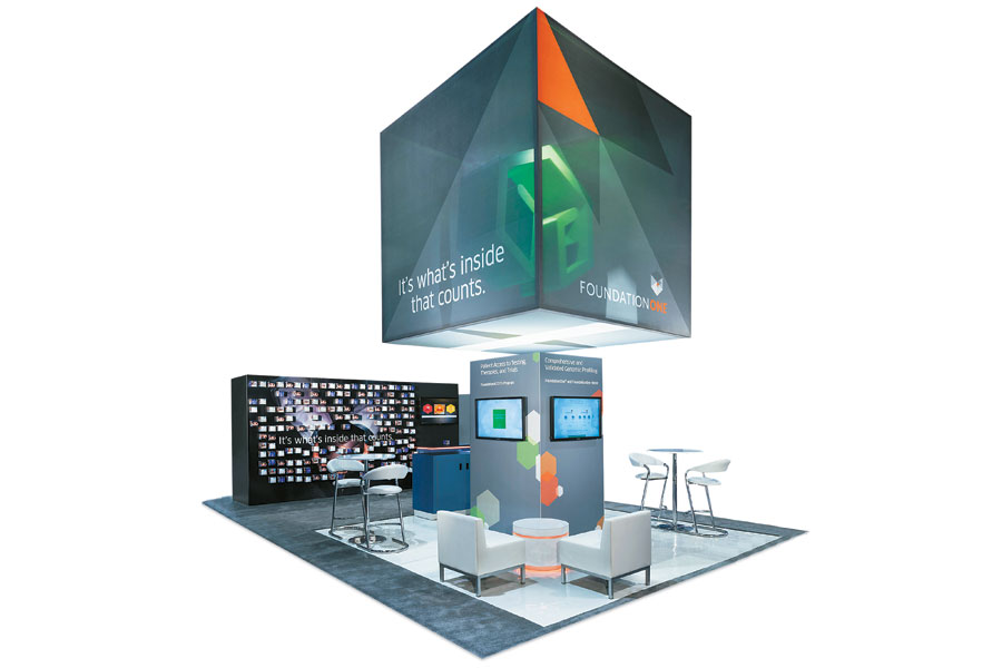
Exhibitor: Foundation Medicine Inc.
When it's time for a new booth, most exhibitors have a general idea of what they want. However, when marketers at Foundation Medicine Inc., which provides transformative cancer treatment based on a patient's molecular profile, came to Access TCA Inc. for a new exhibit, they had very specific parameters. For the American Society of Clinical Oncology show, Foundation Medicine planned to use a brand-specific fabric-cube concept, based on an existing graphic design from GSW Advertising LLC. Thus, Access TCA had to find a way to fit this concept into a relatively small 20-by-30-foot booth space. Design/Fabrication: Access TCA Inc., Whitinsville, MA, 508-234-9791, www.accesstca.com; GSW Advertising LLC, Westerville, OH, 614-848-4848, www.gsw-w.com System: Tectonics Event: American Society of Clinical Oncology, 2015 Budget: $80,000 – $149,000 Size: 20-by-30 feet Photo: Padgett and Company Inc. Initially, Foundation Medicine wanted to use the cube at ground level, a strategy that would have eaten up most of the floor space and provided little high-level identification. Rather, Access TCA elevated the cube, enlarged it to 12 feet square, and incorporated a green, three-dimensional structure that represented the company's logo inside it – a move that freed up the exhibit's floor space, provided an overhead identification and branding beacon, and allowed the fabric graphics to truly shine. The ground-floor space was used to create a seating and presentation area. Here, a central column with touchscreens featured a corporate-capabilities presentation, and various furniture pairings aided cozy conversations. In addition, an 8-by-16-foot freestanding wall, which offered the firm's tag-line, "It's what's inside that counts," displayed a series of 4-inch magnetic cubes, each of which triggered augmented-reality images that then offered one of five educational videos on the company's various products and services. By literally elevating a cube-based concept to a whole new level, Access TCA satisfied not only its clients but also the majority of EXHIBITOR readers, the latter of which honored it with the 2016 People's Choice Award, the competition's only category selected by popular vote on ExhibitorOnline.com. 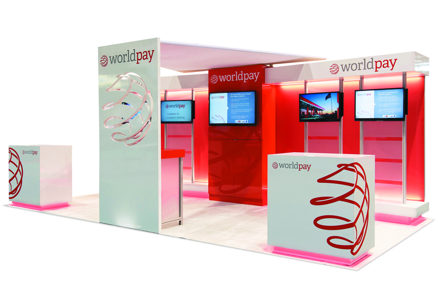
Exhibitor: WorldPay Ltd.
Hailed by judges as "a killer example of how to create consistency – not to mention well-crafted design – across a variety of footprints," this nimble exhibit for WorldPay Ltd. took the top slot in the Best Reconfigurable Exhibit category. Crafted by Deckel & Moneypenny Exhibits using an Octanorm USA system, the structure can be reconfigured to fit footprints ranging from 10-by-10 feet to 20-by-20 feet. Design/Fabrication: Deckel & Moneypenny Exhibits, Louisville, KY, 502-636-5118, www.deckelmoneypenny.com System: Octanorm USA Event: FMI Connect, 2014 Budget: $150,000 – $249,000 Size: 10-by-20 feet Photo: Deckel & Moneypenny Exhibits The secret to the exhibit's success was the designers' implementation of stand-alone, 10-foot-wide modular units throughout each of the configurations. Comprising mainly aluminum extrusions along with tensioned fabric, the units featured LED tape lights as well as aluminum and acrylic brackets to which various shelving, monitors, and accessories could be attached. In 10-by-10-foot configurations, the units were typically accompanied by a reception desk, but for 200- or 400-square-foot configurations, everything from a central ID tower to various overhead fabric panels could be added to create a cohesive and prominent presence. While the well-designed components were one of the reasons this exhibit stood out among other entries, judges were quick to point out that designers' ability to edit also played an important role. "A simple color palette, minimal graphics, and a laser-tight focus on the company name and logo helped maintain a straightforward yet sophisticated aesthetic." 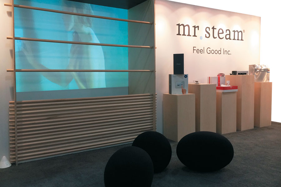
Exhibitor: MrSteam (a division of Sussman-Automatic Corp.)
Taking the top slot in the Best In-Line Exhibit category was the slightly voyeuristic yet seductively effective exhibit for MrSteam (a division of Sussman-Automatic Corp.). Designed by ChrisWendel Inc., the 10-by-20-foot space was born of some cold, hard challenges. In addition to recreating the essence of a home steam-spa experience, the design needed to display two existing point-of-sale units, offer display surfaces as well as storage for all of the steam system's components, and include casual seating – all on a budget of $39,000 or less.Design: ChrisWendel Inc., Westfield, NJ, 908-789-3317, www.chriswendel.com Fabrication: Tivid Productions, New Brunswick, NJ, 732-354-3835, www.tividproductions.com System: Moss Inc. Event: International Contemporary Furniture Fair, 2014 Budget: $20,000 – $39,000 Size: 10-by-20 feet Photo: ChrisWendel Inc. Touted by judges as "an elegant, brand-appropriate space," the booth featured a looping video of a woman enjoying a steam bath. The display was housed in a tensioned-fabric back wall in such a way as to make it look like the woman was standing behind a glass partition taking a shower. The remainder of the exhibit offered point-of-sale units as well as wooden product pedestals and accents to aesthetically compliment a home-spa experience. Behind the back wall, storage areas housed extra literature, the DVD player, and the short-throw projector player used for the looping video. Tato and Tatino modular seating pods from Herman Miller Inc. completed the sensual yet sophisticated scene. 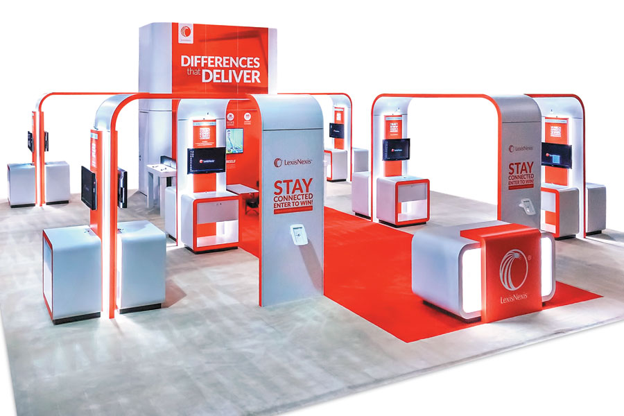
Exhibitor: LexisNexis (a division of RELX Group)
LexisNexis, a provider of legal, government, business, and high-tech information (and a division of RELX Group) wanted to "go big or go home" at the American Association of Law Libraries (AALL) show. So the firm tasked designers with creating a prominent booth that would maximize height allowances, provide visibility from across the show hall, and pay homage to its iconic red corporate color, curvaceous logo, and "Big Red" marketing initiative. What's more, it asked for an open layout that would provide sight lines and easy traffic flow to multiple workstations within its 40-by-40-foot space. Despite its "go big" plans, however, the company gave designers relatively few pennies to play with – amounting to roughly $50 to $93 per square foot.Design/Fabrication: Exhibit Concepts Inc., Vandalia, OH, 800-324-5063, www.exhibitconcepts.com System: BeMatrix Event: American Association of Law Libraries, 2015 Budget: $80,000 – $149,000 Size: 40-by-40 feet Photo: Cole Group Nevertheless, designers at Exhibit Concepts Inc. employed a BeMatrix system to craft a spacious, vertically conscious design that ticked all the boxes. Throughout the booth, various arched forms towered up to 20 feet tall, and 12 workstations were oriented to provide optimal visibility as well as accessibility from the aisles. Plus, to lure AALL attendees to the LexisNexis exhibit, designers incorporated an overhead fabric canopy measuring 16-by-16 feet, which was internally lit and featured the LexisNexis name and logo. Throughout the footprint, a neutral white hue was used on everything from the carpet and reception desks to the structural arches. However, pops of red also appeared throughout – via a carpet inlay, graphics, and accent borders. In addition, exhibit designerschose soft curves as opposed to hard edges for most structural forms, thereby mirroring the company's circular logo. Despite a relatively minimal budget, designers paired a bold color with a purposefully spacious arrangement of elements, ultimately arriving at what judges called "an uncluttered and minimal aesthetic that still provided a bold, powerful impact." 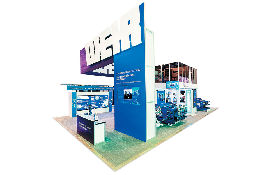
Exhibitor: Weir Oil & Gas (a division of Weir Group Plc)
The oil and gas industry is fueled by massive equipment, such as the pumps, crushers, and wellheads offered by companies like Weir Oil & Gas, a division of Weir Group Plc. However, for its exhibit at the Offshore Technology Conference, Weir wanted a bit more whiz-bang wizardry to promote its down-to-earth on-shore and offshore machinery and services. In fact, it hoped to fill its 30-by-60-foot space with only a few pieces of heavy equipment and to instead use a high-tech component to deliver product and service information.Design/Fabrication: 2020 Exhibits Inc., Houston, 866-790-2356, www.2020exhibits.com System: Octanorm USA Event: Offshore Technology Conference, 2015 Budget: $150,000 – $249,000 Size: 30-by-60 feet Photo: Barchfeld Productions To that end, designers at 2020 Exhibits Inc. devised a 90-inch video wall that was positioned aisle side within the space. Enclosed in a 30-by-60-foot Octanorm structure, the interactive screen allowed attendees to explore Weir's offerings with the touch of a finger, drilling down into product information ranging from pressure pumping to rig diagrams, and content comprising everything from videos and renderings to illustrated text. A graphic banner on the top of the screen featured the words "Experience our service know-how world-wide," and two multiphone charging stations book-ended the screen. "It sounds super simple, but adding those charging stations was pure genius," judges said. "There's no doubt that attendees in need of a little juice would have spent far more time engaged with the screen than if those stations were positioned elsewhere or removed from the booth altogether." Judges also appreciated the screen's content and its contribution to an otherwise equipment-centric space. According to one judge, "In a world of machinery, the high-tech approach no doubt drew some attention from booth visitors. Plus, the wall functioned as an eye-catching graphic surface, which was likely a welcome respite in an exhibit hall full of iron and steel." 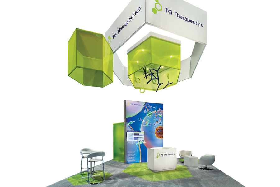
Exhibitor: TG Therapeutics Inc.
Going into the American Society of Clinical Oncology show, TG Therapeutics Inc. had some complex challenges. The startup company, which develops treatments for B-cell malignancies and autoimmune diseases, had a new product in stage-three clinical trials at the time of the show. Since the product wasn't officially approved, pharmaceutical regulations forbid any mention of the product name anywhere in the company's 20-by-20-foot exhibit. Thus, the booth's sole purpose was to create awareness for the firm and its research-and-development efforts. Design/Fabrication: Access TCA Inc., Whitinsville, MA, 508-234-9791, www.accesstca.com System: Access TCA Inc. Event: American Society of Clinical Oncology, 2015 Budget: $150,000 – $249,000 Size: 20-by-20 feet Photo: Padgett and Company Inc. While this task may have been complex, the solution was simple. Designed by Access TCA Inc., the booth featured a minimalistic ground-floor treatment, comprising rented furniture, an enclosed meeting area, gray carpet with bright green inlays, and a backlit wall with an embedded monitor showing clinical-trial information. But the exhibit's true eye candy was located overhead. Here, an elaborate configuration of hanging fabric signs created a 3-D representation of TG Therapeutics' logo – and helped satisfy the firm's awareness-related goals. Centered in the overhead space, white Sintra panels featuring the company's name and logo formed a hexagon shape. Inside that form, a translucent-green fabric element with a hard-wall frame supported various suspended light fixtures as well as PVC pipes, which had been cut and painted to resemble molecules. Designers also positioned two more green-fabric hexagons on either side of the central structure to complete the TG Therapeutics logo. According to judges, "this minimalist exhibit clearly met the client's objectives. What's more, the design solved a relatively complex challenge with a stunning yet simple solution that drew attendees' eyes to the skies and their feet to the company's booth space." 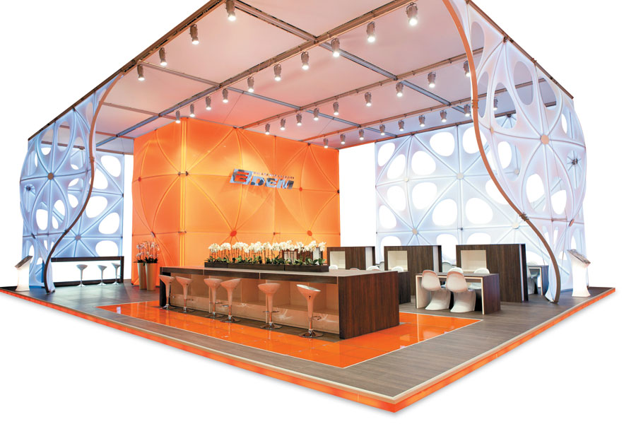
Exhibitor: Edem CJSC
When you hear the words "wallpaper factory," you probably don't think "cutting-edge innovation and modern sophistication." But that's the look Edem CJSC, a Ukranian wallpaper provider wanted for its trade show exhibit. Design/Fabrication: Studio Dega LLC, St. Petersburg, Russia, 7-812-331-74-27, www.studiodega.ru System: Studio Dega LLC; Burkhardt Leitner Constructiv GmbH & Co. KG Event: MosBuild, 2015 Budget: $150,000 – $249,000 Size: 39-by-59 feet Photo: Studio Dega LLC Studio Dega LLC delivered with this 2,301-square-foot booth that topped the competition's Best International Designer category. Throughout the space, muted gray, neutral white, and various wood tones all played second fiddle to the brilliant Edem-orange hue of the conference space, which prominently featured the company's logo. A similar shade of orange carried over to the flooring system, which like so many European designs comprised a raised deck. However, to add a touch of individuality, designers incorporated orange lighting around the exterior edge of the structure as well as inlaid panels under the central hospitality bar in a similar citrus-fruit hue. But the focal point of the 39-by-59-foot structure was the modular exhibit system used to create the walls. A product of Studio Dega, the InfinityConst system consists of four triangular modules that can be used to create myriad curvilinear elements. Here, designers chose white panels with oval cutouts as well as orange-fabric fills to create the exhibit's conference space and exterior walls. Throughout this open layout, various tables and chairs provided ample room for attendees and staff to talk shop. Overhead, a solid-white ceiling canopy comprising Constructive Pila panels from Burkhardt Leitner Constructiv GmbH & Co. KG held more than 35 fixtures, which bathed the space in light and further accentuated the exhibit elements below. Judges hailed the booth as an "innovative and unexpected design" and gave it high marks for its minimalist tendencies and "bold use of color as a branding medium."
|
|
|
||||||||||||||||||||||||||||
|
|
||||||||||||||||||||||||||||
|
TOPICS Measurement & Budgeting Planning & Execution Marketing & Promotion Events & Venues Personal & Career Exhibits & Experiences International Exhibiting Resources for Rookies Research & Resources |
MAGAZINE Subscribe Today! Renew Subscription Update Address Digital Downloads Newsletters Advertise |
FIND IT Exhibit Producers Products & Services All Companies Get Listed |
EXHIBITORLIVE Sessions Exhibit Hall Exhibit at the Show Registration |
ETRAK Sessions Certification F.A.Q. Registration |
EDUCATION WEEK Overview Sessions Hotel Registration |
CERTIFICATION The Program Steps to Certification Faculty and Staff Enroll in CTSM Submit Quiz Answers My CTSM |
AWARDS Exhibit Design Awards Portable/Modular Awards Corporate Event Awards Centers of Excellence |
NEWS Associations/Press Awards Company News International New Products People Shows & Events Venues & Destinations EXHIBITOR News |
||||||||||||||||||||
|
||||||||||||||||||||||||||||


