|
REGISTRATION REQUIRED
exhibit design
Five Mistakes Exhibitors Make
"I never make the same mistake twice," goes an old joke. "I make it five or six times, just to be sure." But it's no laughing matter when exhibitors make the same mistakes over and over. When an exhibit fails to achieve its goals, the blame is often laid on exhibit managers, staffers, show organizers, or other factors. But without solid research and data to back it up, finger pointing just makes everything worse. "The misattribution of blame is the one reason we make mistakes over and over again," wrote Joseph Hallinan, author of "Why We Make Mistakes." Marty Smith, founder of Saint Joseph, MI-based BuyingBehaviorMetrics LLC, agrees. "Exhibitors shoot themselves in the foot constantly with the same errors, because they fail to place blame where it belongs, which makes course correction impossible." Fortunately, the causes of the most egregious exhibiting errors are known. After evaluating nearly 1,000 exhibits over a 10-year period using video footage taken from cameras perched above the trade show floor, Smith has narrowed the most common mistakes to five design factors and staff behaviors. "The problems mostly stem from exhibitors thinking more in terms of elegant form, but not effective function," Smith says. Drawing on references from castles of the Middle Ages to technology of the distant future, Smith identifies and enumerates the top mistakes that handicap exhibits. His work proves, to paraphrase James Joyce, that errors are the portals of discovery – because any mistake, once recognized, can be rectified. 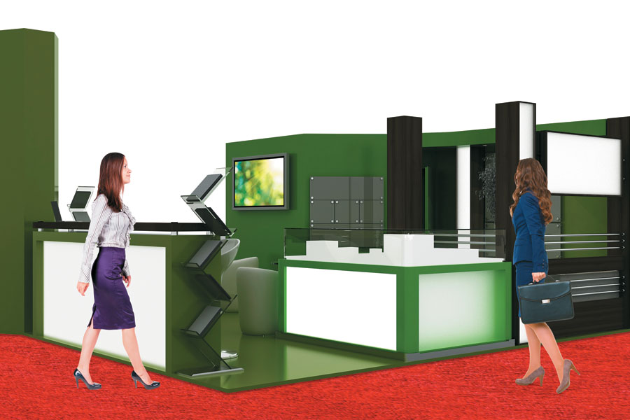 The Force Field In science fiction, a force field is an energy barrier, an often invisible fence that keeps bug-eyed monsters and other undesirables out. In trade show exhibits, a force field is an equally subtle obstruction, usually composed of color or light that renders visitors reluctant to enter your exhibit or a section therein. The most prevalent incarnation of this error is exhibit flooring whose color contrasts starkly with the shade of the show's aisle carpet. For example, the aisle carpet might be a midnight black while the exhibit's rug is an igloo white. The dissimilarity between the two hues creates a psychological barrier in which the area the attendees are in seems "safe" while the contrasting one feels as friendly as a barbed-wire fence. Potential visitors might hesitantly cross the perceived barrier to touch a display or pick up a brochure, but they will then swiftly retreat back across the line to the perceived safe zone. A secondary type of force field, usually occurring inside the booth, can also be inadvertently realized by lighting changes. Bright illumination in exhibit spaces can create severely contrasting areas of light and dark. Attendees and even staff tend to avoid areas that are significantly brighter or darker than surrounding areas for the same reason that they shy away from equally divergent carpet colors. 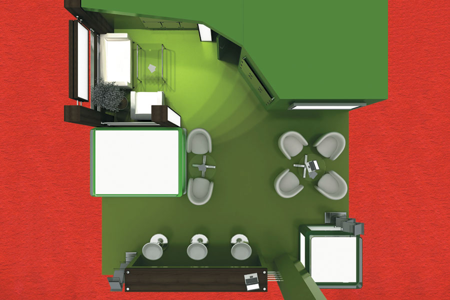
TAKEAWAY:
Ask show management what color the aisle carpet will be, and ensure that your exhibit's flooring isn't strikingly dissimilar. It's not crucial that your carpet match what's in the aisle, but it ideally should be a complementary tone that's not too divergent in terms of brightness or intensity. And avoid extreme variations between lighting levels throughout your exhibit. 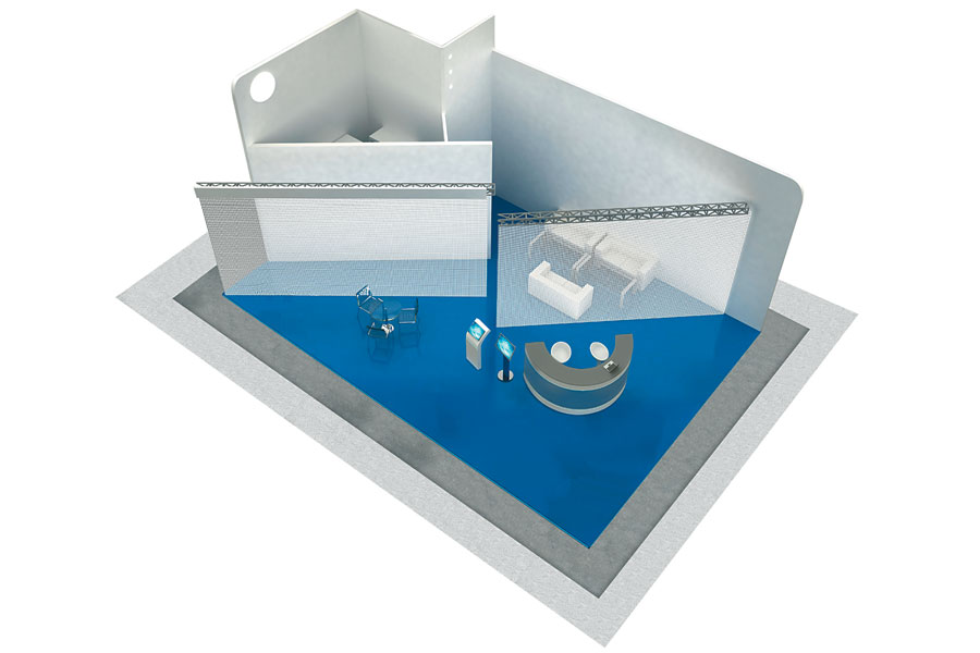 The Castle Moat Like medieval castles fortified with deep and wide water-filled trenches to impede assault from predators, exhibits can produce their own moats that are just as effective at keeping guests out. No, exhibitors aren't digging trenches or flooding portions of the exhibit hall. But in an exhibit-design context, a moat is a physical gap between the aisle carpet and an exhibit's flooring. While there may be a good reason behind the recurrence of this impediment – e.g., sometimes the space is used to display the booth numbers on the floor – it forms an effective barrier that repels prospective visitors from entering the exhibit. A moat can also be created if an exhibitor positions product displays or structural elements several feet inside the footprint of a booth space, creating a dead zone between the aisle and the exhibitry. Not only does this diminish the ability of attendees to "window shop" your exhibit, giving staffers a chance to engage and lure them further into the booth, but it also requires attendees to venture further outside their comfort zones in order to cross the moat and engage with your brand.
TAKEAWAY:
Your exhibit's flooring should extend all the way to the aisle carpet along the edges of your booth space so that no gaps or interruptions in its visual flow occur. Additionally, any displays or structural elements along your perimeter should be close enough to the aisle to avoid creating a dead zone that attendees will likely not traverse. 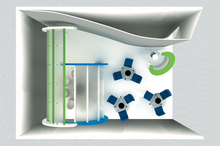 The Castle Wall The castle-wall effect is created when exhibitors line the outer edges of their booth with structural elements and product displays in such a manner that they create a walled-in edifice that looks like it was designed to stave off invaders rather than welcome booth visitors. Many booth designs continue this barricaded-castle analogy by also featuring large, turret-type structures typically placed at the corners of the exhibit space. Others will construct narrow gaps, called portcullises, between the walls and/or product displays, often positioned at a 90-degree angle to the aisle. Collectively, these barricades prohibit attendees from flowing easily into the space, thereby creating a bottleneck effect that slows the flow and clogs the main artery of prospects seeking to visit your booth. It also impedes their engagement with your products and displays – a crucial miscue, since attendees are 32 percent more likely to purchase a product after they've actually held it in their hands for at least 30 seconds.
TAKEAWAY:
Avoid lining your exhibit's perimeter with walls, towers, or displays that project a forbidding-fortress vibe, or that congest ingress or egress. Obviously, some exhibitors intentionally create enclosed exhibits to facilitate certain activities or shield top-secret products from the view of unqualified attendees. But even if you're purposely deviating from an open floor plan, it's wise to ensure multiple access points based on the intended flow of traffic. 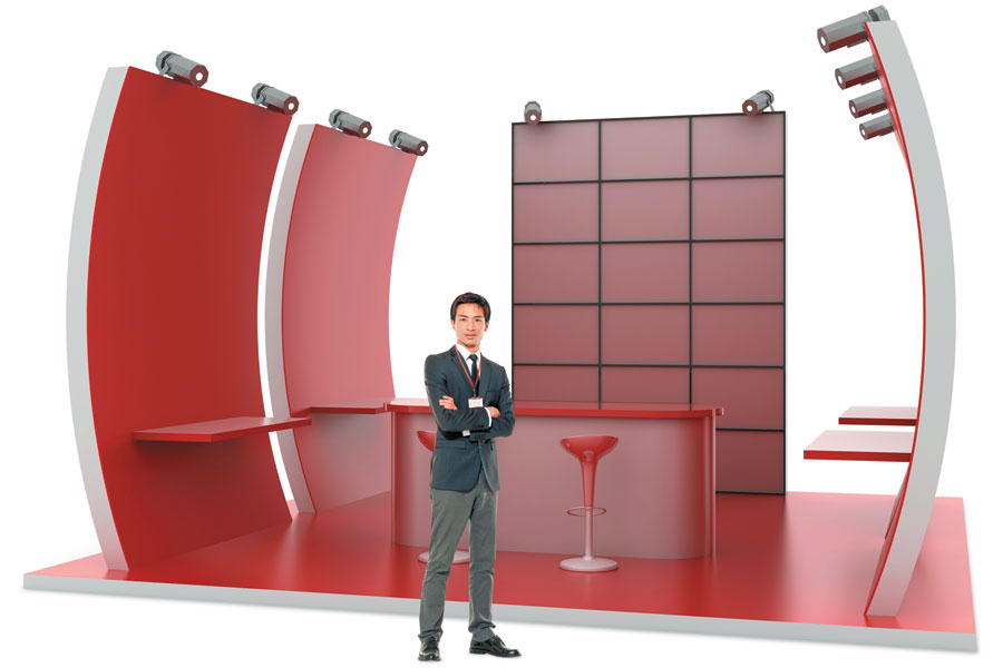 Sentry Duty Perhaps unconsciously influenced by castle walls and similar designs, staffers tend to patrol the perimeter of booths like sentries keeping a watchful eye for any would-be visitors who might try to storm the exhibit to see the company's new offerings. A common variation on this behavior is booth staffers displaying further sentry-like activities by standing still and facing outward, like guards in front of armored cars. These behaviors in turn repel attendees who subcon-sciously view the staff as lookouts rather than hosts. Without realizing it, staffers present an image of guarding the space from the very prospects who might seek to cross the moat, scale the walls, and enter the booth. Furthermore, attendees looking to explore the booth and kick the tires without committing to a three-minute conversation with staffers – or aiming to dodge the question "Can I scan your badge?" – until they've determined whether or not they're even interested in your offerings are far more likely to keep on keeping on than to attempt to sneak past your security-guard-like staffers. 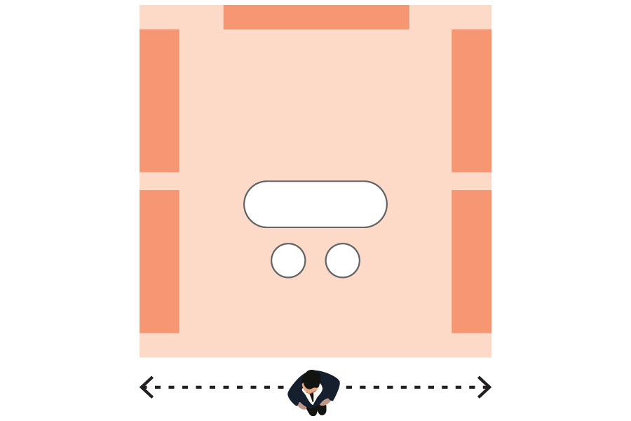
TAKEAWAY:
Train staff members to be aware of their behavior and to practice welcoming body language, such as angling their shoulders away from approaching attendees, keeping their chins pointed toward the floor, and lifting their eyebrows to project a hospitable presence. Keep in mind, the goal is to appear welcoming, not foreboding. 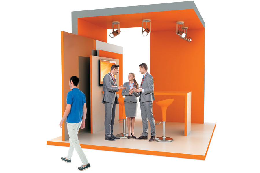 The Safety Zones Like a force under siege from Crusaders, staffers tend to congregate in areas inside the booth where they feel safe and comfortable, and where they can converse with one another. Dubbed "safety zones," these regions, usually comprising exhibit walls and product displays that provide a sort of shelter from the crush of attendees, are where staff cluster. Unlike staffers performing the highly visible sentry-duty behaviors, company reps in safety zones tend to clump together in fixed areas such as back corners of the booth, often facing each other, and therefore away from visitors. As such, they often unintentionally present the appearance that they're in the middle of an impromptu team huddle or informal meeting and should not (or cannot) be interrupted. Since 87 percent of attendees won't approach a staff member who's engaged in conversation – especially if it's with a co-worker – staffers' uninterested demeanor effectively turns the exhibit into a "fortress of solitude," sequestering the staffers from engaging with hundreds, or even thousands, of potential booth visitors, and preventing your company from collecting those leads.
TAKEAWAY:
Identify any potential safety zones before a show, and alert the staff to avoid congregating in clumps inside them. To further safeguard against this behavior, nominate a staffer to monitor any such massing and break up a congregation as soon as it begins to form.
|
|
|
||||||||||||||||||||||||||||
|
|
||||||||||||||||||||||||||||
|
TOPICS Measurement & Budgeting Planning & Execution Marketing & Promotion Events & Venues Personal & Career Exhibits & Experiences International Exhibiting Resources for Rookies Research & Resources |
MAGAZINE Subscribe Today! Renew Subscription Update Address Digital Downloads Newsletters Advertise |
FIND IT Exhibit Producers Products & Services All Companies Get Listed |
EXHIBITORLIVE Sessions Exhibit Hall Exhibit at the Show Registration |
ETRAK Sessions Certification F.A.Q. Registration |
EDUCATION WEEK Overview Sessions Hotel Registration |
CERTIFICATION The Program Steps to Certification Faculty and Staff Enroll in CTSM Submit Quiz Answers My CTSM |
AWARDS Exhibit Design Awards Portable/Modular Awards Corporate Event Awards Centers of Excellence |
NEWS Associations/Press Awards Company News International New Products People Shows & Events Venues & Destinations EXHIBITOR News |
||||||||||||||||||||
|
||||||||||||||||||||||||||||


