|
REGISTRATION REQUIRED
design awards
gold award
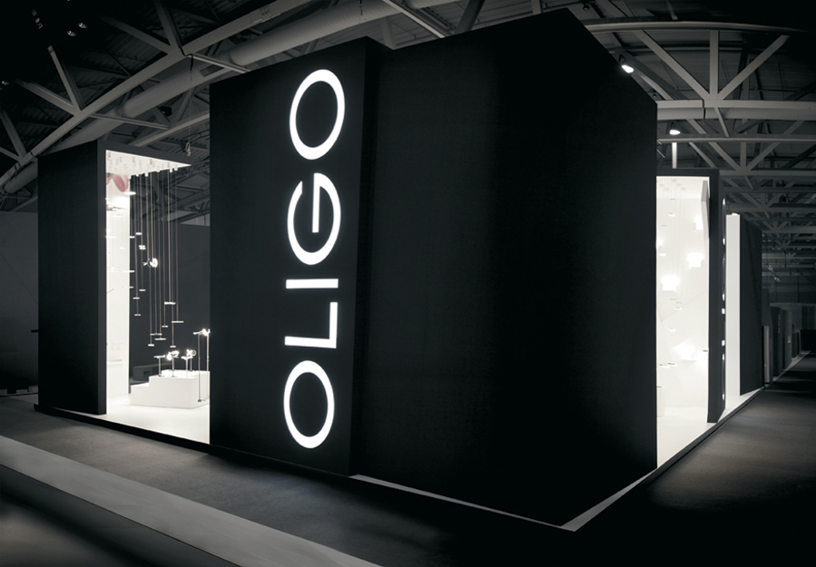
Category: Peninsula Exhibit Exhibitor: Oligo Lichttechnik GmbH Design: Bachmann Kern & Partner, Solingen, Germany, 49-212-23566-900, www.bkp-architektur.de Fabrication: Visage Gruppe, Cologne, Germany, 49-221-1261872 Show: Light + Building, 2014 Budget: $150,000 – $249,000 Size: 43-by-62 feet
PHOTOS: Alexander Ring
Black Light
By Linda Armstrong
What's black and white and light all over? It's this stunning exhibit for Oligo Lichttechnik GmbH, a manufacturer of light fixtures and lighting systems. Comprising a black exterior paired with a white inner space bathed in light, the design was the perfect marriage of light and dark — and the ultimate canvas upon which to display Oligo's products.
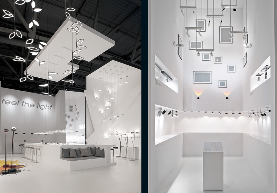
This neutral-hued canvas, however, was born of a rather emotional directive, i.e., to embody Oligo's corporate philosophy, "feel the light." Readily accepting the challenge, the design team at Bachmann Kern & Partner crafted a 43-by-62-foot stand that judges called "an exquisite architectural gallery that seemed to bring light to life." Twelve-foot-tall wooden walls, most of which were joined into "L" shapes and topped with wooden ceiling panels, did double duty as identity towers and cozy product alcoves. Designers treated their exterior sides to a matte-black finish, cut the word "Oligo" into one wall on each side of the booth, and added backlighting to create couldn't-miss branding beacons. Video Player is loading. Kplus reaped big rewards from its risky, interactive stand strategy. Using only 200 square feet (and spending less than $32 per square foot), the company intrigued attendees, appealed to their senses, communicated a corporate motto, and collected promising leads. Curiosity may have killed the cat, but at EuroShop 2014, it also attracted the attendees. Pairing a neutral palette with pops of color, and soaring architecture with whimsical interior details, the resulting exhibit allowed attendees to feel — and see — the light. E 
Bright Ideas
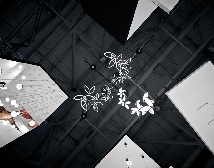
Soaring exterior walls formed branding beacons that drew guests into the space where minimal architecture and graphics allowed the lighting products from Oligo Lichttechnik GmbH to shine. With product lines separated into various alcoves within the space, all offerings were visible from almost any perspective, yet each line had its own distinct environment to help distinguish it from the rest. A sparing use of color and imagery kept the exhibit cohesive despite a plethora of product displays. 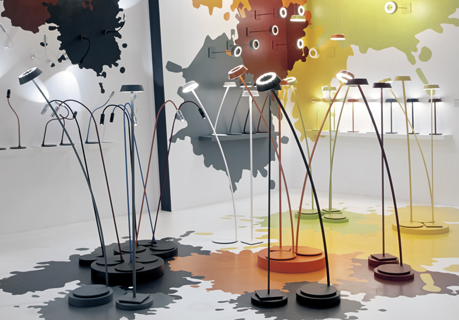

|
|
|
||||||||||||||||||||||||||||
|
|
||||||||||||||||||||||||||||
|
TOPICS Measurement & Budgeting Planning & Execution Marketing & Promotion Events & Venues Personal & Career Exhibits & Experiences International Exhibiting Resources for Rookies Research & Resources |
MAGAZINE Subscribe Today! Renew Subscription Update Address Digital Downloads Newsletters Advertise |
FIND IT Exhibit Producers Products & Services All Companies Get Listed |
EXHIBITORLIVE Sessions Exhibit Hall Exhibit at the Show Registration |
ETRAK Sessions Certification F.A.Q. Registration |
EDUCATION WEEK Overview Sessions Hotel Registration |
CERTIFICATION The Program Steps to Certification Faculty and Staff Enroll in CTSM Submit Quiz Answers My CTSM |
AWARDS Exhibit Design Awards Portable/Modular Awards Corporate Event Awards Centers of Excellence |
NEWS Associations/Press Awards Company News International New Products People Shows & Events Venues & Destinations EXHIBITOR News |
||||||||||||||||||||
|
||||||||||||||||||||||||||||


