Exhibit design |
|
Small Giants
Exhibitors can learn a few things from Kacy Catanzaro. At only 5 feet tall and 95 pounds, the former gymnast was the first woman ever to reach the finals of "American Ninja Warrior," and the only woman thus far to make it up the competition's warp wall obstacle. She credits her clever strategy, light and lean frame, and positive attitude for beating male and female competitors twice her size.
But smaller can be better when it comes to trade show exhibits as well. Small exhibits offer a host of benefits, not the least of which are that they allow exhibitors to flex their creative muscles, take a few risks, and test drive new concepts, all without dropping wads of cash on the project. But many exhibit marketers blessed with small spaces see their footprints as more of a curse than a blessing. Rather than taking the field with the big boys and going head to head to gain their share of the spotlight and a good chunk of leads in the process, they practically admit defeat before the starter gun sounds. In fact, many put forth a halfhearted effort and sideline themselves with the usual excuse: "We just can't compete with our small exhibit."
So what's the difference between these downtrodden folks and the scrappy little exhibitors that generate far more effectiveness than the burly behemoths twice their size? They're missing Catanzaro's can-do attitude and a little creative go juice. Here, then, is a bit of inspiration to help get your head in the game and ensure that your 10-by-10- and 10-by-20-foot booths are ready for the big show. Offering everything from inventive materials and precision product placement to bold splashes of color and dramatic shapes, these lean, mean, creative machines combined Catanzaro's optimism and agility with imaginative design to outshine and likely outperform their massive competitors.
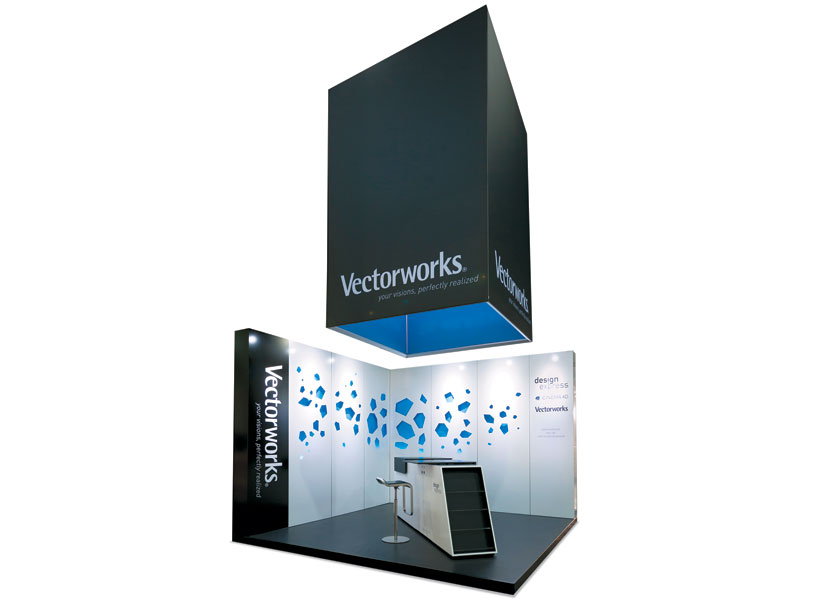
PHOTO: ALUVISION NV
Brand Stand
When your software products help designers capture, develop, and communicate their ideas efficiently, your exhibit better relay your brand attributes in a similar manner. This exhibit for Nemetschek Vectorworks Inc., developer of Vectorworks software, ticked all the appropriate
boxes for the firm's presence at Interieur 2014. The 13-by-13-foot stand designed by Aluvision NV comprised Aluvision's Omi Frame wall panels clad with Aluvibond composite infills. Cutouts and light fixtures added an extra dimension to the back wall, while a suspended fabric cube was the ideal identifier. The combination of bold colors, effective lighting, and sleek elements gave life to the firm's tagline: "Your visions, perfectly realized."

Picnic Spot
Given the myriad steps involved and the potential pitfalls along the way, exhibiting usually isn't much of a picnic. But the folks at One Hundred 80 created just that, i.e., a picnic, in their exhibit at the National Stationery Show. Hoping to spotlight the company's line of ceramic plates that resemble their paper counterparts, the wholesale giftware manufacturer and distributor devised a picnic-themed booth complete with a wooden picnic table, a faux-grass wall, and a swatch
of green carpet tiles that directed attendees' eyes — and their feet — straight into the space. Uncluttered, well-lit shelving in stark white provided a neutral background upon which to display the firm's colorful wares. One Hundred 80's exhibit was a product-centric picnic amid the frenetic show floor — without the ants and biting flies found at typical picnicking sites.
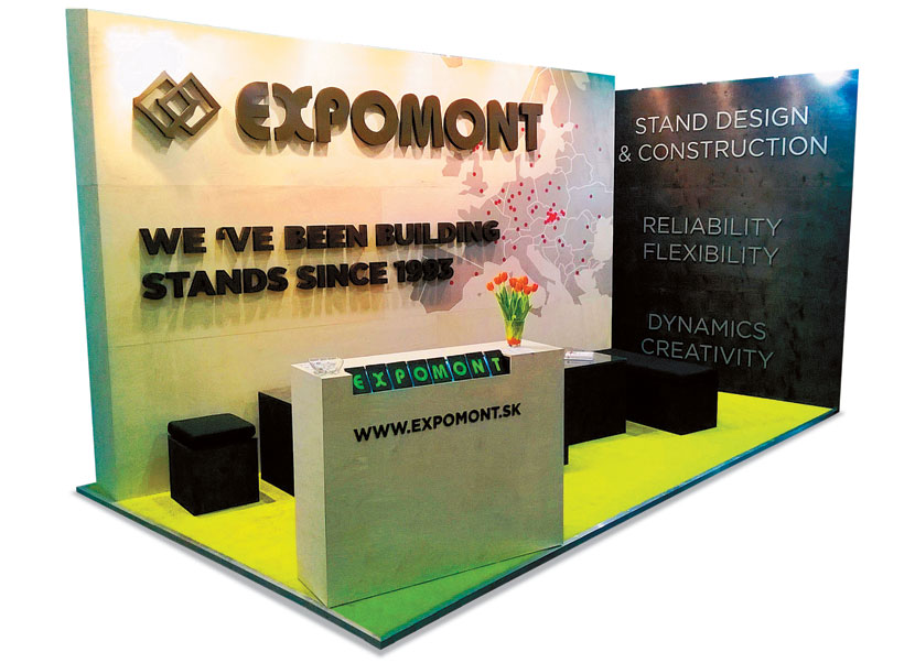
Here's Looking at Hues
Straight lines, simplistic structures,
and a palette of neutral hues offset by pops of color combined to create this stunning stand at EuroShop. Designed and built by Expomont Nitra spol. S R.o., an exhibit house in Nitra, Slovakia, the stand featured clean, clear messaging paired with a charming aesthetic. Brightly lit via attached arm lights, the back wall offered 3-D letters touting the firm's 20-year history, along with a map denoting the location of key shows for which it has constructed exhibits. Black seating along with a side wall listing the firm's capabilities formed a dynamic backdrop.
The Last Straw
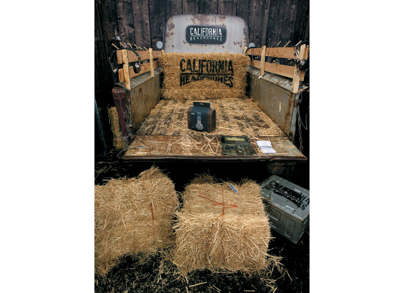
California Headphone Co. has a lot in common with Donny and Marie Osmond. That's because its headphones are targeted to the specific aesthetic preferences of both rock and country music enthusiasts — making it "A Little Bit Country, A Little Bit Rock 'N Roll." So to make this brand statement come to life at the International Consumer Electronics Show (CES), the firm created an optical illusion with a down-home flair. Comprising four hay bales, a couple of ammunition boxes, and the bed of a vintage pickup truck, the design incorporated back-wall graphics featuring what appeared to be the front half of the vehicle. Together, the components created the illusion of an antique truck sitting within the diminutive
space — and provided a perfect environment for the distinctive brand.
Handsome High-Rise
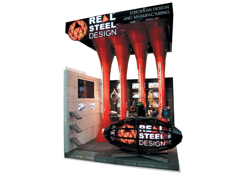
If your company offers 3-D models and laser-assisted manufacturing, building a booth from banner stands would be like Frank Gehry constructing a house out of Lincoln Logs. That's why Real Steel Design Ltd., which offers these precise services, developed this wonder for EXHIBITOR Show (now known as EXHIBITORLIVE). Towering to a height of roughly 12 feet, four columns comprised part of the back wall, and acted as structural supports for the ceiling canopy. Meanwhile, monitors embedded in the back and side walls offered photos of
the firm's work and videos depicting its
engineering capabilities.
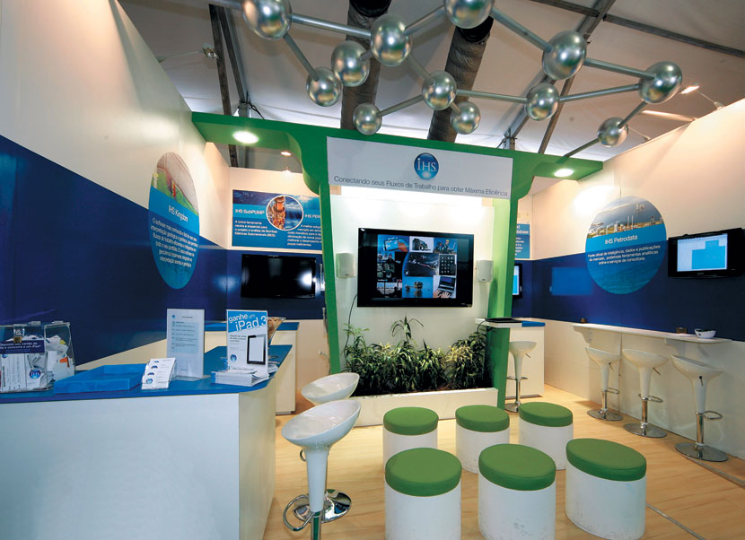
PHOTO: FOTO ANDRES
Information Station
Do you think you can't incorporate a theater, three workstations, and a serving area in a 13-by-16-foot space? Well think again. This multifunctional beauty does it all for IHS Inc., a provider of technical information, decision-support tools, and related services to customers in fields such as energy, defense, and aerospace. Designed by Excalibur Exhibits for the Rio Oil & Gas Expo and Conference, the info-rich exhibit offered a central theater complete with six covered stools. Additional workstations positioned against the walls provided conversation space, while an overhead molecule-like element attracted the eye. Together, the components provided the perfect environment to disseminate information to
international energy engineers.

Steel Deal
For Anthon Concept, a German reseller of Swipespot Tablet Stands, product is king. So for its exhibit at EuroShop, the firm wanted an alluring booth that not only matched the quality and aesthetic of said king, but that also let the emperor reign supreme. The resulting stand designed by Studio Uberdutch of the Netherlands featured a single material atop the walls, flooring, and wall-attached display stands: corroded steel with a matte varnish finish that provided contrast against the colorful products. With only a few graphics and a logo to communicate messages, the clean design established a clear focus on the beauty of the tablet stands.
Pavilion Perfection
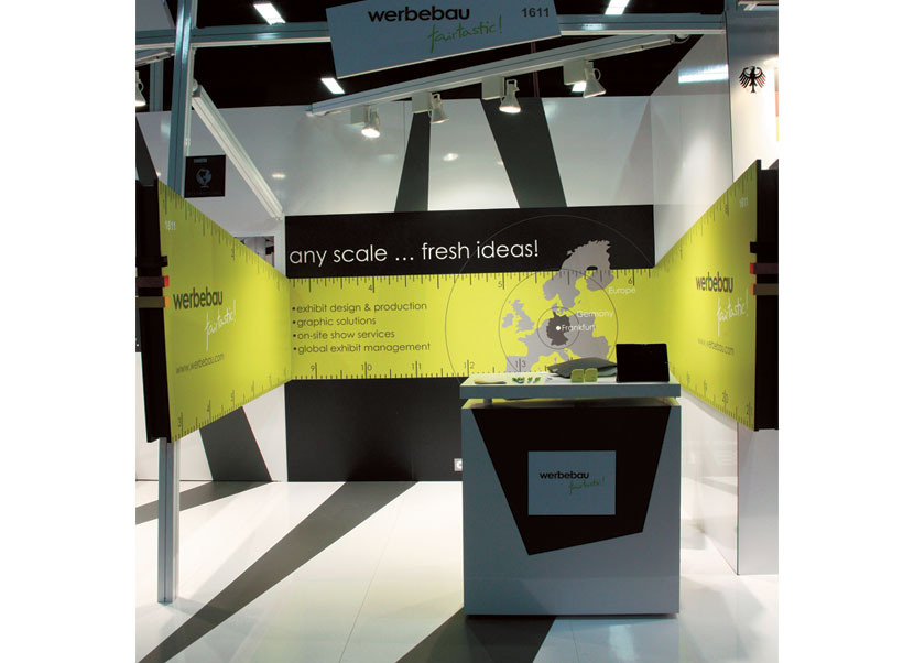
More often than not, small exhibits within large pavilions — such as those hosted by specific countries or industry organizations — are downright ugly. But this exhibit in the German pavilion at EXHIBITOR Show was wunderbar. Incorporating the black and white angular stripes running throughout part of the larger pavilion, this 10-by-10-foot space for exhibit house Werbebaugesellschaft GmbH featured a succinct message, "any scale ... fresh ideas!" and an appropriate visual accompaniment, a lime-green ruler that created an attractive band throughout the space. While the back wall offered a few bullet points and a map illustrating the company's location near Frankfurt, Germany, the exhibit clearly communicated the firm's offerings and locale. Void of all exhibit accoutrements except for a reception desk, this sleek space redefined pavilion exhibits.
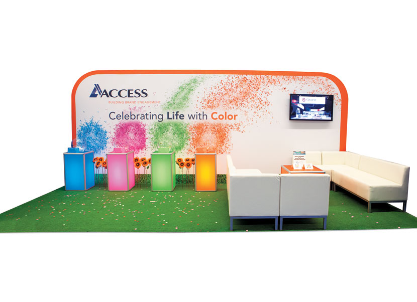
Color Wash
At the Healthcare Convention and Exhibitors Association Annual Meeting,
Access TCA Inc. created a stunning booth bursting with color that also offered a charitable twist. Faux turf and contemporary white furniture played second fiddle to the back wall and internally lit kiosks. Bowls atop the kiosks held confetti- like paper shaped as flowers, each piece of which had flower seeds imbedded in it. During the show attendees placed their confetti seeds of choice into a bag as a takeaway, and after the event, Access made a donation in attendees' honor to The Confetti Foundation, a nonprofit group that supplies birthday-party kits to children who spend their special days in the hospital.
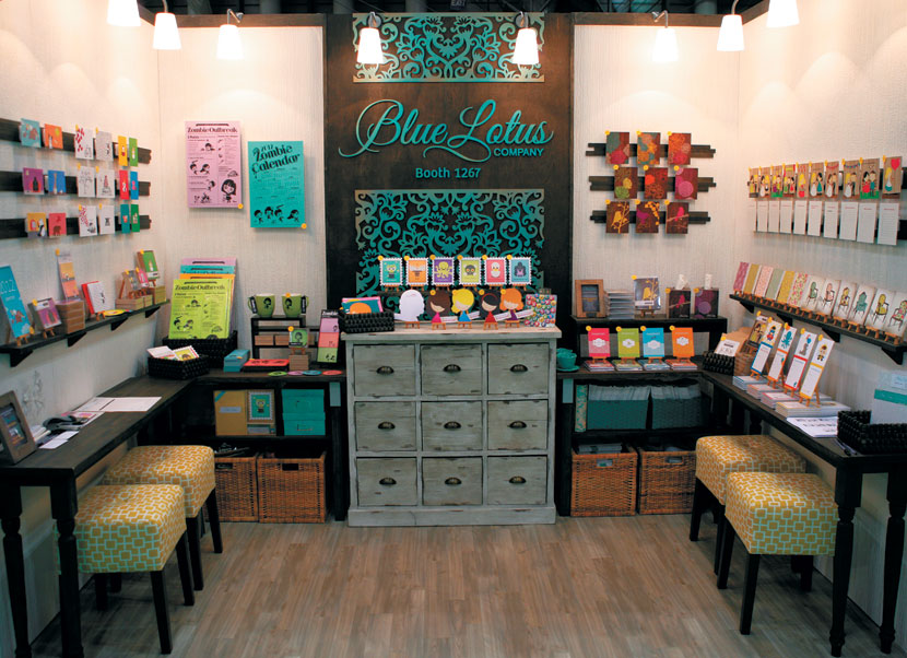
Pristine Scene
The folks at Blue Lotus Co. (now known as Ruchi Design) must live by the saying "A place for everything, and
everything in its place." While this teeny 10-by-10 at the National Stationery Show was chock-full of the company's paper handiwork, the precise organization and placement of each item actually created a clean, contemporary effect. Textured back and side walls — both of which were carefully illuminated by attached fixtures — housed horizontal product-display bars and highlighted a wonderfully intricate Blue Lotus logo. Slim wooden tables and padded stools offered attendees a place to sit and peruse the paper products, while the majority of samples were neatly tucked away into the wooden cabinet and wicker baskets positioned against the back wall. Given its uncluttered aesthetic, you'd never guess this booth was jampacked with colorful product samples.
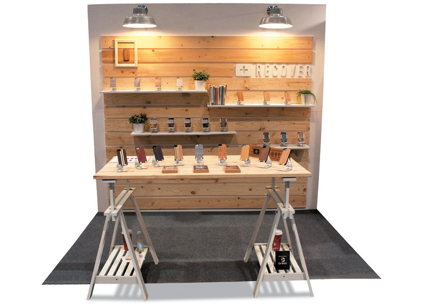
Wooden it be Nice
It's hard for a small exhibitor to make a big impact at CES, where massive brands trot out equally mammoth exhibits. But Recover sailed over this sizeable hurdle with a bare-bones yet brand-appropriate exhibit. Wood was an obvious but apropos material of choice for Recover, a provider of precision-crafted wood cellphone cases. Hence, the back wall of this 10-by-10-foot exhibit featured unfinished planks with white shelves to display the company's wares. White sawhorses topped with a sheet of wood became a reception desk and display table. Lights attached to the back wall and a few plants completed the subtle yet sophisticated scene.
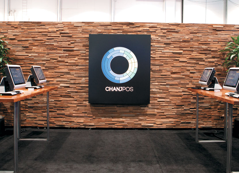
Wall of Fame
When you're launching a product and exhibiting at your first trade show, you need a booth that makes a statement — yet doesn't break the bank. The one-off design for ChanjPOS LLC did just that at the Nightclub and Bar Convention and Trade Show. The firm, which offers a cloud-based point-of-sale system, enlisted the help of Boards of Design to craft the back wall. Comprising recycled and reclaimed lumber, the wall was a handcrafted, panel-based interlocking system requiring minimal assembly. ChanjPOS merely added its logo, a couple of tables and some faux foliage, and voila, it had a primo presence and a little change left in the bank.

Conversation Starter
Apparel and accessories firm Love Nail Tree is fueled by a desire to provoke conversation about topics neglected and often ignored by our culture. That's why in its booth at Magic Marketplace, the company displayed a wide array of its T-shirts alongside controversial newspaper clippings about topics ranging from child abduction to Hitler. Stained plywood formed the back and side walls, while industrial bars held the company's T-shirts. A roughly 3-by-6-foot newspaper-covered wall adorned the front of the space, providing an aisle-side attraction. Hip, urban, and edgy, the exhibit was utterly brand appropriate to boot.
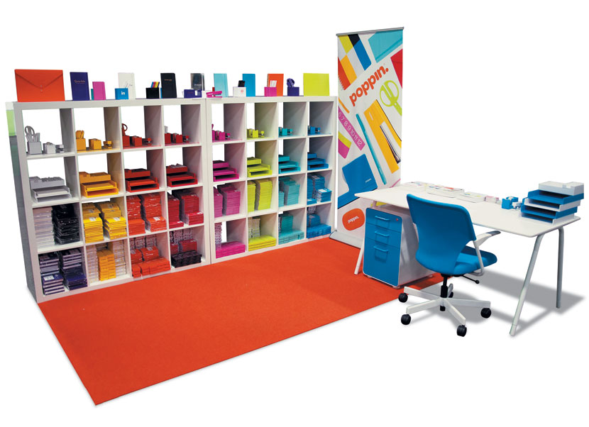
Organization Station
Oftentimes, the old adage is true: It's not what you've got, but rather how you use it that counts. Poppin, a New York-based office-supply provider, took that message to heart for its exhibit at EXHIBITOR Show. Working with a 10-by-10 footprint, the company still managed to craft a clean, contemporary presence. The firm positioned two of its bookcases at the back of the space and filled the cubbies with assorted products — including everything from pens and scissors to notepads and sticky notes — organized by colors into eight different vertical groupings. A bright-orange floor mat delineated the area, and a rolling banner proclaimed the space as Poppin territory. Meanwhile, a Poppin desk and rolling chair functioned as a reception desk.
|
|
|