Dolphin GEOPHYSICAL AS PHOTOS: NeosCreative Ltd.
1. Norwegian Graffiti
 Dolphin Geophysical AS uses graffiti artists to
underscore its corporate tagline and illustrate ideas
crowdsourced from its oil-company clients.
Offering a fleet of vessels that conduct marine seismic surveys, Dolphin Geophysical AS must stay on the razor's edge of ever-advancing geophysical science and technology for its client base of multinational oil companies. But the Bergen, Norway-based company – founded just four years ago – distances itself from the pack of its long-established competitors by zeroing in less on its technological prowess and more on its talented personnel, a stance captured by its tagline, "Intelligent, Fast, and Friendly."
When the company began planning for its appearance at the European Association of Geoscientists and Engineers (EAGE) Conference and Exhibition in London, then, it wanted to communicate each of the tagline's three individual components to the target audience of 60 oil companies. The company worked with NeosCreative Ltd., an exhibit-design house in Hampton Wick, Surrey, England, to craft an approach that would entice attendees enough to visit the booth again and again.
The initial stage in this come-hither strategy was a pre-show campaign asking Dolphin's clients, current and potential, to visit the company's booth at the show, and share their thoughts on the trio of descriptors in its "Intelligent, Fast, and Friendly" tagline, as well as how those words pertained to the company. The subsequent words would then be inscribed on an in-booth graffiti wall.
To spread the word, Dolphin mailed missives designed to make the recipients (about 40 current and 20 potential customers) curious about the booth. When opened, the letter unfolded into a 2-foot-by-4-inch invitation summoning the readers to come to the exhibit, and encouraged recipients to email their tagline-related thoughts to company reps. "Get involved and see your ideas come to life," the mailer further urged, adding that if the readers stopped in at the booth, they might "take a piece of the action" home.
 |
Dolphin hoped the bait of a graffiti board that would metamorphose during EAGE with guests' suggestions, in combination with the bespoke present, would lure attendees in time and again over the course of the show. Meanwhile, to extend the reach of its campaign, Dolphin turned to Facebook, Vimeo, LinkedIn, and Twitter, inviting EAGE attendees to visit its booth and add their thoughts to the wall. "We felt this approach emphasized engagement and would be effective at a show where many rely on touchscreens and technical presentations," says Tom Doumasiou, creative director at NeosCreative.
During each day of the three-day trade show, Dolphin planned to highlight a different word from its "Intelligent, Fast, and Friendly" tagline. Inside the booth, staffers would ask visitors to offer their own immediate interpretation of that day's keyword during an informal and unexpected word-association sort of dialogue. And the concepts conjured up by booth visitors, in response to each day's keyword, would ultimately be added to the fodder already supplied by those who responded to the pre-show promotions. The medley of monikers would eventually transform into a series of murals reflecting Dolphin's attributes.
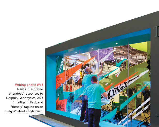
What attendees saw when they approached the 30-by-40-foot exhibit was an 8-by-25-foot clear acrylic graffiti wall upon which their perceptions would eventually be painted. As staffers queried clients and prospects on the first day's keyword (which was "fast," followed by "intelligent" and finally "friendly" on subsequent days), attendees pondered the challenge as if gazing deep into the ambiguous abyss of a Rorschach blot before suggesting whatever word or image came to mind. Staffers then recorded the ideas on the back of each attendee's business card, slid it into a small envelope the same shade as the company's corporate orange hue, and fastened the envelope to a board attached to a transparent wall. Artists in the booth would then pluck guests' ideas from the wall (including those submitted via emailed responses to the pre-show promotion) and choose which ones to transcribe on the graffiti wall.
|
Words With Friends
As attendees offered up suggestions, artists tagged the wall with comets of color that swirled next to icons and imagery on the see-through surface.
|
Tempting guests even further, like a Granny Smith apple waved in front of an inquisitive Eve, would be the promise of the unique gift the mailers hinted at: After the show, the company would section each day's wall and send attendees the piece with their contribution on it (assuming it had been selected), along with a certificate of authenticity signed by the artist.
Prompted by the keyword "fast," attendees blurted out ideas such as Porsche, bullet, and Usain Bolt, while Soulful Creative Ltd., a group of four graffiti artists hired by NeosCreative and Dolphin, waited nearby to translate participants' thoughts onto the acrylic wall. Set in a can't-miss position near the front of the booth, the board holding the envelopes seemed to multiply with the enclosures minute by minute. Working from 8:30 a.m. to 5:30 p.m. each day, the artists snatched the envelopes off the board as quickly as they could to translate the enclosed
entries to the graffiti wall with head-snapping speed. Perplexed booth visitors who hadn't previously taken part stopped by the wall to inquire about the activity, and add their own input to illustrate that particular day's keyword.
For three straight days, hundreds of visitors poured into the Dolphin booth to see the graffiti walls that shifted and changed with words and concepts like a rectangular kaleidoscope. Using brushes, markers, and vinyl transparencies, the artists daubed and decorated the sheer surface into something that was part Banksy art installation and part psychedelic smear. The wall (which was lit in tones of blue on the first day, followed by teal and white on successive days to accentuate the sense of an ever-changing exhibit) became a gaudy brawl of bold images befitting graffiti's roots that are as old as Pompeii and as modern as cans of spray paint: disembodied brains and Einstein's E=MC² formula, alongside Mickey Mouse and Lassie's food bowl. Before the visitors left, Dolphin staffers reminded them that the wall would be taken down each day and replaced by another one, where guests could again start fresh and offer their impromptu word association with that day's term.
In the end, the real work of art was Dolphin's strategy of staging a work in progress to build repeat traffic and reach its goals. In fact, an astounding 90 percent of the booth's overall traffic consisted of attendees returning to see which ideas – including theirs, naturally – had appeared on the wall's florid surface. Even better, these participants included all of the oil companies Dolphin had targeted with its pre-show communications. With numbers like that, you don't need a seismic survey to detect the potential impact.

Luxottica retail north america inc. PHOTOS: Connie Carr Photography
2. Photo Booth
 Luxottica Retail North America Inc. touts its 20/20 vision with a booth that becomes an instant – and repeat – hit using the social-media site Instagram.
From eyeglasses' probable origins in 13th century Italy, where monks wore primitive versions balanced on their noses like levels, to the 21st century's adjustable-focus lenses that come in frames of titanium, eyewear has grown into a behemoth $35 billion market. Even for a major player like Luxottica Retail North America Inc., competing in this industry requires a novel way of looking at its exhibiting strategies.
That was especially true for Luxottica at Vision Expo West in Las Vegas, where 12,500 attendees are dazzled by more than 450 brands on display. To set itself apart from the rest, the Mason, OH-headquartered company devised a strategy involving attendees and incorporating social media in an attempt to create an exhibit that would evolve as dramatically as eyeglasses have over the past 800 years.
With its longtime partner, Rochester, NY-based RES Exhibits LLC, Luxottica wanted to promote itself at the trade show as a cool company that embraces the latest technology. Playing off its Ray-Ban brand's Never Hide campaign, which aimed at persuading consumers to proclaim their individuality with a pair of the iconic shades, Luxottica would leverage the glasses and the promotion in a strategy to coax attendees to make multiple visits to the booth.

"Instead of a booth jammed with product to bring people in, we would bait the hook with a strategy that turns attendees into content producers for the booth and thereby ambassadors for the brand," says Tim Prinzing, RES' creative director. "That would, by design, bring them into the booth multiple times, which would provide additional touchpoints to reinforce our brand messaging."
The strategy hinged on photo- and video-sharing site Instagram, which brags more than 150 million users. Even better, according to one measure by Forrester Research Inc., Instagram users engage with top brands (e.g., Nike and Starbucks) 58 times more often on Instagram than they do on Facebook, and 120 times more than they do on Twitter.
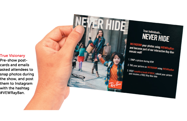
Thirty days before Vision Expo West got underway, Luxottica dispatched emails and postcards to registered attendees inviting them to participate in the photo-centric promotion in exchange for a free Ray-Ban-branded tote bag. The missives asked recipients to snap a picture during the show, post it to Instagram, and affix the hashtag #VEWRayBan to their shots. In addition to the tote bag swag, Luxottica also promised participants that they would see the images become part of a larger, evolving mosaic.

|
Picture Perfect
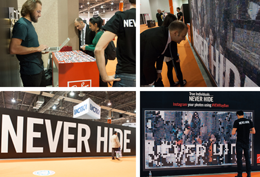
Special software compiled attendees' photos into a mosaic on a 10.5-by-5.5-foot wall in Luxottica's exhibit. |
The day Vision Expo West opened, attendees, propelled by the pre-show invitations, began generating an avalanche of imagery. Luxottica staffers used a special program called Instaprint Mosaic that scoured Instagram for shots marked with the special hashtag, analyzing them for colors, hues, and shapes, and matching them to corresponding areas on the mosaic. Inside the 80-by-78-foot booth space, three staffers printed out hard copies of the selected pictures on four printers and one by one affixed them to a 10.5-by-5.5-foot white board mounted to an aisle-side wall. As each photo was printed, Instaprint Mosaic informed staffers where to affix it to the board to make sure the desired image would come into view.
The more photos participants took, the more they returned to witness their images become part of the bigger picture. (The mosaic-forming software used about 75 percent of the pictures sent in.) Visitors to Luxottica's exhibit stood transfixed by the montage of nearly 3,200 photos transforming into a stunning picturescape. The software rearranged contributors' shots – ranging from selfies in sunglasses to snaps of beloved dogs – and out of them formed a picture Luxottica had also used in its promotions for the show.
Depicting a busy urban sidewalk, the resulting mural captured several individuals in the midst of a typical pell-mell city day. While most in the shot seemed frozen in the visual amber of a still photograph, a young mother, along with her two children and dog, almost vibrated with the quirk and color that were the very essence of the individuality Ray-Ban's Never Hide campaign extolled. The mosaic also appeared in digital form on one 90-inch LED monitor and a duo of 103-inch LED monitors nearby.
"Evolution is not a force but a process," said 19th century British statesman John Morley. For Luxottica it was a process that, in the guise of an ever-changing collage, compelled roughly 75 percent of booth visitors to revisit the exhibit a second – or even third – time during the show. And those repeat visits fueled an estimated 15- to 20-percent jump in brand impressions. Hundreds more stopped to view the mosaic and snap their own shots.
For Luxottica, an exhibit strategy that had attendees generating content and consequently coming back to the booth as inevitably as the seasons return, proved to be picture perfect.

Thomas & Betts corp. PHOTOS: Christies Photographic Studios
3. Grand Illusion
 Thomas & Betts Corp. electrifies its
utility-company clients with underground
art that sparks many
happy returns.
According to famed paleontologist Stephan Jay Gould, "Evolution is a process of constant branching and expansion." Nobody knows that better than Thomas & Betts Corp. A designer and manufacturer of electrical components, the Memphis, TN-based company was expanding its Elastimold product line (which connects, grounds, and splices primary cable connections) with a new protection apparatus for overhead power cables dubbed Elastimold Recloser. To do this, the company set its sights on the Institute of Electrical and Electronics Engineers Power and Energy Society Transmission and Distribution Conference and Exposition, which attracts roughly 3,100 attendees from about 20 industries, including electric utilities, information-technology firms, and consulting-engineer businesses.
But Thomas & Betts worried that a single exhibit visit wasn't sufficient to drive home its key messages with attendees and foster the awareness and trust it would take to persuade 10 large utilities companies to try the Elastimold Recloser. Furthermore, the firm had a vested interest in giving attendees who visited the booth on day one a reason to return to the booth again during subsequent days. "Driving repeat traffic had to be part of the strategy,
 |
Strike a Pose
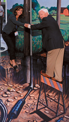
Nearly 750 attendees posed for photos on an
illusory precipice, then took home a branded card with a URL they could visit to download their images. |
because the Elastimold Recloser wouldn't be revealed until a private client event, which would be held after the show closed for the first day," says Jeff Jarzynka, experiential marketing creative lead at Derse Inc., the company Thomas & Betts hired to help them launch the new product. "We had to give all attendees a reason to come back to the booth so they'd have a chance to see the new product on display."
Partnering with Derse, Thomas & Betts decided the best way to illustrate the idea behind the new product and its tagline, "The Best Underground Is Now Overhead," was to literally illustrate it. And to drive repeat visits from interest-piqued attendees, that illustration would take shape in the company's exhibit during show hours. More than just a garish gimmick, however, the illustration would be an integral part of the product reveal itself, a psychic kindling that would build attentiveness and anticipation.
To convey what the Elastimold Recloser would look like in a real-world setting, Thomas & Betts decided to incorporate a panoramic cutaway illustration. Popularized by masters of the technique such as Frank Soltesz and David Macaulay, cutaways reveal the inner workings of everything from submarines to spacesuits. Often appearing to be three dimensional, the images captivate viewers by granting them a unique perspective on the subject's inner workings.
The companies brought in renowned artist Tracy Lee Stum to paint the panorama. Acclaimed for her massive 3-D street paintings and chalk drawings, Stum creates compositions that are disorienting in their realness, from King Kong ascending the Empire State Building, to a sewer system thick with crazed and chomping alligators.
Instead of Stum composing the picture on the fly in the booth, she prepared it beforehand. Then, at the show, the company would methodically reveal parts of it. About a month before the show, Stum produced two color chalk illustrations drawn to scale on canvas, one showing the product above ground, and another showing it below ground via a cutaway. The drawings were then photographed, scanned at high resolution, and printed on four 5-by-10-foot vinyl panels that fit together to form two 10-by-10-foot pictures.
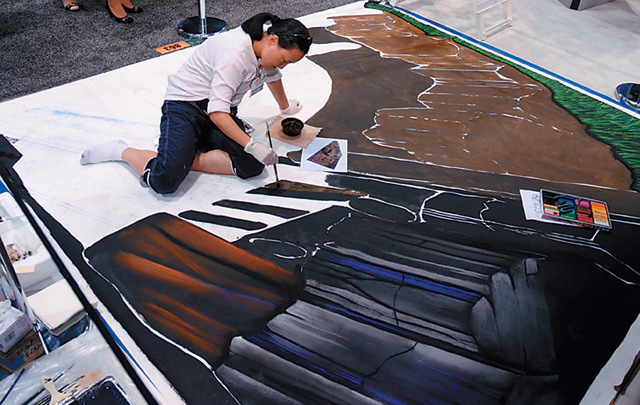
Attendees entering the 40-by-90-foot booth the first day of the show couldn't have expected the crowd-drawing illusion that stood before them. Set vertically near the booth's main entrance was the first half of Stum's work, a 10-by-10-foot landscape of absinthe-green pastures under a bright blue sky. In that serene setting, the Elastimold Recloser and overhead power lines somehow fit as naturally as the lush foliage and billowing clouds. Working on the floor in front of the picture were two of Stum's assistants, who appeared to be drawing another 3-D cutaway of the underground cables on a white canvas. But that was a kind of subtle misdirection that might have made Penn and Teller smile in approval. The artists sketched on the canvas covering the already-finished product underneath it.
To visitors, it appeared as if the artists were somehow excavating the show floor, revealing a web of cables that snaked underneath. The ongoing and highly visible process of artists busily toiling away, paired with the illusion of unearthed ground, drew dozens of attendees who stopped, often for 10 minutes or more, to gaze at the sight of a seemingly hollowed-out surface.
 |
Mind-Boggling Masterpiece
Crowds gathered in Thomas & Betts exhibit to watch as skilled artists sketched a mesmerizing 3-D cutaway of underground cables on a white canvas placed on the floor. |
After show hours ended on the first day, Thomas & Betts held an invitation-only event at The Seas with Nemo & Friends attraction in Disney World's Epcot center. That same night, while the company debuted the Elastimold Recloser to the select group, staffers and artists removed the canvas that shrouded the actual work in the booth.
Here, the company's strategy shined like neon at night: The next day, hundreds of attendees, even those who had attended the launch, hurried back to the booth to see what they had been told would be the finished illustration – and take part in an additional activity. Extending the connection with its product even further, the company offered a unique photo op to attendees. Guests posed on what seemed like narrow rock outcroppings, for instance, over the scooped-out show floor. While participants were actually standing on solid ground, the vertigo-inducing image made them look like skilled gymnasts perched atop a balance beam. Over the course of the second and third days of the show, staffers snapped pictures of about 750 people in exchange for a branded card with a URL recipients could visit to download their images.
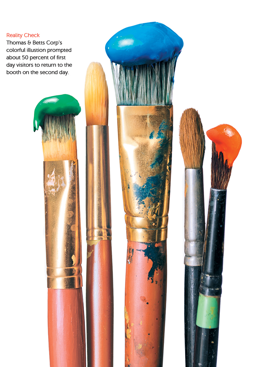
Illusions are generally considered an impediment to achieving your goals, but for Thomas & Betts, the marketing mirage helped spur multiple booth visits from attendees. According to the company, an estimated 50 percent of attendees from the first day visited the booth again the second day, which helped result in 20 utility companies purchasing the Elastimold Recloser, double Thomas & Betts' original goal for the show. The transforming artwork may have been an illusion, but the company's results were very real. 
