|
Light Done Right
Mention the term "lightweight exhibit materials," and most people conjure images of ethereal fabric scrim, flimsy paper wall dividers, and cardboard components with the structural integrity of a shantytown lean-to. Indeed, lightweight exhibitry can be delicate and fine, diaphanous and airy. But various lightweight materials also can be used to craft durable solid structures, devise seemingly weighty, eye-catching treatments, and design dynamic forms that appear more permanent than passing. To prove the point, here are six exhibits that are light on weight but heavy on impact. By Linda Armstrong

PHOTO: Mauk Design Inc.
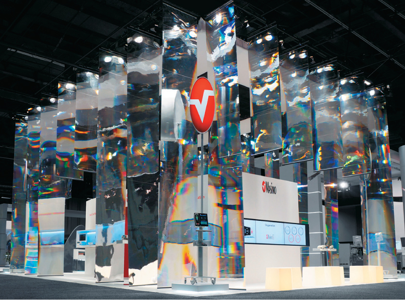
Lightwaves Ahead
Exhibitor: Masimo Corp.
Show: American Society of Anesthesiologists
Design: Mauk Design Inc., San Francisco,
415-243-9277, www.maukdesign.com
Pulse oximetry uses light to measure human body conditions.
So to capture attendees' attention and promote its pulse-oximetry technology, Masimo Corp. clad its 40-by-50-foot booth with sheets of reflective light-distribution film. The effect screamed "Light!" without uttering a word.

PHOTO: Moss Inc.
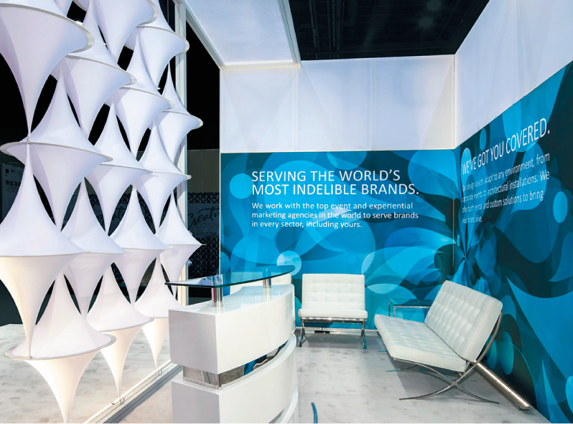
A Simple Solution
Exhibitor: Moss Events
Show: The Special Event
Design: WantedMan Works, New York,
917-774-1741, www.wantedmanworks.com
Sometimes, simplicity soothes the soul. Such was the case with this tensioned-fabric structure from Moss Inc. A stark-white exterior drew attention to the "Stretch Your Experience" message while geometric fabric shapes in the center of the space captivated the eye.

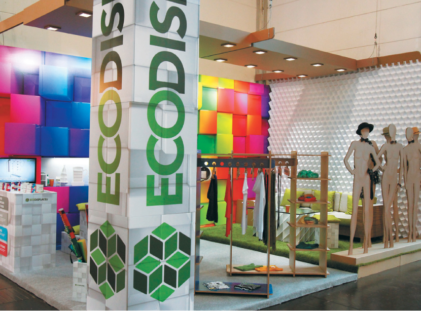
Paper Caper
Exhibitor: Color Studio Ltd.
Show: EuroShop
Design: Color Studio Ltd., Sofia, Bulgaria,
359-2-400-5000, www.color-studio.com
To tout its role as a pioneer in eco-friendly printing materials and technologies, Color Studio Ltd. opted for this recycled cardboard and paper exhibit. Despite its minimal footprint, this clever concoction plays with shapes, colors, and textures to deliver a petite yet powerful punch.

PHOTO: Fabric Images Inc.
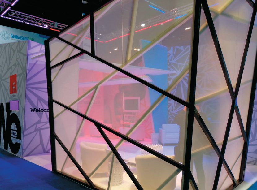
Acute Angles
Exhibitor: Fabric Images Inc.
Show: GlobalShop
Design: Fabric Images Inc., Elgin, IL,
847-488-9877, www.fabricimages.com
Why settle for straight walls and traditional colors? This striking exhibit turned up the volume with angled structural elements, vibrant internal lighting, and a geometric fabric print. Text on the exhibit's exterior conveyed a message and stopped visitors in their tracks.

Cardboard Cave
Exhibitor: Willson & Brown – WB Sp. Z.o.o. Sp.k.
Show: EuroShop
Design: Willson & Brown – WB Sp. Z.o.o. Sp.k.,
Warsaw, Poland, 48-22-101-61-00
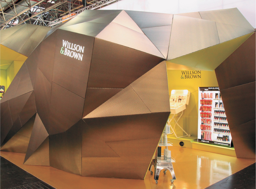
Willson & Brown, a Polish point-of-sale product provider, delivered this cavernous space made mostly of cardboard. While the material is an obvious nod to the firm's cardboard store displays, the exhibit's colors and angles give an elegant edge to an otherwise mundane medium.

White Noise
Exhibitor: Kubik Inc.
Show: EXHIBITOR Show
Design: Kubik Inc., Mississauga, ON, Canada,
905-272-2818, www.thinkubik.com
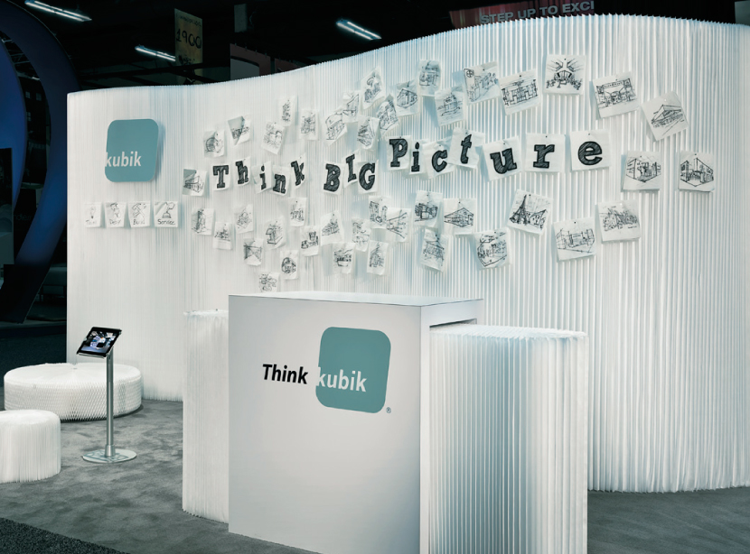
Comprising little more than white accordian-fold paper Molo components, a traditional laminate-covered reception desk, and hand-drawn artwork illustrating the exhibitor's work on paper napkins, Kubik Inc.'s exhibit was the pièce de résistance of pop-up paper structures.
|


