WHAT'S HAPPENING NOW:
SUBSCRIBE TO MAGAZINE
Exhibiting &
Event Topics
EXHIBITOR
Magazine
Find It
Marketplace
EXHIBITOR
LIVE
EXHIBITOR
Education Week
EXHIBITOR
eTrak
CTSM
Certification
EXHIBITOR
Insight
EXHIBITOR
Awards
News
Network
Advertise
With Us
Topics
Exhibits
& Experiences
Exhibit
Design
Exhibit
Design Awards
Green
Exhibiting
Rental
Exhibits
Exhibit
Graphics
RFPs & Booth
Management
Small
Booths
Fabric, Flooring
& More
Technology
Case
Studies
Design Awards
-
Home Décor
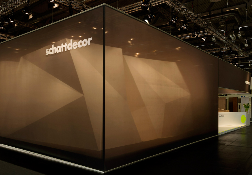
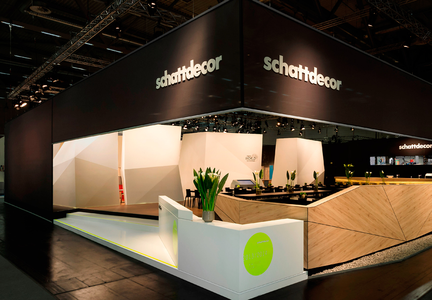
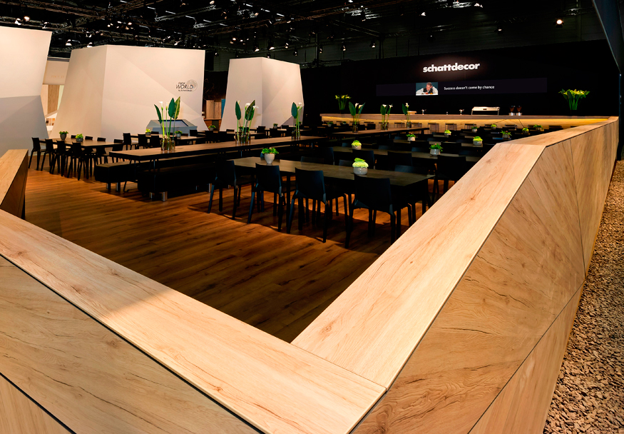
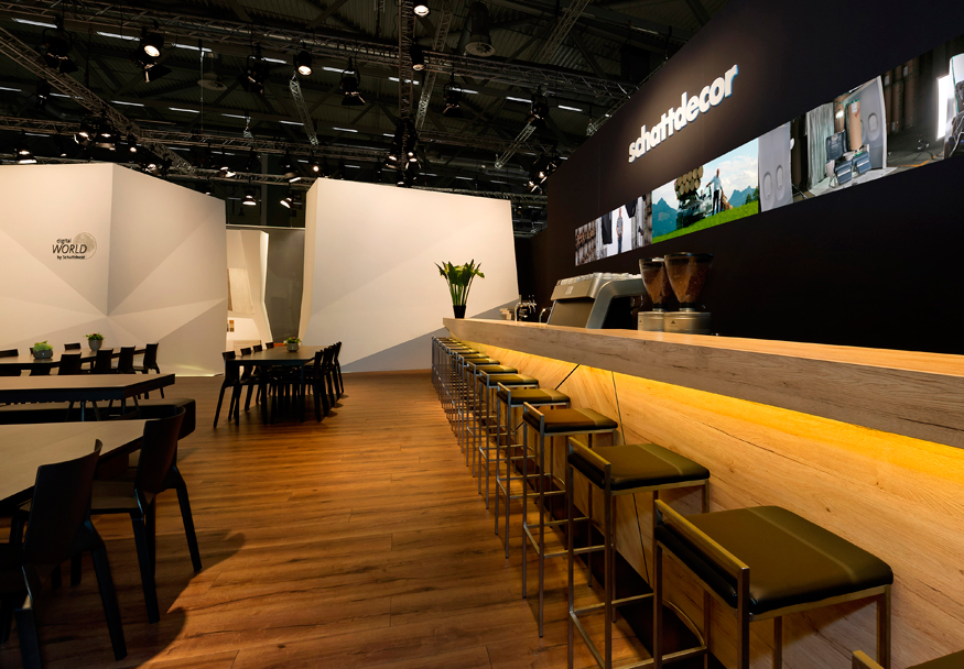
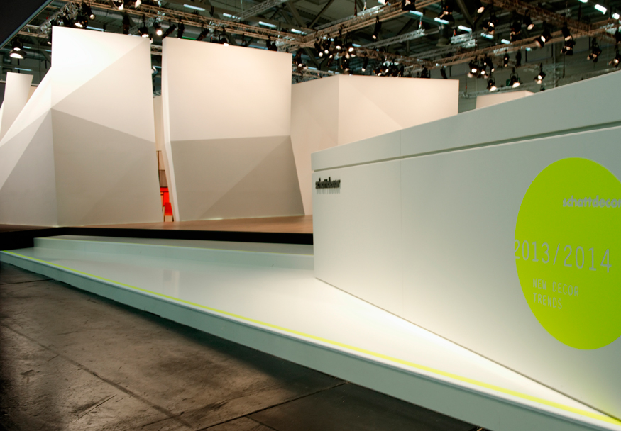
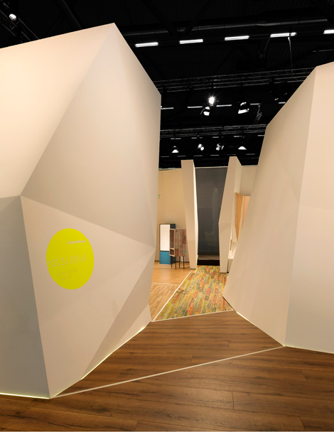
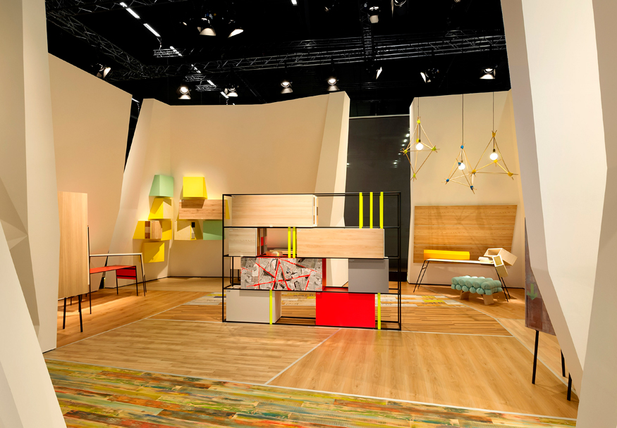
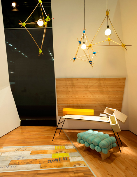
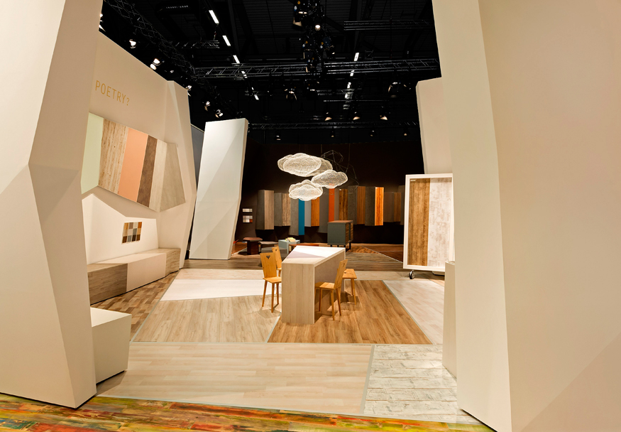
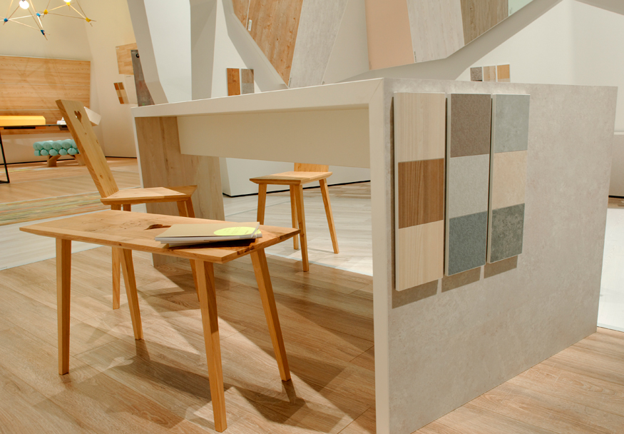
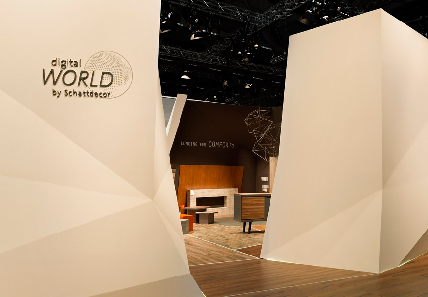
Clean, angular lines, pops of color, and touches of whimsy made this striking exhibit for Schattdecor AG a winner with Exhibit Design Awards judges, who marveled at the freshness of the stark but sophisticated design. Each of the booth's three product areas employed a deliberate restraint that allowed the stone, wood, and graphical properties of Schattdecor's products to take center stage.
Photos: fotodesign schiemann
Interior Design
SILVER AWARD
Category: International Designer
Exhibitor: Schattdecor AG
Design/Fabrication: Kohlhaas Messebau GmbH & Co. KG, Hanover, Germany, 49-511-450-89-70, www.kohlhaas-messebau.de
Show: Interzum, 2013
Budget: $500,000 – $749,000
Size: 89-by-79 feet
hen a company has thousands of products, finding an exhibit design that embodies them, as well as the company's overarching message, can be a challenge more colossal than the company's inventory itself. But Kohlhaas Messebau GmbH & Co. KG didn't just accomplish that herculean feat for Schattdecor AG, it did so with the kind of clarity and polish that Exhibit Design Awards judges called fresh, artistic, and stunning.
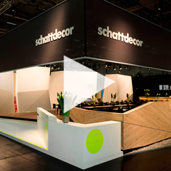
Schattdecor's product lines span all manner of printed, texturized paper. Used in home décor, the material can feature realistic wood, stone, or graphical printed images that can be laminated onto walls, flooring, and furniture. To showcase the product lines at Interzum 2013, Kohlhaas' goal was to transform Schattdecor's 7,000-square-foot exhibit into a crystal geode metaphor of sorts.

To achieve the effect, designers used black, semitransparent fabric to cloak the exterior, only offering a glimpse of what laid within through an opening along one end of the otherwise enclosed booth. Stepping into the exhibit, attendees passed between white, angular walls that conjured the image of crystalline passageways through the display. Inside, three product areas and a hospitality lounge used distinctly different palettes to showcase the materials on various surfaces, from the floor to the sculptural-looking pieces of art on the walls.

Complementing the design, whimsical touches via light fixtures and an occasional burst of color gave the space a controlled simplicity that Exhibit Design Awards judges praised. "This tactic is subtle but an oh-so effective way to make the product the hero without having to shout," one judge said. Effectively showcasing a massive cache of products is one thing, but doing so in a way that judges call "brilliantly simple" is a design feat of Sisyphean proportions that gives credence to the old adage that sometimes less really is more.


you might also like
 
Join the EXHIBITOR Community Search the Site
TOPICS
Measurement & Budgeting
Planning & Execution
Marketing & Promotion
Events & Venues
Personal & Career
Exhibits & Experiences
International Exhibiting
Resources for Rookies
Research & Resources
MAGAZINE
Subscribe Today!
Renew Subscription
Update Address
Digital Downloads
Newsletters
Advertise
FIND IT
Exhibit & Display Producers
Products & Services
All Companies
Get Listed
EXHIBITORLIVE
Sessions
Certification
Exhibit Hall
Exhibit at the Show
Registration
ETRAK
Sessions
Certification
F.A.Q.
Registration
EDUCATION WEEK
Overview
Sessions
Hotel
Registration
CERTIFICATION
The Program
Steps to Certification
Faculty and Staff
Enroll in CTSM
Submit Quiz Answers
My CTSM
AWARDS
Sizzle Awards
Exhibit Design Awards
Portable/Modular Awards
Corporate Event Awards
Centers of Excellence
NEWS
Associations/Press
Awards
Company News
International
New Products
People
Shows & Events
Venues & Destinations
EXHIBITOR News
© Exhibitor Group | The Leader in Trade Show and Corporate Event Marketing Education PO Box 5996, Rochester, MN 55903-5996 | (507) 289-6556 | Need Help? Ask Scott