portfolio |

|
A Rather Lovely Loo
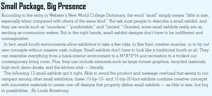
 How do you display more than 18 sinks, a full-size bathtub, and a plethora of accents in a 10-by-10-foot space? Thompson Traders Inc., which sells kitchen and bathroom products, turned its tiny exhibit into a fantasy bathroom at the 2007 Kitchen/Bath Industry Show and Conference. Complete with wall art, mirrors, and a chandelier over the tub, the in-house-designed exhibit takes a more vignette-style approach, while the narrow half walls on both sides of the bathroom-product display feature stunning sinks cleverly attached to PVC pipe. How do you display more than 18 sinks, a full-size bathtub, and a plethora of accents in a 10-by-10-foot space? Thompson Traders Inc., which sells kitchen and bathroom products, turned its tiny exhibit into a fantasy bathroom at the 2007 Kitchen/Bath Industry Show and Conference. Complete with wall art, mirrors, and a chandelier over the tub, the in-house-designed exhibit takes a more vignette-style approach, while the narrow half walls on both sides of the bathroom-product display feature stunning sinks cleverly attached to PVC pipe.
|
Aged to Perfection
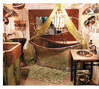
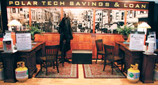
A savings-and-loan-themed booth isn't exactly an obvious choice if you're selling refrigerant-recovery systems. But if those systems save people money, and cost savings is the main message you'd like to relay, then the bank theme is spot on. That's why Polar Technology LLC transformed its 10-by-20-foot exhibit space into a '30s-style Polar Tech Savings and Loan at the 2007 International Air-Conditioning, Heating, and Refrigeration Expo. Designed by Mercatus Communications of Nashville, TN, the exhibit features antique furniture atop a wooden floor and period-style throw rugs, along with a vintage photo mural of a San Francisco street.
|
Posh Petite
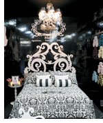
 When your company's brand identifiers include "opulence," "luxury," and "glamour," you can't really toss up a pop-up in your booth space and call it a day. OK, maybe you can, but it would be really ineffective. Not surprisingly, then, Miss Heloise Inc., which sells everything from linens and wall décor to pet beds and headboards, bathed its 10-by-10 space in glamour with this black-and-white bedroom scene at the Hospitality Design Expo and Conference in Las Vegas. Three glossy-black walls partially enclose the space and offer graphics to explain the company's various product lines, while a comfortable bed offers not only a can't-miss focal point, but also a place for attendees to plop down and relax. Packed to the hilt with product and featuring an honest-to-goodness chandelier, this pint-sized exhibit designed by Czarnowski of Las Vegas is small but sumptuous.
|
G Spot

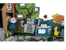
The words "fun" and "funky" don't usually spring to mind when you think recycling. However, these two words encapsulate this exhibit from the 2008 International Consumer Electronics Show promoting Gcycle, a nonprofit Web site that fosters electronics recycling. Designed by Jet Sets of North Hollywood, CA, this 10-by-10's graphics juxtapose the great outdoors with landfills chock full of e-waste. Made of 90-percent recycled content, the exhibit features monitors that provide canned content from the Gcycle site.
|
Memories of "M*A*S*H"
 Exhibit house Delphi Productions traded its previous booth for this "M*A*S*H" recreation at the Healthcare Convention & Exhibitors Association show. The perfect fit for Delphi's audience of health-care marketers, the 10-by-20-foot booth is filled with inexpensive items reminiscent of the 4077th. Corrugated-tin walls adorned with tent canvas and army blankets form the backdrop for a front-and-center army cot, while a primitive stove made out of an oil drum adorns the exhibit's back corner. Travel trunks, antique medical equipment, and a '50s-style TV permanently tuned to Delphi's promotional video complete the theme.
|
Your Better Half
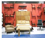
 How do you display an endless variety of furniture for the hospitality industry, communicate your creative talents, and avoid jamming your 10-by-20-foot space with knee-bangin' end tables? If you're Solutions for Hospitality, a Los Angeles-based manufacturer and sourcing company of furniture and bedding, you position a few key pieces around your floor space and use the back and side walls to create as a product display. Created for the Hospitality Design Expo and Conference in Las Vegas, the in-house-designed exhibit demonstrates the company's creative capacity. The walls hold various chairs and tables that were cut in half to provide for both easy attachment and visual appeal. To display even more product, the exhibitor also projected a product-image slide show on the side wall above the desk.
|
Girl Power
 Displaying several lines of T-shirts in a 10-by-10-foot booth is a product explosion waiting to happen. While most exhibitors would fall victim to the disaster, Ripple Junction, a Cincinnati-based licensed-apparel provider, escaped the detonation with this clever in-house-designed exhibit. Since the girls consumer group is a top priority for the company, Ripple Junction designed its Magic Marketplace exhibit to look like a girl's bedroom. A miniature bed, complete with decorative throw pillows, and two end tables serve as the focal point and seating area. The back and side walls are covered with posters and T-shirt graphics framed to look like posters along with a smattering of products to add a touch of 3-D flair. Meanwhile, racks of T-shirts hang on rods mounted to one side wall, where they act as an open closet, ripe for rummaging.
|

Green Scene
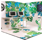
Nonprofit agencies always undergo extra scrutiny when it comes to spending. But the U.S. Green Building Council faced the added challenge of relaying an environmental theme at NeoCon. Designed by Shaw-Jelvah Design LLC of Baltimore, this exhibit not only got it right in terms of lightweight materials, it also hit the bull's eye with striking design. Blue, green, beige, and grey leaves adorn the walls and flooring of this 10-by-10-foot booth, while the USGBC logo is positioned on a convention-center column.
|
Magical Mural
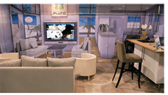
 Mission: Turn a 10-by-20-foot exhibit space into a full-size living room and kitchen complete with oodles of comfortable seating. Impossible, right? Not if you're Pluto, a provider of products that link in-home technologies such as media, security, telecom, and computing. The company used an ingenious back wall and matching real-life elements to create an authentic home-like environment - and a play on perspective. First, Pluto hung an image of a living room and kitchen on the back wall of its booth at the 2008 International Consumer Electronics Show in Las Vegas. The Miami Beach, FL, company then filled the space in front of the wall with carpet, furniture, and décor that matched the mural. The resulting effect was a seemingly expansive exhibit
that appeared impossibly larger than the relatively modest space it occupied. Mission accomplished.
|

Paperwork
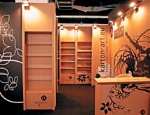
Nearly every inch of this 10-by-16-foot exhibit at Paperworld 2008 is made of corrugated cardboard from exhibitor Karton Art Design. From the display case to the chairs and shelves, each sturdy piece of furniture is a product of Karton Art, based in Budaörs, Hungary. Each product ships as a flat panel that can be assembled in minutes, and comes with a three-year guarantee. Available since 1995, the water-resistant cardboard furniture can be cleaned with a wet cloth, and the manufacturer can paint it or treat it with a fire-retardant liquid. It's only a paper booth, but when it comes to presence, it delivers much more than typical parchment.
|
Penguin Paradise
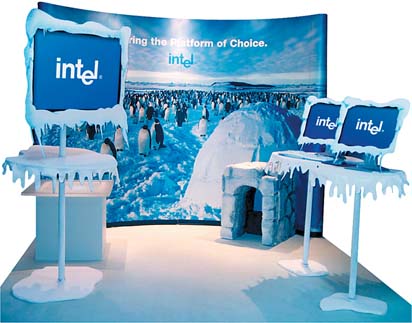
Back-wall graphics alone aren't enough to create a penguin habitat; at the very least you also need some igloos and ice. At the International Society of Motor Control show, Intel Corp. used this cool solution to promote the company's partnership with Linux operating systems, whose mascot is "Tux" the penguin. Including minimal text and the Intel logo, the back-wall graphic sets the scene with a flock of emperor penguins in their natural habitat. Designed by Henry V of Portland, OR, the 10-by-10-foot exhibit features white carpet and a faux igloo door made of Styrofoam, which protrudes out of the back wall and continues the icy arctic landscape. Inexpensive white stands hold monitors, all three of which are draped in white felt to resemble icicles. Paired with a similarly styled monitor - complete with faux felt icicles - the frigid design expressed Intel's arctic theme on a frugal $10,000 budget.

|
Heart-Felt Design
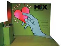
When you're selling graphics, your booth had better be simple, clear, and striking. Mix Imaging of Miami delivered with this stunning yet simple 10-by-10 booth for the Healthcare Convention & Exhibitors Association show. Featuring nothing but a floor, reception desk, and back 
wall - all in a near-violent shade of lime green - the booth practically shouts, "Look at me!" Flowing from the flooring to the back wall, an illustrated image of a hand holds a glowing, red heart, which accompanies the main tagline "pumping creativity." Four more short phrases, such as "Large Format Graphics," use clear, concise language to explain exactly what Mix offers.
|
|
|


