|
REGISTRATION REQUIRED
|
|
||||||||||||||||||||||||||||||
|
||||||||||||||||||||||||||||
|
|
||||||||||||||||||||||||||||
|
TOPICS Measurement & Budgeting Planning & Execution Marketing & Promotion Events & Venues Personal & Career Exhibits & Experiences International Exhibiting Resources for Rookies Research & Resources |
MAGAZINE Subscribe Today! Renew Subscription Update Address Digital Downloads Newsletters Advertise |
FIND IT Exhibit Producers Products & Services All Companies Get Listed |
EXHIBITORLIVE Sessions Exhibit Hall Exhibit at the Show Registration |
ETRAK Sessions Certification F.A.Q. Registration |
EDUCATION WEEK Overview Sessions Hotel Registration |
CERTIFICATION The Program Steps to Certification Faculty and Staff Enroll in CTSM Submit Quiz Answers My CTSM |
AWARDS Exhibit Design Awards Portable/Modular Awards Corporate Event Awards Centers of Excellence |
NEWS Associations/Press Awards Company News International New Products People Shows & Events Venues & Destinations EXHIBITOR News |
||||||||||||||||||||
|
||||||||||||||||||||||||||||


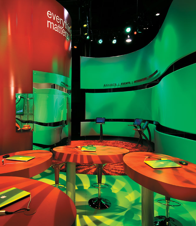
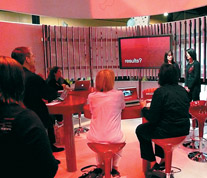
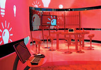
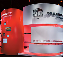
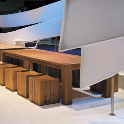
 xhibit-design house 3D Exhibits Inc. wanted its booth at EXHIBITOR2008 to impress attendees with the company's technological savvy, creative flair, and even its ecological awareness. But that's not easy when you're competing in a show where exhibits have been known to resemble postmodernist mansions and groovy '60s pop-art pads. So the Elk Grove Village, IL-based company sought to blend a sinuous exterior, lush colors, and educational activities to turn its booth into a red-hot stop on the trade show floor.