|
awards
EXHIBITOR Magazine's 2nd Annual Portable / Modular Awards
Affordable to purchase, economical to own, simple to install, and infinitely customizable, today's portable, system, and hybrid exhibits are turning the industry upside down and inside out, while offering a high-quality alternative to traditional, hard-walled custom-built exhibitry. And exhibiting companies large and small are employing these modular solutions for everything from tabletops and 10-by-10-foot booths to massive exhibits at major international shows.
That's why EXHIBITOR magazine launched its Portable/Modular Awards competition last year, to recognize the vendors and designers responsible for these remarkable exhibits, while also spotlighting what's possible within this realm. Our goal is not just to give winners a well-deserved pat on the back, but to simultaneously showcase the countless capabilities of portable/modular structures. So please join us in congratulating the winners of our second annual Portable/Modular Awards, selected by a panel of marketing and design experts. These stunning systems not only raise the bar for our entire industry, but also prove that portability and modularity are not the only attributes of portable/modular exhibits. 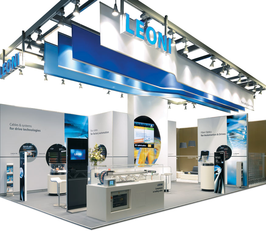
Cable Show
Best Island Exhibit (600 – 1,000 s.f.)
Simple shapes, an uncomplicated color palette, and a clearly organized footprint combined to create an exhibit that not only dominated its category but also took home the competition's top honor, The Zeigler Award, presented to the entrant with the highest cumulative score, regardless of category. Designed by Expotechnik International Holding GmbH & Co. KG, the 20-by-43-foot island space for Leoni AG also sported a relatively minimal budget of less than $79,000 — causing judges to label the booth "remarkably budget conscious, yet utterly sophisticated." Exhibitor: Leoni AG Design/Fabrication: Expotechnik International Holding GmbH & Co. KG, Taunusstein, Germany, 49-6128-269-0, www.expotechnik.com; Expotechnik America Ltd., Suwanee, GA, 678-672-1366, www.expotechnik.com System: Expotechnik International Holding GmbH & Co. KG Event: SPS IPC Drives, 2013 Budget: $40,000 – $79,000 Size: 20-by-43 feet Photo: Expotechnik International Holding GmbH & Co. KG Originally constructed for the SPS IPC Drives show in Nuremberg, Germany, the stand had the difficult challenge of generating awareness for Leoni's suite of products, i.e., wires, cables, and wiring systems that are typically housed inside other products. The design solution highlighted these "invisible" products in a series of circular displays. Positioned within white walls throughout the booth, black circular cutouts formed the backdrop against which Leoni's colorful cables were presented. While the ground-level exhibitry maintained neutral hues that highlighted the various products, a ceiling structure offered dramatic pops of blue and white fabric and also served as a mounting device for multiple light fixtures. Although the majority of the space was devoted to product displays and technical-explanation areas, a coffee-colored conference space offered attendees a quiet respite. White graphics on its interior walls posed questions from the attendee perspective, such as "Does Leoni provide the right motion control cable for my application?" To obtain answers, visitors scanned nearby Quick Response (QR) codes, which directed them to corresponding information on Leoni's website. Leoni's success just goes to show that creating an award-winning exhibit doesn't require tons of money or acres of space. Rather, all you need are some talented designers that understand colors and shapes — and can easily wield the mighty power of simplicity. 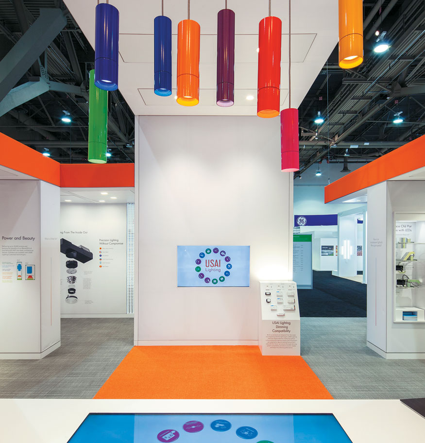
Story Time
Best Fabric Exhibit
There's something utterly magical about effective storytelling. In fact, for New Windsor, NY-based USAI Lighting LLC, an exhibit clearly organized into eight product-story areas wasn't just magical; it was an award-winning masterpiece that judges called "a study in color, form, and materials that was perfectly balanced in every way." Exhibitor: USAI Lighting LLC Design: FPM Design, Fishkill, NY, 914-299-4733, www.fpmdesignllc.com Fabrication: Dimensional Communications Inc., Mahwah, NJ, 201-767-1500, www.dimcom.com System: FabXFrame Systems LLC Event: Lightfair International, 2014 Budget: $250,000 – $499,000 Size: 30-by-50 feet Photo: Exposures Ltd. Comprising tensioned-fabric components, USAI's 30-by-50-foot exhibit for Lightfair International told the tale of the firm's innovative approach to LED lighting, which allows users to select the color and intensity of light to fit each specific area's — or each day's — needs. As attendees approached the structure, they discovered a series of walls towering up to 15 feet tall, which formed a perimeter around the space. Backlit acrylic panels in muted gold featured the USAI logo and highlighted the two main exhibit entrances. Once inside the booth, visitors were immersed in a white environment peppered with pops of brilliant colors. Here, staffers guided attendees through the eight different areas, and revealed product stories ranging from an interactive demo of color-curve dimming to an educational display detailing how artificial light affects circadian rhythms in humans. Each of the eight areas featured colorful graphics, photos, lighting, and pro-duct displays, along with recessed cubbyholes for collateral literature. While attendees could manipulate various dimmer switches, the lights in each story area also could be controlled from an iPad manned by USAI staff. Fabric headers and carpet in the company's orange hue warmed and unified the entire space, while cheerful clusters of cylindrical, jewel-toned stools encouraged relaxed conversation. With its uncluttered interior, elegant color palette, and simple — albeit effective —graphics, the exhibit lured in attendees like a warm campfire on a cold night and told the firm's stories as masterfully as one of the Grimm Brothers. 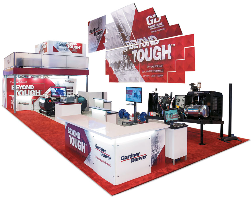
Mapquest
Best Use of Technology
Projection-mapping experiences might be commonplace at music concerts and even high-tech trade shows, but they rarely make their way onto the show floor at the Offshore Technology Conference. That's just one of the reasons why judges' awarded Gardner Denver Inc., a manufacturer of oil- and gas-drilling equipment, with top honors in the Best Use of Technology category.Exhibitor: Gardner Denver Inc. Design/Fabrication: 2020 Exhibits, Houston, 713-893-0067, www.2020exhibits.com System: Octanorm USA Inc. Event: Offshore Technology Conference, 2014 Budget: $250,000 – $499,000 Size: 20-by-60 feet Photo: Gary Barchfeld Gardner Denver's stakeholders thought that a projection-mapping experience was the perfect way to launch a new campaign (called Beyond Tough) and they charged 2020 Exhibits with doing just that. Working with projection-mapping firm Paintscaping Inc., designers positioned a 14.5-by-27-by-4.3-foot dimensional screen center stage in the exhibit, where it came to life four times a day. One minute before each presentation, an image of a digital timer appeared on screen, and rock music played softly as the timer counted down. At the 10-second mark, a woman's voice started announcing each remaining second (e.g., "nine," "eight," "seven," etc.). Finally, the presentation sprang into action as the Gardner Denver logo appeared center screen, followed by various iterations of the new brand messaging. Text then segued into 3-D images of the exhibitor's drilling products in exploded and rotating views. Throughout the three-minute experience, the screen's pyramid tiles periodically seemed to pop off the surface, creating a unique dimensional effect for viewers. Not only did the experience stop attendees in their tracks, but also it caught the attention of myriad media representatives. In fact, an image of the experience appeared on the front page of the Houston Chronicle, spreading Gardner Denver's message far beyond the exhibit-hall confines. Now that's a special-effects experience with some long-distance effects. 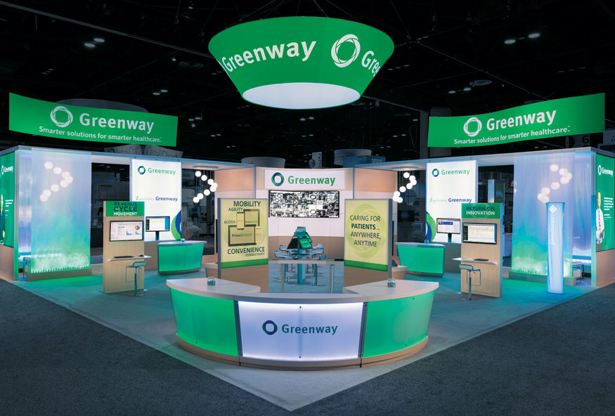
Green Scene
People's Choice Award
While Kermit the Frog might think that it's not easy being green, Greenway Health LLC has an entirely different perspective. In fact, Greenway claims that its electronic-health-records software and services actually make life easier for physicians and patients — while saving a lot of trees in the process.Exhibitor: Greenway Health LLC Design/Fabrication: Access TCA Inc., Whitinsville, MA, 508-234-9791, www.accesstca.com System: Aluvision Inc. Event: Healthcare and Information Management Systems Society, 2014 Budget: $250,000 – $499,000 Size: 50-by-50 feet Photo: Padgett and Co. Inc. For its booth at the Healthcare and Information Management Systems Society (HIMSS) show, Greenway needed an open, airy space with plenty of room for conversations and product demos. And of course, it wanted the exhibit to display its corporate green color along with its Green, i.e., environmentally friendly, message. The resulting 50-by-50-foot booth was awash in Greenway's grassy hue and littered with its logos. Designers used system components from Aluvision Inc., pairing them with various fabric and hard-skinned panels to create the perfect blend of semitransparent dividers, colorful graphics, and hard walls. In fact, judges applauded the material variety and designers' ability to "artfully mix and match without creating a dreadful jumble." Large-format, fabric graphics set off wall-imbedded demonstration stations, while additional kiosk-based monitors were scattered around the space for independent attendee exploration. Plus, an informal lounge accented by modern fixtures and furniture offered attendees a cozy place to relax and talk shop. Both HIMSS attendees and ExhibitorOnline.com visitors were similarly wowed by Greenway's space, as the latter group honored it with the People's Choice Award — the only popular-vote category in the competition. While nearly 15,000 votes were cast, Greenway came out on top. Featuring lightweight fabric and eco-friendly materials, the design kept weight-related costs to a minimum — and put a few greenbacks in Greenway's pocket. 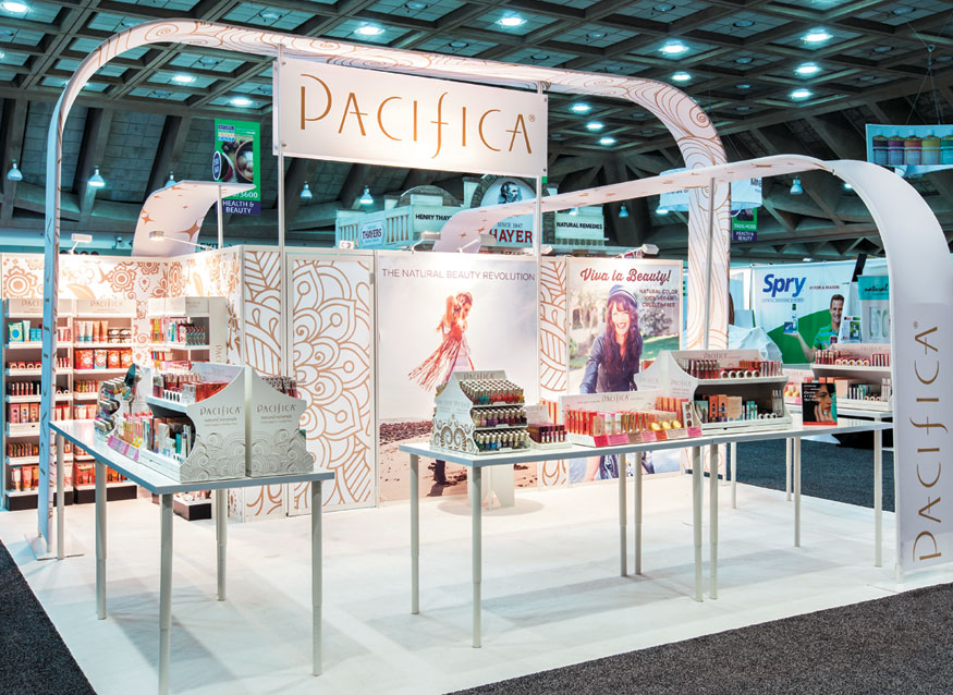
White Space
Best Island Exhibit (Less Than 600 s.f.)
Crafted by Classic Exhibits Inc. for Pacifica International's presence at Natural Products Expo West, the 20-by-20-foot booth was born of the exhibitor's demand for an intimate product-display space with soft lines. In addition, the firm challenged designers to devise a structure that was lightweight and easy to ship.Exhibitor: Pacifica International Design/Fabrication: Classic Exhibits Inc., Portland, OR, 503-652-2100, www.classicexhibits.com System: Classic Exhibits Inc. Event: Natural Products Expo West, 2014 Budget: $40,000 – $79,000 Size: 20-by-20 feet Photo: Exposures Ltd. So to minimize weight, designers opted for fabric and aluminum components, the latter of which it powder coated a brilliant white. This same color also covered the majority of the exhibit elements, including the fabric backgrounds, tabletops, and even carpet. Pacifica's curvaceous logo and trademark packaging pattern, i.e., soft-gold swirls, appeared on back-wall graphics and on two fabric arches. These same overhead elements added a sense of intimacy below, where various beauty products were available for perusal. Here, strategically positioned light fixtures highlighted these products as well as the full-color graphics and product shelving on the back wall. Judges felt the fabric walls and curved elements created a clean, dynamic environment befitting of the brand, and they applauded the overhead elements, which seemed to mirror some of the shapes found in the Pacific logo. 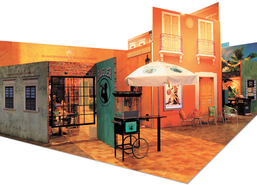
Smoke Shop
Best Use of Graphics
How do you recreate Havana on the trade show floor? If you're E4 Design, you craft authentic vignettes circa 1950s Cuba — featuring Spanish and Colonial furniture, music, and decor — and you create glorious, realistic graphics to bring the entire environment to life. Exhibitor: Scandinavian Tobacco Group Lane Ltd. Design/Fabrication: E4 Design, Norcross, GA, 800-316-4640, www.efourdesign.com System: BeMatrix USA Event: National Association of Convenience Stores Show, 2013 Budget: $250,000 – $499,000 Size: 50-by-70 feet Photo: E4 Design Designed for Scandinavian Tobacco Group Lane Ltd. (a Tucker, GA, subsidiary of Copenhagen-based Scandinavian Tobacco Group), the resulting 50-by-70-foot exhibit helped launch the firm's newly acquired product, Havana Honey Little Cigars, at the National Association of Convenience Stores show. Comprising B62 extrusions, a modular, aluminum frame system from BeMatrix USA, the booth featured colorful fabric graphics that produced the distinctly Cuban scene. A combination of direct-UV prints and fabric dye-sublimation graphics were used to create the illusion of vibrant stucco buildings, brick walls, pressed-tin ceilings, decorative tile, crystal-blue skies, and more. Described by judges as a "superbly realistic graphic experience," the booth was divided into multiple vignettes, which included everything from cobblestone street scenes complete with vintage telephone booths and bicycles, to cozy cafe settings with intricately tiled tabletops. While numerous alcoves were also available for quiet client meetings, designers scattered product displays made to look like street vendors throughout the space. For example, a popcorn cart offered rolling papers, and newspaper stands displayed products and literature. As Cuban music played in the background, Havana Honeys (i.e., models dressed in period costumes) hand rolled cigarettes and encouraged attendees to try rolling their own. When you pair the right exhibit designers with the perfect modular system — and throw in a graphic artist who has likely sampled a stogy or two — you get a rather unusual but impressive result: an authentic Cuban environment built for a Danish cigar manufacturer. 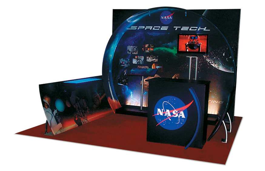
A Space Odyssey
Best 10-by-10 Exhibit
As one might expect, NASA wanted to shoot for the moon with its 10-by-10-foot exhibit, hoping to cram a galaxy of elements, images, and functions into a miniscule footprint. Luckily for the agency, Eco-Systems Sustainable Exhibits Inc. found a way to deliver while still creating a budget-friendly booth grounded in reality.Exhibitor: NASA Design/Fabrication: Eco-Systems Sustainable Exhibits Inc., Grand Rapids, MI, 866-463-2611, www.ecosystemsdisplays.com System: Eco-Systems Sustainable Exhibits Inc. Event: Small Satellite Conference, 2013 Budget: $20,000 – $39,000 Size: 10-by-10 feet Photo: Capitol Exhibit Services Inc. NASA's award-winning exhibit, then, was born of numerous challenges. For not only did NASA hope to offer attendees at the Small Satellite Conference enough galactic graphics to make them stop and stare, but also it wanted to provide multimedia presentations, discreet storage capabilities, and illuminated countertops. And the whole thing had to cost less than $40,000, weigh as little as possible, and set up in a flash. Comprising a modular framework, the structure allowed for quick, easy setup, and given its aluminum components, weight-related charges were kept to the bare minimum. Meanwhile, pillowcase graphics that slid over the framework hid internal supports and provided an uninterrupted surface for the space-themed graphics. Two pedestal-attached monitors positioned directly in front of the back wall offered multimedia presentations and drew attendees' eyes and feet into the space. Hailed by judges for its simplicity and lighting effects, as well as for its use of all three sides of the space, NASA's exhibit may have been small, but it held a universe of offerings. 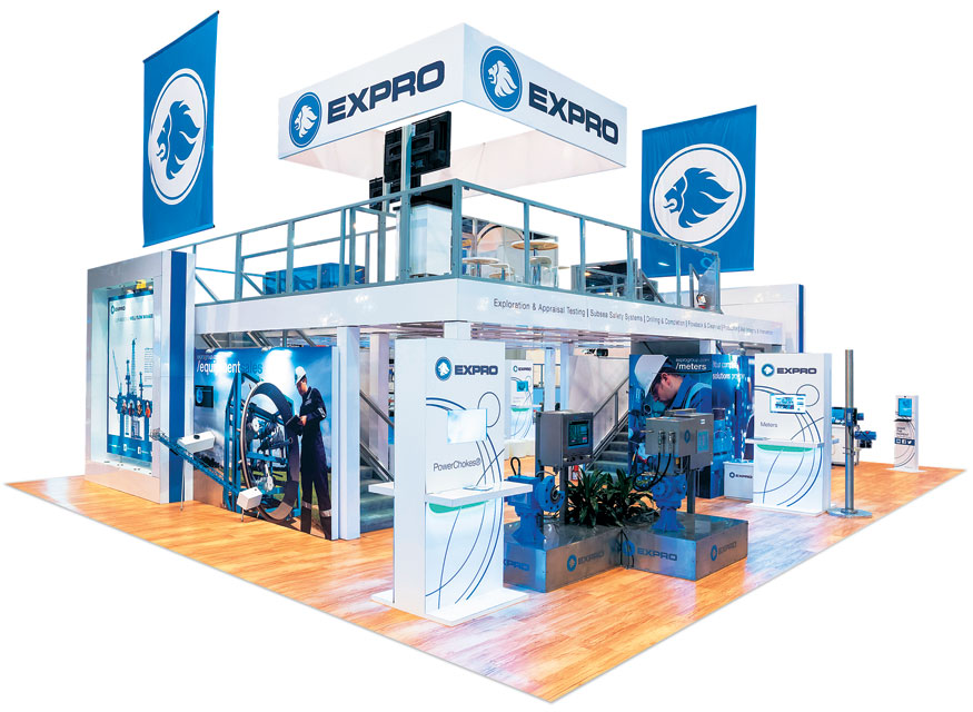
Well-Oiled Design
Best Island Exhibit (More Than 1,000 s.f.)
Some products are more difficult to showcase than others. Exotic automobiles, for instance, are infinitely easier to display than, say, products related to oil-well management. Nevertheless, for Expro Americas LLC, a provider of these offerings, 2020 Exhibits crafted what judges described as a "striking and emotional exhibit that was both highly functional and yet tastefully well done."Design/Fabrication: 2020 Exhibits, Houston, 713-893-0067, www.2020exhibits.com System: Octanorm USA Inc. Event: Offshore Technology Conference, 2014 Budget: $150,000 – $249,000 Size: 40-by-50 feet Photo: Gary Barchfeld For the Offshore Technology Conference, Expro Americas wanted an exhibit design that brought its well-management technology to life while also displaying a mixture of bold, bright graphics and clean, open spaces. Plus, the company was celebrating its 40th anniversary, so it wanted the exhibit to somehow relate this long-term success. Designers opted for a two-story, 40-by-50-foot structure comprising a framework from Octanorm USA Inc. Moving meeting and hospitality functions upstairs allowed the lower level to maintain the open feel the exhibitor demanded. While various presentation areas dotted the lower level, it was anchored by a 90-inch multimedia screen on the front corner of the space, which displayed a video showcasing the firm's 40-year journey. In addition, four double-sided kiosks positioned along the aisles offered information about the firm's products and services for self-guided or staff-assisted exploration. Throughout the booth, designers chose a neutral white backdrop paired with the company's blue hue to maintain a clean aesthetic that kept the eye focused on the kiosks, product-display areas, and colorful graphics. Meanwhile, banners and a central identification header clearly branded the space. Simple and unassuming yet high-tech and sophisticated, the design turned a potentially mundane booth space into a seductive siren. 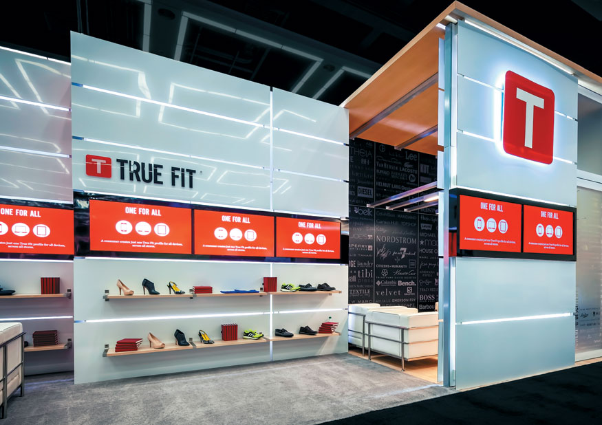
Pop-up Store
Best In-line Exhibit
Creating the look and feel of a permanent retail store within the confines of a 10-by-40-foot exhibit space is about as easy as cramming a size 12 frame into a size 4 pair of skinny jeans. But Hill & Partners made it look easy with this modular exhibit for True Fit Corp.Exhibitor: True Fit Corp. Design/Fabrication: Hill & Partners, Weymouth, MA, 617-471-7990, www.hillpartners.com System: Searle Exhibit Technologies Inc. Event: Shop.org Summit, 2014 Budget: $40,000 – $79,000 Size: 10-by-40 feet Photo: Cole Group True Fit, whose retail software helps online clothing shoppers find the perfect fit, challenged designers to replicate a custom, retail-store feel with seamlessly integrated technology and multiple meeting spaces for the Shop.org Summit. Using Ambidex framework as the exhibit's core, designers produced what judges called a "clean, modern design with a superb use of mixed materials." The bulk of the structure comprised 12-foot-tall walls made of high-gloss white aluminum clad with PVC. When joined together, the wall panels formed a sort of grid, and LEDs positioned behind them highlighted the seams and created a high-tech vibe. To integrate monitors into the walls on either side of the space, designers sandwiched hidden "standoff" hardware between two separate walls. They then inserted monitors into the small void between the structures and surrounded them with glossy black panels. Featuring a maple ceiling and floor, a semi-private meeting space sat center stage behind an 8-by-12-foot wall on the front edge of the footprint. Acting as a branding tower, the wall offered the True Fit logo and two monitors showing looping videos. While the exhibit was based on a modular framework, the designers' clever construction techniques and choice of contemporary furnishings created the look of a permanent retail store on a mall-kiosk budget.
2015 Judges
All entries were scored by a two-part panel of marketing and design experts, who evaluated not just the aesthetic qualities of the completed portable/modular exhibits, but also their functionality, practicality, suitability, messaging, and marketing capabilities.  Glenda Brungardt, CTSM, tradeshow/event marketing program manager, HP Printing and Personal System Group, Hewlett-Packard Co., Fort Collins, CO Glenda Brungardt, CTSM, tradeshow/event marketing program manager, HP Printing and Personal System Group, Hewlett-Packard Co., Fort Collins, CO  Florian Dorsch, partner and creative director, Kohlhaas Messebau GmbH, Hannover, Germany Florian Dorsch, partner and creative director, Kohlhaas Messebau GmbH, Hannover, Germany  Alp Gumus, managing partner, Terminal Design, Istanbul Alp Gumus, managing partner, Terminal Design, Istanbul Deanna Kuhlmann-Leavitt, principal, Kuhlmann Leavitt Inc., St. Louis Deanna Kuhlmann-Leavitt, principal, Kuhlmann Leavitt Inc., St. Louis  Annette Piskel, founder and creative director, AMPdzine, Fort Lauderdale, FL Annette Piskel, founder and creative director, AMPdzine, Fort Lauderdale, FL  Nico Ueberholz, principal, Ueberholz GmbH, Wuppertal, Germany Nico Ueberholz, principal, Ueberholz GmbH, Wuppertal, Germany  Judy Volker, marketing director, Iatric Systems Inc., Boxford, MA Judy Volker, marketing director, Iatric Systems Inc., Boxford, MA Terrence Young, CMP, marketing programs manager, Pyrotek Inc., Spokane, WA Terrence Young, CMP, marketing programs manager, Pyrotek Inc., Spokane, WA
|
|
|
||||||||||||||||||||||||||||
|
|
||||||||||||||||||||||||||||
|
TOPICS Measurement & Budgeting Planning & Execution Marketing & Promotion Events & Venues Personal & Career Exhibits & Experiences International Exhibiting Resources for Rookies Research & Resources |
MAGAZINE Subscribe Today! Renew Subscription Update Address Digital Downloads Newsletters Advertise |
FIND IT Exhibit & Display Producers Products & Services All Companies Get Listed |
EXHIBITORLIVE Sessions Certification Exhibit Hall Exhibit at the Show Registration |
ETRAK Sessions Certification F.A.Q. Registration |
EDUCATION WEEK Overview Sessions Hotel Registration |
CERTIFICATION The Program Steps to Certification Faculty and Staff Enroll in CTSM Submit Quiz Answers My CTSM |
AWARDS Sizzle Awards Exhibit Design Awards Portable/Modular Awards Corporate Event Awards Centers of Excellence |
NEWS Associations/Press Awards Company News International New Products People Shows & Events Venues & Destinations EXHIBITOR News |
||||||||||||||||||||
|
||||||||||||||||||||||||||||


