| ALL STAR |
 Terrence Young, CMP, international events manager at Pyrotek Inc., has more than 20 years of marketing experience. He's won the Tomorrow's Leader Award and the Corbin Ball Technology Award from Meeting Professionals International. Terrence Young, CMP, international events manager at Pyrotek Inc., has more than 20 years of marketing experience. He's won the Tomorrow's Leader Award and the Corbin Ball Technology Award from Meeting Professionals International.
|

ince its start in 1956 as a family-owned business making heat-resistant bags to filter molten aluminum, Spokane, WA-based Pyrotek Inc. has rolled through the past 57 years like a snowball picking up mass and momentum. During that time, expansions and acquisitions transformed the small aluminum-industry supplier into a powerhouse with 66 locations in 31 countries and a global presence that would seem hard to ignore.
But what made Pyrotek infinitely easier to ignore was the fact that as it grew into new regions and markets, it had no uniform brand logo and message to grow with it. Acquisitions happened so quickly and the locales for new ventures were so far flung that each new office was exhibiting under the Pyrotek brand sharing only the font used to spell out the company's name. By chance as much as choice, field staff mostly stuck with the color scheme of red, black, and white in booth design, but that was it.

Before
Without a design template, Pyrotek Inc.'s exhibits were one-off structures that lacked branding and did little to reinforce the company's global presence.
|
Salespeople in field offices around the world were left to freestyle logos, displays, and graphics as long as the word "Pyrotek" appeared somewhere on the exhibit. The result: an aimless hodgepodge of styles that made the company look more like a disjointed kinship than a unified industry giant.
When Terrence Young, CMP, joined Pyrotek as the international events manager in 2008, he filled a position that had been a revolving door in the corporate office for several years. With the company growing at a frenetic pace, previous managers were barely able to oversee Pyrotek's 35 to 50 annual trade shows and events, and none had gotten their arms around the disorganized presence the company had worldwide.
Consequently, Pyrotek spent hundreds of thousands of dollars in design and building costs, reinventing the wheel with each trade show and never reusing existing graphics or booth properties. There were a few warehouses scattered about that had some exhibiting items in them – no one was sure exactly what – and booths were randomly stocked with products from multiple divisions with no discernible order. When field-office staff called the corporate office for product images, the request was fulfilled by whoever answered the phone using whatever images they could find, and the corporate graphics designer spent endless hours creating one-off graphics for the varied displays global offices came up with. It was, in short, unmitigated chaos that had taken decades to create.
ESTABLISHING BRAND GUIDELINES
Terrence Young created a branding
guidebook to unify the company's appearance.
|
Click arrows to navigate
specific branding changes |
|
|
|
|
|
After: Exhibit design takes a fraction of the time and the company has achieved a uniform brand appearance.
|
It took Young about 18 months to get up to speed with Pyrotek's products, which were divided into four divisions; its locations, which were spread across Asia, Europe, the Middle East, and North and South America; and its business practices, which he realized were costing the company an enormous amount of money. "We have everything from annual shows to quadrennial shows, and depending on the year, we can have 20 shows going on at one time in different regions," Young says. "It took me a year and a half to really see what was going on, and when I realized how it all worked I said, 'We've got to do something to bring this together.'"
Reinventing an Image
Creating a company-wide template for exhibit properties and logos and shooting it off to offices around the world may sound like a simple matter, but Young knew that merely issuing such an edict was not the

way to stitch a fragmented company together. There were regional differences to consider, and egos. "I didn't want to come in like I was taking their decision-making authority away," Young says, noting that while the time spent designing exhibits was a burden, the responsibility it conveyed was a source of pride. "I wanted to help them understand how a unified approach would benefit them in the end."
Young knew his vision wasn't going to happen quickly. It had taken years to create the problem, and it was going to take more than a few emails to fix it. In fact, Young wasn't going to rely on email at all. "You can't get things like corporate change done in an email," he says. "You need to sit across the table from someone, or at least pick up the phone and talk to a person." Young began sketching out a plan for face time with all 10 of the company's major regional offices across the globe, eyeing when the next major show was for each and who was making the decisions about it.
But there were a few things Young needed to do in the corporate office before he went on his globetrotting mission. Chief among them was creating a set of design principles to which the company's trade show presence should adhere. On the front line of that issue was the corporate graphic designer. "Our graphics person was instrumental in creating artwork for the displays, but she didn't have a trade show background," Young says. "I needed to partner with her for the branding concepts and convince her that using a template was better than continuing to make one-off designs."
The skeletal branding concept Young formed included a few basic tenets: The word "Pyrotek" needed to consistently be in white against a red background and positioned as high as possible in the booth, and exhibit managers had to swear off what appeared to be a favorite look for many – indistinct white walls and a postage-stamp-type scattering of product graphics on the walls.
Branding Buy-In
In addition to having hundreds of phone calls and Skype conversations with international contacts in field offices, Young flew around the globe to talk with staffers about their programs. He realized
early that there were many different exhibiting needs in the company, from 10-by-10-foot pop-up displays to 2,000-square-foot double-deck booths, and from exhibitions that showcased all of the company's divisions to ones that focused on just a few key products. There was not going to be a uniform solution for Pyrotek's international identity, but by the end of the journey there was going to be a look that identified each as part of the same company.

The next major show on the calendar when Young embarked on his rebranding quest was one of the largest shows the company exhibited in – the German International Foundry Trade Show (GIFA). Pyrotek's regional office there had a committee of 14 salespeople working on preparations, so Young met with each one of them to talk over his branding and booth ideas for the show. If he could convince them to adopt the design, Young saw the perfect opportunity to incorporate the new branding concepts into an exhibit that could become a template for the rest of the company. He approached exhibit houses in North America and Europe with requests for proposals, asking them to create a "model" exhibit based on his brand sketch that was large enough to fill the GIFA space.
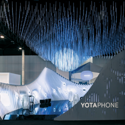
Easily winning the RFP design competition was a company called Partner Sp based in Poznan, Poland. It proposed a design that featured clean black walls and counters with red accents and a gray line that created a wave appearance, product display columns that presented the company's offerings in stylish order, and red carpeted pathways in the exhibit that could visually take attendees through Pyrotek's processes. At the exhibit's highest point, the company's logo in white jumped off of its deep red background, and a new tagline, "Working together to improve performance," along with words explaining the company's "value proposition" (resources, service, expertise, solutions) stood out from otherwise uncluttered walls. "We loved the design so much we asked them if they could build exhibits for all our regions, but they only work in Europe," Young says. "So instead they created a stylebook that took the same basic design principles and reworked them into exhibits of all sizes."
Pyrotek's GIFA committee adored the display too. But what the team particularly loved was that designing it had taken them almost no time at all. "Our field salespeople don't want to build booths; they want to sell," Young says. "They just needed to feel that it was a collaborative effort – that they had skin in the game and a hand in what they ended up with."
Creating Cohesion
Using the design book from Partner and the logo templates created with the help of the corporate graphic artist, as well as the success story of the GIFA exhibit, Young went from one international office to another sharing the concepts and exploring how the models might fit that group's exhibiting needs.
Guidelines in Action
With the help of the branding guidebook created by Young, Pyrotek Inc.'s offices are able to effortlessly design and build cohesive exhibits that are instantly recognizable the world over.
 |
"It was a little like walking on egg shells," Young says, "because it's a sensitive issue when someone from corporate seems like they are coming into a regional office and telling people what to do. I didn't do that.
I just shared with them the success the last group had when it used the guidebook instead of coming up with everything from scratch." Helping field staff maintain a sense of control over their program was the fact that they could continue to use a builder of their choice to create an exhibit and choose which products they displayed based on that region's market.
Some things were a challenge to get staff to agree to, Young says, particularly the new rule that the walls not be covered with 2-by-3-foot product graphics like many had been in the past. Young talked staffers off of that design ledge by explaining the wisdom of having a tagline and value proposition on the wall instead of lots of images that would quickly be forgotten. "They were very product focused," Young says, "but now they're solution focused. Everyone agrees that this is our value proposition, but they didn't realize it wasn't coming through in the exhibit the way it was being done."
Creating that kind of cohesion, All-Star Awards judges felt, is the hallmark of a true leader. "Rebranding is hard. Rebranding on a global level can seem nearly impossible," one judge said. "That he was able to bring together so many people from around the world and create agreement is a remarkable accomplishment."
Waste Not, Want Not
While in Europe visiting field offices, Young tackled Pyrotek's primary warehouse located in Heinenoord, Netherlands, a facility that was established with good intentions but had become a catchall for properties and exhibiting accessories that most had forgotten about. Pyrotek exhibits over the years had evolved into build-and-burn properties, even for small stands, either because field office staff didn't know about the warehouse or didn't have a good system for using it. As a result, the space was full of things no one wanted, and nothing much had gone out of it for some time.
Calculating the costs to store and ship exhibits of various sizes, Young found that anything over 200 square feet was more practical to create on site as a build and burn, but smaller displays crafted in modular pieces could present significant savings for the company if they were maintained in that warehouse and shipped when needed, even to faraway destinations. "I went through everything one piece at a time – and mostly went chuck, chuck, chuck. A lot of it was old and nasty, bad graphics with terrible resolution, stuff nobody really owned anymore. It was wasted space," Young says. After a thorough cleaning and cataloging of anything that could still be useful, Young worked with an on-site property manager for the warehouse to create an online inventory system that can now be accessed in real time with a couple of mouse clicks.
"It took me a year and a half to really see what was going on, and when I realized how it all worked I said, 'We've got to do something to bring this together.'"
 |
The new system for small exhibits created a need for more cooperation from field-office staff, but after the preceding months, Young had established himself as a partner in their exhibit programs. "I think they are glad to have this brand guidebook," Young says. "They're proud of the displays they've created using it, and it's made their jobs easier."
Speaking the Language
Finalizing the official Pyrotek brand guidebook, which has sections on flooring, product kiosks, graphics, and more, took the better part of a year, and didn't happen before each regional office had a chance to talk about their program's unique needs. By June of 2012, all of Pyrotek's exhibits had been transformed by the guide, and Young had achieved global unification for the industry giant.
But he had accomplished more than that. His initiatives cut corporate graphics design and production costs by almost 90 percent, shrinking them from an average of $2,666 per show to $366. And having the guidebook in hand let field salespeople get back to selling, cutting the average number of hours spent planning a show from 140 to just 21, a reduction of 85 percent.
In addition, field offices are beginning to share and reuse properties thanks to the reinvented warehouse in Heinenoord, and Young can review its inventory and recommend properties for upcoming shows with a click of a mouse. It's a system certain to save Pyrotek enormously on its trade show costs over time.
However, according to judges, Young is not just an All Star because he got global buy-in on rebranding, or that in doing so he implemented a vibrant and memorable new brand. "He did this in a way that was efficient and allowed him to scale some tough hurdles," one judge said. "He established core brand principles but left flexibility so people the world over took ownership."
Young learned plenty along the way, too, particularly that patience is a virtue when it comes to rebranding, and it's best accomplished in face-to-face meetings. With this approach, he may have become the first Pyrotek event manager to actually get his arms all the way around the global identity, and as such end up with the whole world in his hands.