unique exhibits |
 |
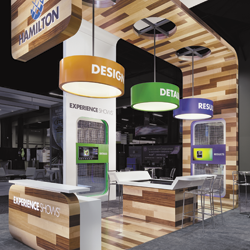
 hen it comes to trade shows, where generating awareness and capturing attention are two prerequisites to exhibit-marketing success, why oh why do so many companies avoid the unexpected and instead try to blend in to the background? Peruse just about any show floor in the country, and you'll find that the vast majority of booths look exactly the same, featuring traditional exhibitry, graphics, flooring, lighting, etc., and only a handful of exhibitors break the mold. More often than not, when the show's over, it's that handful of unique booths, not the mundane masses, that attendees remember. hen it comes to trade shows, where generating awareness and capturing attention are two prerequisites to exhibit-marketing success, why oh why do so many companies avoid the unexpected and instead try to blend in to the background? Peruse just about any show floor in the country, and you'll find that the vast majority of booths look exactly the same, featuring traditional exhibitry, graphics, flooring, lighting, etc., and only a handful of exhibitors break the mold. More often than not, when the show's over, it's that handful of unique booths, not the mundane masses, that attendees remember.
So why not harness a few unusual and unexpected elements to help you stand out in a sea of sameness? Just a little something different, be it a color scheme or product display or structural component, can help set your booth apart from the been-there-done-that crowd. Plus, it doesn't take oodles of cash to warrant a second glance, and you don't need miles of booth space to pique the interest of passersby. All you need is a single, unique idea.
To prove the point - and help get your wheels turning about ways you too can stand out in the crowd at your next show -
EXHIBITOR rounded up 15 exhibits that captured our attention for various reasons. Including everything from an exhibit wrapped in tinfoil to a miniature barn, the following examples demonstrate how a single unique element, unexpected material, or unusual display can help you stand out in the crowd as opposed to blending in to the background.
|
 |
 |
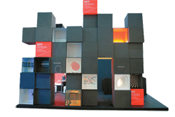
 Creativity Cubed Creativity Cubed
How does a small booth stick out in
a forest of behemoth exhibits? According to Wit Design bv, a Zaltbommel, Netherlands-based exhibit-design and construction firm, you try something a little different, both in terms of color scheme and overall structure. For its 16-by-23-foot space at EuroShop 2011, Wit Design opted for an almost all-black palette (highlighted by pops of color) and a series of aisle-side cubes to catch attendees' attention. Positioned along the front edge of the space, a collection of black, roughly 2-foot-square cubes were stacked up to seven high. While many of the cubes offered nothing but a flat, matte-black façade, some featured graphic messages such as "experience" and "focus," and on others, the front side was removed to reveal interior graphics, messages, or even objects within the cube. For example, one cube interior featured a red bull's-eye on a white background, with the word "target" across the top - suggesting that Wit Design can help you reach your target audience. Another cube was lit from within, casting a vibrant orange glow. The opposite side of the cubes actually formed an interior wall of sorts. Here, some of the cubes offered a flat, matte-black face, but many displayed images of Wit Design's work via light boxes housed within the cubes. The rest of the interior space featured little more than a reception desk - in black, of course - and a lounge/conversation area.
|

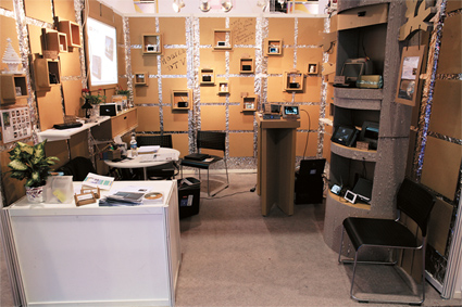
Foiled Again
Generally speaking, international exhibiting pavilions are little more than cookie-cutter creations. But at the International Consumer Electronics Show, one little exhibit stood out from the cacophony of cookie-cutter booths lining the aisles. Bright Vision Technologies Inc. covered the entire interior of its booth space with household-variety tinfoil and plain-old cardboard. The unique and low-cost concept not only gave the exhibit an interesting and textural aesthetic, but it also acted as an aisle-side icebreaker, as passersby continuously stopped to ask, "Is that tinfoil and cardboard?" |
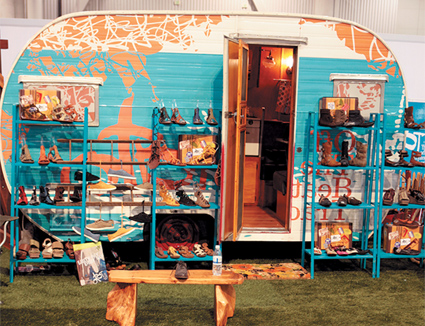
Off Track, On Target
To live up to its playful moniker, a shoe company named Off the Beaten Path filled its exhibit at the Magic Marketplace Show with a hanging porch swing, wooden bench, outdoor grill, and faux-grass flooring. Echoing the outdoorsy, adventurous, and unconventional attributes of the Off the Beaten Track brand, this eccentric but on-target booth environment proved that the road less traveled is often worth the trek.

|
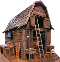
 Spinning a Barn Spinning a Barn
Barnwood Inc. of Bend, OR, locates old barns that are going to be torn down, purchases the lumber, and resells it to builders who are looking to incorporate the old, rustic, repurposed wood in new-build projects. For Barnwood, recycling old farm structures aids Mother Nature and forms a solid business model. So for its exhibit at the International Builders' Show, the company built a 20-by-30-foot faux barn out of reclaimed wood. Not only was the exhibit a perfect fit for the company's name, but it was also made from the product the company sells and it demonstrated just one way in which its products could be used in a new structure. In addition, the exhibit featured a leather-bound scrapbook positioned atop a beautiful wooden desk along one side of the barn. The scrapbook, branded with the company's name and location, contained vintage-style photos of the barns the company has deconstructed, along with information about each one, including its location, its dimensions, what the barn was used for during its lifetime, etc. The authentic exhibit and scrapbook-inspired portfolio told Barnwood's story in beautiful, brand-appropriate style. |
Road Work Ahead
As a provider of traffic-safety markers - including everything from "Utility
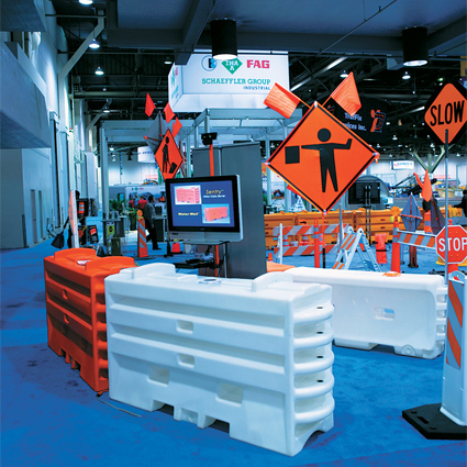
Work Ahead" signs to emergency traffic cones - TrafFix Devices Inc. of San Clemente, CA, knows a little something about getting people to slow down and take notice. So rather than use a traditional exhibit to grab attendees' attention at the 2011 ConExpo-Con/Agg show in Las Vegas, the company employed its wares to create a booth that doubled as a giant

product display. The exhibit's outer edges were marked with shoulder barriers and compressor guardrails (the water-filled devices typically found in construction
areas). Inside the exhibit, a variety
of portable signs and traffic cones
set up like road-hazard markers got
attendees to wander in to take a closer look. By using its products in a manner similar to their designed function, TrafFix Devices made attendees notice the booth as they might a road-construction site. And at a huge show like ConExpo, that moment of hesitation can mean the difference between attendees speeding past your booth or slowing to pause and then park in your exhibit. |
Sustainable Structure
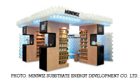
 Why just talk about your products when you can build a booth out of them and simultaneously demonstrate their versatility in the process? That's what Miniwiz Sustainable Energy Development Co. Ltd. did at the International Consumer Electronics Show. The company, which designs and sells eco-friendly products, built its 10-by-20-foot exhibit's entire back wall and an eye-catching overhead structure from its Polli-Brick recycled polymer architecture bricks. The exhibit helped attendees envision the architectural applications for the Green building product, and gave staffers the opportunity to discuss the material's strength-to-weight ratio, acoustic and thermal insulation, and optional integrated LED lighting. Sounds like a sustainable strategy.
 |
Full Coverage
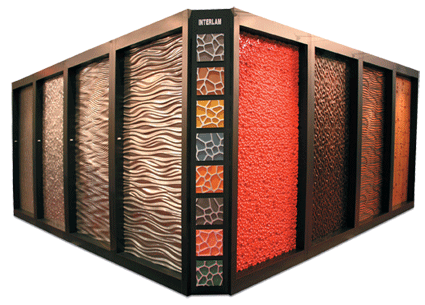
Rather than simply displaying its products
at GlobalShop 2010, Interlam Inc. actually
covered the exterior walls of its exhibit
with them. Three walls of the
company's 20-by-20-foot
booth each featured
roughly 2-by-8-foot
panels of its laminate
product, which were
recessed into the walls.
The fourth wall, which
contained a doorway
to the exhibit's interior,
featured two similarly
sized recessed panels.
Meanwhile, each of the
exhibit's four corners
offered eight additional
product samples com-
prising 1-by-1-foot squares,
which were arranged vertically.
The exhibit exterior alone displayed more
than 40 product samples, giving attendees
a good sense of what the company offered
long before they ever set foot in the booth.
 |
A Change of Perspective
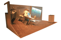
 At the 2011 Healthcare Convention & Exhibitors Association meeting, Group Delphi wanted attending exhibit and event managers to know that it understands their needs have changed amid the Great Recession. To communicate this message, Delphi created a 10-by-20-foot booth that illustrated attendees' slightly skewed worlds. While the front right corner of the space offered a reception desk, the floor, the back wall, and the left corner were elevated at an angle. Delphi positioned office furniture atop the angled floor to suggest that exhibitors' lives are a little off kilter compared to four or five years ago. Text on the back wall told attendees to "change your perspective," and a faux window on the right side of the space offered the Group Delphi logo. The attention-getting device gave staffers an easy opening to suggest ways in which Delphi could help level out attendees' exhibit- and event-marketing experiences. At the 2011 Healthcare Convention & Exhibitors Association meeting, Group Delphi wanted attending exhibit and event managers to know that it understands their needs have changed amid the Great Recession. To communicate this message, Delphi created a 10-by-20-foot booth that illustrated attendees' slightly skewed worlds. While the front right corner of the space offered a reception desk, the floor, the back wall, and the left corner were elevated at an angle. Delphi positioned office furniture atop the angled floor to suggest that exhibitors' lives are a little off kilter compared to four or five years ago. Text on the back wall told attendees to "change your perspective," and a faux window on the right side of the space offered the Group Delphi logo. The attention-getting device gave staffers an easy opening to suggest ways in which Delphi could help level out attendees' exhibit- and event-marketing experiences. |
 Life's a Beach Life's a Beach
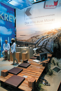
Rather than creating a stuffy, corporate booth at EuroShop 2011, Strohbach
& Krey Messebau Design GmbH &
Co. KG turned its space into a sand-covered beach. A large-format graphic
on the back wall sported a sea-side image, while overhead panels were printed to resemble clouds. A pier-like structure jutted out from the back wall and served as a place for attendees to talk shop. Strohbach also covered its booth space in real sand, then mounted monitors running clips of waves lapping at the beach into small drift-like piles. The surreal scene subtly communicated that Strohbach can keep your program beachy keen.
|
 Budget-Friendly Boxes Budget-Friendly Boxes
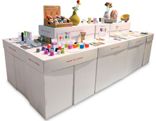
Faced with a bare-bones budget, Made By Humans barely
had enough cash to cover shipping costs for a traditional booth structure at the National Stationery Show. Even renting an exhibit locally proved too pricey. So the Canadian
designer of contemporary giftware got creative and contacted a cardboard box company. Together, they custom designed white cardboard boxes that could be shipped flat and put together on site to create eye-level display tables. When Made By Humans' booth staffers arrived on site, they simply assembled the boxes, and positioned most around the exterior of the space. A two-tiered center-island structure - also made
of boxes - completed the exhibit. The result was a significant savings on shipping and drayage, and since the cardboard was both recycled and recyclable, the custom structure was eco-friendly to boot. |
The Aloha Exhibit
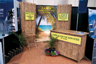
 When Laser Exhibitor Service Inc. wanted to let attendees at EXHIBITOR2011 in Las Vegas know about its newest branch office in Hawaii, the company put a whole lot of "aloha" into its exhibit. The graphics and installation-and-dismantle company based in San Juan Capistrano, CA, celebrated its most recent addition by treating attendees to a Hawaiian-themed booth. The exhibit was decked out like a beach shack complete with walls, flooring, and furniture made from rattan and bamboo; meanwhile, staffers in Hawaiian shirts complemented the motif. The company also handed out old-fashioned postcards from the Aloha State, each of which included information on Laser Exhibitor Service locations across North America and highlighted the new island location and
its offerings. The booth theme served as a talking point about not only the
company's newest location but its network of offices across North America. When Laser Exhibitor Service Inc. wanted to let attendees at EXHIBITOR2011 in Las Vegas know about its newest branch office in Hawaii, the company put a whole lot of "aloha" into its exhibit. The graphics and installation-and-dismantle company based in San Juan Capistrano, CA, celebrated its most recent addition by treating attendees to a Hawaiian-themed booth. The exhibit was decked out like a beach shack complete with walls, flooring, and furniture made from rattan and bamboo; meanwhile, staffers in Hawaiian shirts complemented the motif. The company also handed out old-fashioned postcards from the Aloha State, each of which included information on Laser Exhibitor Service locations across North America and highlighted the new island location and
its offerings. The booth theme served as a talking point about not only the
company's newest location but its network of offices across North America.
|
 Spider Vain Spider Vain
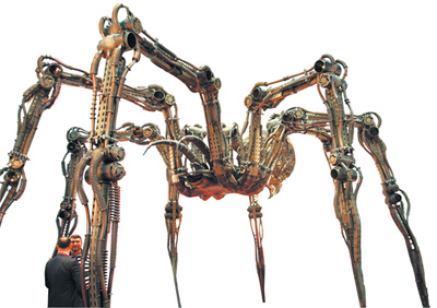
Nothing says "Hey, look at me!" like a 12-foot tall mechanical spider. So to demonstrate its creative capabilities - and showcase its shelving and shop-fitting hardware - to been-there, done-that attendees at EuroShop 2011, Kifato MK LLC created a 12-by-18-foot spider made entirely of its products. The Moscow-based company positioned the menacing arachnid in the center of its booth where it not only drew attention from aisles away but also allowed them to walk underneath and around it to inspect every nut and bolt. Once the spider lured in attendees, staffers sprang into action and explained Kifato's product offerings. |
 |
 |
Mural, Mural on the Wall
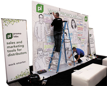
To some, good art is purely subjective. But to Promo Labs, an Austin, TX-based marketing- and sales-technology supplier to the promotional-products industry, good art can also be a marketing tool. At the 2011 Promotional Products Association International Expo, Promo Labs hired a team of artists known as Jazz Rules to create a roughly 10-by-20-foot mural on its white back wall. The mural was designed to feature 12 industry leaders chosen by Promo Labs, alongside inspirational words of wisdom from each honoree such as "Get social," "Adapt to the new economy," and "Don't be afraid to try new things." But rather than completing the

work of art pre-show and shipping it to the Mandalay Bay Convention Center
for PPAI, Promo Labs brought the artists to Las Vegas to create the mural during show hours. Aside from the illustrated back wall, the rest of the exhibit comprised simple rental furniture such as high-top tables and chairs, creating a lounge-like feel where attendees could take a seat, chat with Promo Labs' staffers, and watch the in-exhibit art installation unfold. The evolving illustration drew repeat booth visits, as attendees stopped back to see the progress throughout the show, and to see if their faces and words of wisdom would be featured. As it turns out, good art may be subjective, but in this case, it was undeniably strategic. |
Crate Expectations
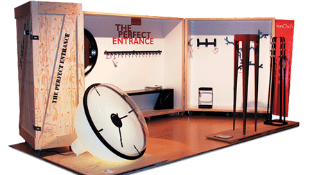
Van Esch BV thought inside the box when it came to its 10-by-20-foot exhibit at the International Contemporary Furniture Fair. Essentially a hinged shipping crate on casters, the booth's primary structure comprised three crate-like displays
that opened to create a back wall. Unlike anything else on the show floor, the wooden structure stood out, with each individual crate resembling a sort of department-store window display. And since most of the products featured were actually mounted to the crates' interiors, the structure could be closed up and shipped without additional labor, making installation and dismantle a snap.
 |
A Literal Interpretation
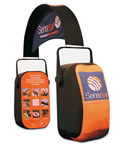
 How do you communicate that your company offers protective headphones? If you're Sensear Pty. Ltd., you turn your booth into an oversized representation of your headgear. The company, which provides headphones that enhance speech while suppressing background noise, traded traditional exhibitry for a giant set of headphones at the International Wireless Communications Expo (IWCE). Positioned diagonally across Sensear's 10-by-20-foot space, the
black tension-fabric structure was accented
with the company's corporate messages and
orange and blue hues. Blue fabric joined
to the headband featured the company's
name and logo along with its tagline: "Hear
Speech, Stay Protected." Meanwhile, two
sides of each earpiece offered orange
fabric and additional messaging. For
example, the interior side of one ear-
piece included eight full-color images of
the headphones at work in high-volume
situations. Accompanied by little more
than two reception desks and a hand-
ful of product samples, the headphone
booth spoke volumes about the Sensear's
offerings without uttering a word. How do you communicate that your company offers protective headphones? If you're Sensear Pty. Ltd., you turn your booth into an oversized representation of your headgear. The company, which provides headphones that enhance speech while suppressing background noise, traded traditional exhibitry for a giant set of headphones at the International Wireless Communications Expo (IWCE). Positioned diagonally across Sensear's 10-by-20-foot space, the
black tension-fabric structure was accented
with the company's corporate messages and
orange and blue hues. Blue fabric joined
to the headband featured the company's
name and logo along with its tagline: "Hear
Speech, Stay Protected." Meanwhile, two
sides of each earpiece offered orange
fabric and additional messaging. For
example, the interior side of one ear-
piece included eight full-color images of
the headphones at work in high-volume
situations. Accompanied by little more
than two reception desks and a hand-
ful of product samples, the headphone
booth spoke volumes about the Sensear's
offerings without uttering a word. |
|
|
|
|


 hen it comes to trade shows, where generating awareness and capturing attention are two prerequisites to exhibit-marketing success, why oh why do so many companies avoid the unexpected and instead try to blend in to the background? Peruse just about any show floor in the country, and you'll find that the vast majority of booths look exactly the same, featuring traditional exhibitry, graphics, flooring, lighting, etc., and only a handful of exhibitors break the mold. More often than not, when the show's over, it's that handful of unique booths, not the mundane masses, that attendees remember.