|
product displays
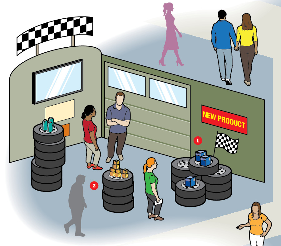
Illustration: Colin Hayes
How to Maximize the Effectiveness of Product Displays
Trade show exhibits and retail stores have many similarities. Both are branded environments designed to lure passersby, showcase goods or services, and influence a purchase decision. With these parallels in mind, here are eight product-display tips from retail experts Scott Devine, vice president of visual merchandising and store design at Macy's Inc.; Susan Negen, co-founder of WhizBang! Retail Training; and Paco Underhill, author of "Why We Buy" and founder of the market-research firm Envirosell Inc. By Brian Dukerschein
1. Be in the Right
Many exhibitors think they should put their featured products front and center. However, experts refer to this space as a "decompression zone" in which booth visitors mentally adjust to a new setting. Underhill suggests displaying key items to the right of your exhibit's entrance, as an aggregate of studies show that the majority of consumers begin navigating an environment by turning to the right. A display here will likely be the first thing to get attendees' undivided focus. 2. Pick Your Props According to Underhill, effective product displays "communicate that a company is selling solutions, not items." Thoughtfully chosen props can reinforce a product's benefits with a single glance. For example, a firm offering low-fat snacks could place an assortment of items atop a bathroom scale. Or if your wares feature temperature-regulating technology – say a line of insulated tote bags – consider displaying them on transparent risers filled with acrylic ice cubes. 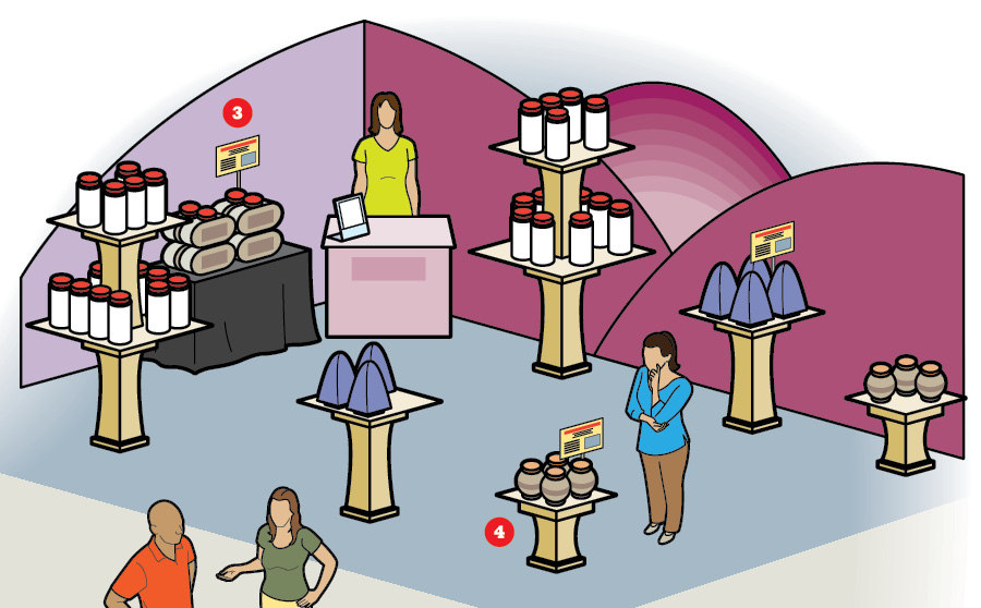
Signage on a product display can function as a silent sales rep, communicating the goods' features and benefits when a staffer isn't available. The key to using signage effectively, according to Devine, is restraint and uniformity (i.e., placing placards in a consistent location, such as the upper-right corner of a fixture, whenever possible). "An overabundance of signage can create visual noise that detracts from the merchandise you're trying to highlight," he cautions. 4. Keep a Low Profile It may be tempting to impress arriving booth visitors with an expansive display augmented with banner stands and other signage, but going too over the top can have its drawbacks. "Placing tall, imposing fixtures at the exhibit's entrance can block attendees' views of the rest of the stand," Negen says. "Start with low fixtures at the front and lead up to taller, larger ones toward the back and side walls. This will draw people into the exhibit and encourage exploration." 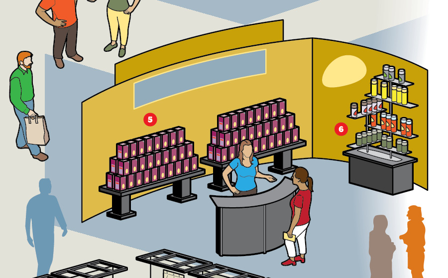
"Stack it high and watch it fly" is a common tactic from the retail-merchandising playbook that can work just as well on the trade show floor, especially when showcasing top-selling wares or a new product. "Even though attendees won't be leaving the exhibit with a purchase in hand, displaying a core item in bulk gives it visual prominence and broadcasts the subtle message that 'Everyone is getting in on this, and you should get in on it too,'" Negen says. 6. Raise the Bar When it comes to product displays, flat equals forgettable. Devine suggests using risers to elevate wares off the surface of a table. "This makes them easier to access, whether that be visually or physically, while differing heights create more appealing displays," he says. Fabrication options range from U-shaped segments of barely there Plexiglas to rough-hewn wooden crates, and experts suggest choosing styles that align with your exhibit's overall aesthetic. 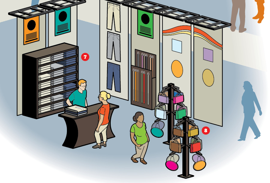
When composing a display for a shelved wall, think up and down, not left and right. "Because human beings are vertical shapes, our primal brains are trained to look for and be attracted to the same form," Negen says. "Plus if you put your entire assortment of a product on a shelf below eye level, you lessen the chance of attendees paying it any attention." So organize items in vertical compositions, such as by color, product category, brand, etc. 8. Know the Angles Arranging your fixtures, such as tables, freestanding shelved units, etc., in a diagonal layout as opposed to straight lines perpendicular to the exhibit's entrance gives arriving attendees an immediate view of most – if not all – of the products on display. This layout also creates nonlinear paths that encourage booth visitors to explore. Experts recommend placing square fixtures at an angle as well to increase the visibility of as many items as possible.
|
|
|
||||||||||||||||||||||||||||
|
|
||||||||||||||||||||||||||||
|
TOPICS Measurement & Budgeting Planning & Execution Marketing & Promotion Events & Venues Personal & Career Exhibits & Experiences International Exhibiting Resources for Rookies Research & Resources |
MAGAZINE Subscribe Today! Renew Subscription Update Address Digital Downloads Newsletters Advertise |
FIND IT Exhibit & Display Producers Products & Services All Companies Get Listed |
EXHIBITORLIVE Sessions Certification Exhibit Hall Exhibit at the Show Registration |
ETRAK Sessions Certification F.A.Q. Registration |
EDUCATION WEEK Overview Sessions Hotel Registration |
CERTIFICATION The Program Steps to Certification Faculty and Staff Enroll in CTSM Submit Quiz Answers My CTSM |
AWARDS Sizzle Awards Exhibit Design Awards Portable/Modular Awards Corporate Event Awards Centers of Excellence |
NEWS Associations/Press Awards Company News International New Products People Shows & Events Venues & Destinations EXHIBITOR News |
||||||||||||||||||||
|
||||||||||||||||||||||||||||


